

List
Show testimonials one per row with the reviewer's photo beside the text, plus an optional zig-zag that alternates which side the photo sits on.
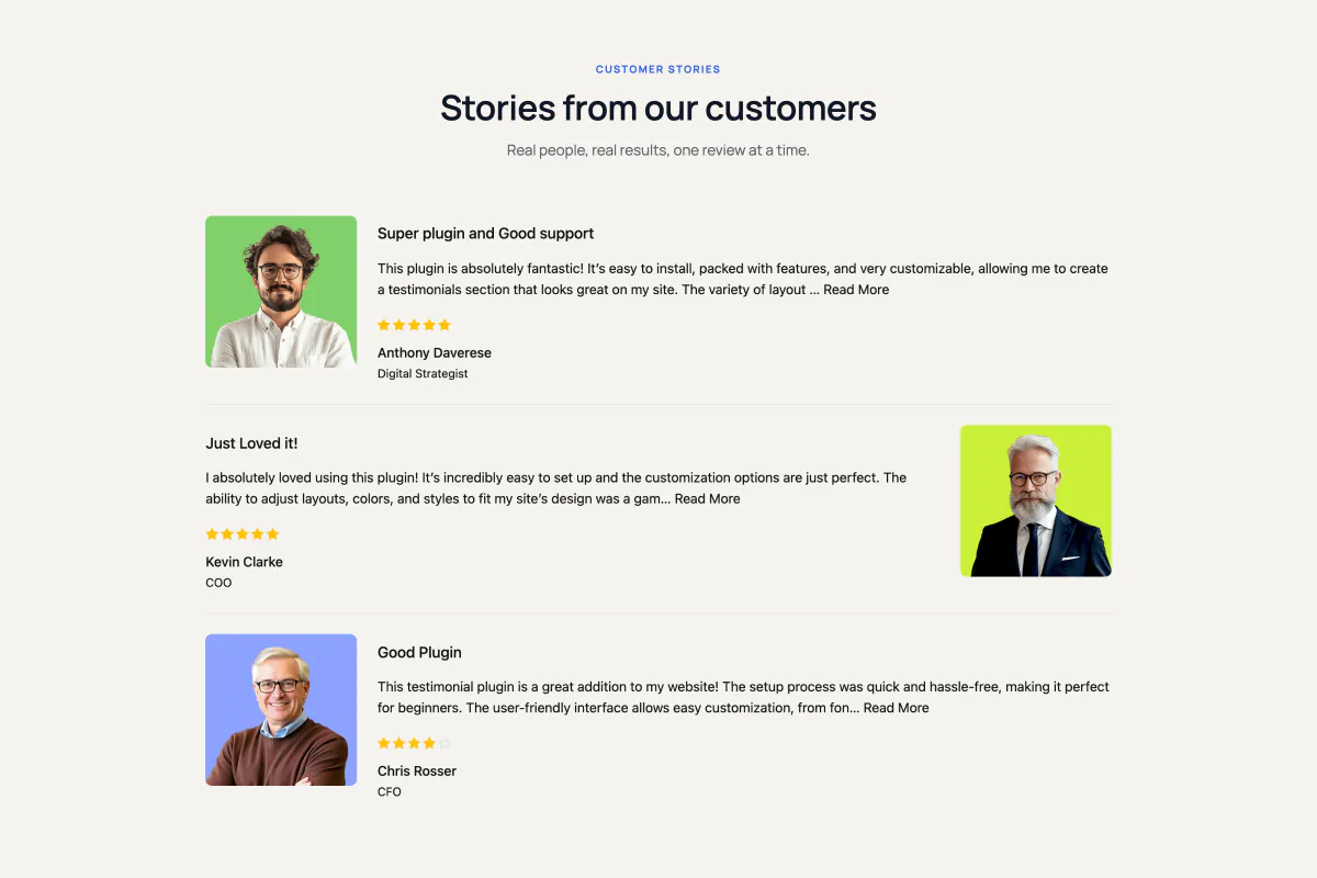
The List block (a ready-made content element you drop into the WordPress editor) gives each testimonial a full row to itself. The reviewer's photo sits beside the words instead of above them, so reviews read like short stories rather than cards on a wall. Turn on Zig Zag Orientation and the photo flips sides on every second row, which keeps a long page from feeling like a column of identical blocks.
When to use it
- Long, story-style testimonials that need space. A grid would cut them short.
- A case-study or success-story page where you want a handful of detailed reviews, not dozens of short ones.
- Anywhere you want reviews to read top to bottom, the way people actually scroll a page.
How to add it
- Click the + block inserter in the editor.
- Search for List (under the Real Testimonials category) and select it.
- A Choose Your Card Design box appears in the block's place. Pick one of the three list designs. If you'd rather start from something finished, the same box has Start with Ready Patterns (a fully styled design from the pattern library) and Build with AI (describe the block you want in plain words).
- Open Query Builder in the inspector (the settings sidebar on the right) to choose which testimonials appear.
When the block's in place, select it and click Refine with AI in its toolbar to ask for a change in your own words, such as "turn on the zig-zag and add a line between rows". Build with AI explains how both AI buttons work, and the Carousel page covers the other editor shortcuts, such as Ready Patterns and Documentation at the top of the inspector.
Layouts
The List has three designs of its own instead of the six card designs the grid-style blocks share. They're built for a horizontal row rather than a vertical card. And because one testimonial fills each row, there are no Columns or Column Gap controls here.
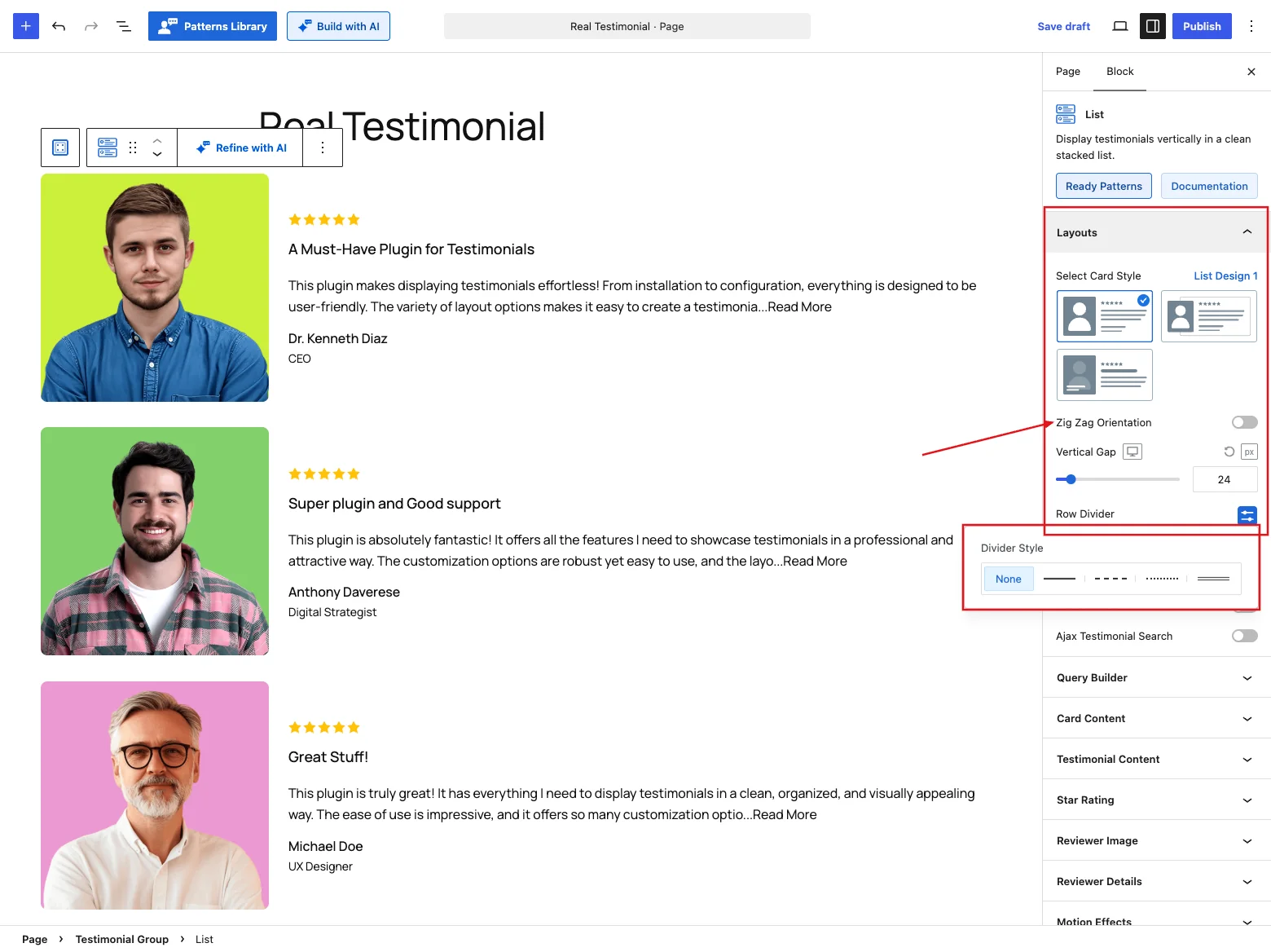
| Control | What it does |
|---|---|
| Select Card Style | Choose one of three list designs (see the table below). |
| Zig Zag Orientation | Flips the photo to the opposite side on every second row. Off by default, and it works with all three designs. |
| Vertical Gap | Space between rows, up to 200 px. Default 24 px (20 on tablets, 16 on phones). |
| Row Divider | Draws a line between rows. Off by default. Click it to open the Divider Style options: None (default), solid, dashed, dotted or double. Pick a line style to reveal Divider Width (default 1 px) and Divider Color (default #E0E0E0). |
| Ajax Pagination | Loads rows in pages with a load-more button or numbers. On by default. It attaches the Ajax Pagination child block. |
| Review Summary | Adds an aggregate Review Summary above the list. |
| Live Frontend Filter | Adds filter controls so visitors can narrow down the rows live. |
| Ajax Testimonial Search | Adds a live search box. |
Turning on any of the last three toggles wraps the block in a Testimonial Group and inserts the matching child block for you. A list doesn't slide, so there are no Navigation Arrow or Pagination Dots panels.
The three list designs
| Design | What it looks like |
|---|---|
| List Design 1 | A bare row: photo on one side, review on the other, no frame. |
| List Design 2 | A framed card (1 px light-grey border, 8 px corners, 24 px padding) with the reviewer's photo hanging half outside the frame. Pair it with Zig Zag Orientation for the classic alternating look. |
| List Design 3 | A bare row with the reviewer's name and job title laid over the photo instead of beside the text. |
Picking a design sets the card's frame, spacing and left alignment to match it, so choose your design before you fine-tune the card's style.
On List Design 2, the block makes room for the overhanging photo inside each row. The photo never pokes past the edge of the block, and a Row Divider still runs the full width of the row. With Zig Zag Orientation on, that room moves to whichever side the photo is on.
On List Design 3, the company name joins the job title on the photo, as in "Designer at Acme". That's why Reviewer Details only offers Show Name with Designation as the company display style while this design is picked.
The block starts with a Display Limit of 3 rather than the usual larger number, because full-width rows take up far more vertical space than grid cards. Raise it in the Query Builder once you've seen how tall a row is on your theme.
Rows stack on small screens
At 599 px wide and below, the photo and text stack vertically and the zig-zag stops, since a phone doesn't have room for a side-by-side row. List Design 2's overhanging photo tucks back inside its frame at the same point.
Query Builder
Choose which testimonials appear in the list: the latest ones, one or more groups, a hand-picked set, or only high star ratings. Then set the display limit and the order, or shuffle them. Every option is explained in the Carousel reference.
Card Content
Here's where you shape each row's card. Turn parts on or off and drag them into order (photo, title, text, rating, name and more), set the alignment and a hover effect, and style the background, border, shadow, corners and padding. See the Carousel reference for details.
Testimonial Content
Set up the title and the quote. Choose a heading tag, show the full text or trim it with a Read More action (expand, popup or link), add quote symbols if you want them, and pick typography and colors for both. More in the Carousel reference.
Star Rating
Style the rating with one of 16 icon styles (stars, hearts, thumbs and more), then adjust the size, spacing, and filled and empty colors. The details are in the Carousel reference.
Reviewer Image
The reviewer photo's resolution, aspect ratio and size live here, along with the fallback avatar for testimonials without a photo, retina loading and click-to-play video testimonials. Each control is covered in the Carousel reference.
The List gives the photo much more room than the other blocks, because it's half of every row. Out of the box, Image Width is 280 px on desktops, 200 px on tablets and 180 px on phones, and the Aspect Ratio is 1:1 (square).
Reviewer Details
Style the name line: the name's heading tag, a verified badge, how company info, location and date appear, and the typography for each part. Full details in the Carousel reference.
One default is different here: Location Display Style starts on Country Name, not a flag over the photo. On a big square photo a small flag in the corner is easy to miss, so the country is written out beside the name instead.
Social Media
This panel shows up when the Social Profiles card part is on and the Reviewer Social Profiles module is enabled. It sets the size, clickable area, gap and colors of the reviewer's social icons (the Carousel reference has the specifics). On the List, Icon Area Size starts at 32 px (24 px on the other blocks), so the icons are easier to tap next to the larger photo.
Motion Effects
If the Motion Effects module is on, you can animate the list as it scrolls into view with an entrance animation (fade, slide, zoom, bounce) and an optional scrolling effect, each set per device. See the Carousel reference.
Advanced Settings
These settings apply to the whole block: a background with padding and margin, per-device visibility (show or hide the block on desktops, tablets or mobile devices), and custom CSS class and ID fields. They're explained in the Carousel reference.
Tips
- Keep the Display Limit low and let Ajax Pagination handle the rest. Full-width rows get tall fast.
- Zig Zag Orientation works best when the photo clearly shows a person. If most of your testimonials have no photo, turn the photo part off in Card Content and use a plain list instead.
- Reach for Row Divider when you've turned the card frame off. It stops one review from running into the next.
- List rows honour wide and full width alignment from the block toolbar.