

Filter by Group
Filter testimonials by group, as a dropdown or a button group.
The Filter by Group control lets visitors narrow testimonials to a specific group (category) — for example Product, Support or Enterprise. It lives inside a Live Frontend Filter row and updates the display block live.
How to add it
Usually you won't need to add it yourself — enabling Live Frontend Filter on a display block inserts one for you. If you do need another, add it from the inserter inside a Live Frontend Filter row.
Settings
Select the Filter by Group control and open the Filter by Group panel in the inspector (the settings sidebar on the right of the editor). It has two tabs: Settings and Style.
Settings
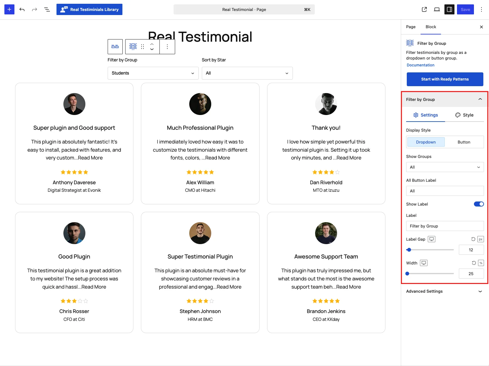
| Control | What it does |
|---|---|
| Display Style | Show the filter as a Dropdown (default) or a Button group. |
| Show Groups | Which groups to offer — All (default), Include (pick specific groups) or Exclude. |
| Include / Exclude Groups | The group list used by Include / Exclude. |
| All Button Label | Label for the "show everything" option (e.g. All). |
| Item Orientation | (Button style) Lay buttons out Horizontal or Vertical. |
| Button Width | (Button style) Fit (default), Grow or Fixed width — Fixed reveals an extra numeric width field (default 100px). |
| Buttons Gap | (Button style) Space between buttons (default 8px). |
| Show Label + Label + Label Gap | Add a caption before the control — on by default, caption Filter by Group — and set the space between the caption and the filter (default 12px). |
| Width | Overall width of the control (default 25%). |
The button-only controls (Item Orientation, Button Width, Buttons Gap) appear once you switch Display Style to Button.
Style
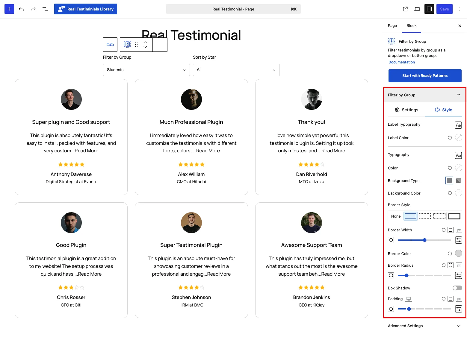
Here you can style the label (typography and color) and the filter itself: typography, color, background, border (style, width and color), border radius, box shadow and padding. In the button style, each of these comes in Normal and Hover & Active states.
Advanced Settings
The shared per-device visibility toggles (Hide on Desktop / Tablet / Mobile) and the Custom CSS Class and Custom CSS ID fields — the same controls described in the Carousel reference.
Frontend behavior
When a visitor picks a group, the block fetches just the matching testimonials over AJAX and swaps them into the display block, with no page reload. The active button or option is highlighted using your Hover & Active styles. If you've also added a Filter by Rating control, the Live Frontend Filter's Multiple Filter Relation setting decides how the two combine.
Tips
- Use the Button style for a few groups; switch to Dropdown when you have many.
- Set Show Groups → Include to expose only the groups relevant to the page.
- Keep a clear All Button Label so visitors can always reset the filter.