

Manage Views
Build a reusable testimonial layout in the admin, then place it anywhere with a shortcode.
A View is a saved testimonial layout you build the classic way. You choose a layout (Slider, Grid, Carousel and more), decide which testimonials it shows, style it, and save. Real Testimonials gives you a shortcode — a short [bracketed] code — that drops that exact layout onto any page, post, widget, or page builder. Edit the View later and every place that uses it updates at once.
If you've used the display blocks, a View is the classic equivalent of a layout block — the difference is where you build it (the admin, not the page editor) and how you place it (a shortcode, not the inserter).
Create a View
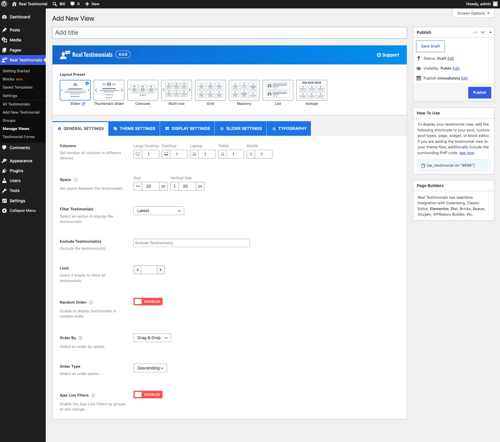
- In the WordPress admin, go to Real Testimonials → Manage Views.
- Click Add New. (If your Default Editor is set to Ask Every Time, choose Classic Shortcode here.)
- Give the View a title at the top — this is just for you, to find it later (for example, Homepage Carousel).
- Work through the Layout Preset picker and the Shortcode Options box below (both covered next).
- Click Publish.
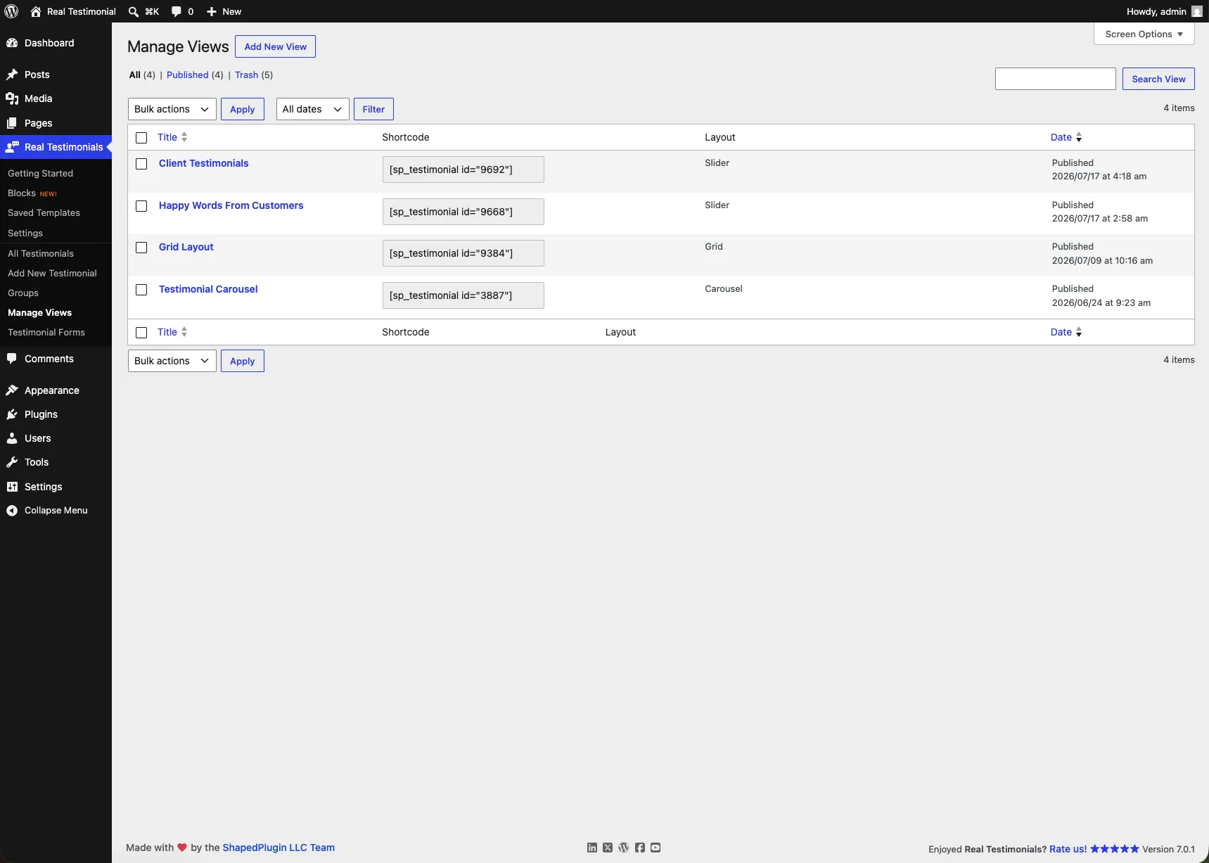
A Live Preview box sits at the top of the edit screen, right above the Layout Preset picker. Click Show Preview and it renders the View with your published testimonials, exactly as visitors will see it — click again (Update Preview) after changes. So you're never designing blind.
Pick a layout
The Layout Preset box is where you choose the overall shape of the display. There are eight to pick from — start here, because the setting tabs adapt to your choice (slider-type layouts get the Slider Settings tab; grid-type layouts get pagination options instead). See Layout Presets for a closer look at each, with live demos.
| Layout | What it looks like |
|---|---|
| Slider (default) | One testimonial at a time, sliding across full width. |
| Thumbnails Slider | A slider paired with a strip of clickable reviewer thumbnails. |
| Carousel | A rotating band of cards with arrows and dots. |
| Multi-row | A carousel stacked into several rows. |
| Grid | An even, multi-column wall of testimonials. |
| Masonry | A Pinterest-style layout where cards take the height they need. |
| List | A simple stacked, single-column list. |
| Isotope | A filterable grid with animated shuffle transitions. |
Some layouts add a sub-style choice right below the picker:
- Carousel → Carousel Style: Standard, Center, or Ticker.
- Thumbnails Slider → Thumbnails Style: Thumbs Top, Thumbs Bottom, Thumbs Left, or Thumbs Right.
- Isotope → Isotope Style: Even or Masonry.
Configure it — the Shortcode Options tabs
Below the layout picker, the Shortcode Options box holds every setting for the View, split into five tabs: General Settings, Theme Settings, Display Settings, Slider Settings, and Typography. You don't have to touch every one — the defaults produce a working display, so adjust only what you care about, then publish. Here's what lives on each tab.
General Settings
This tab decides which testimonials appear and the broad shape of the display.
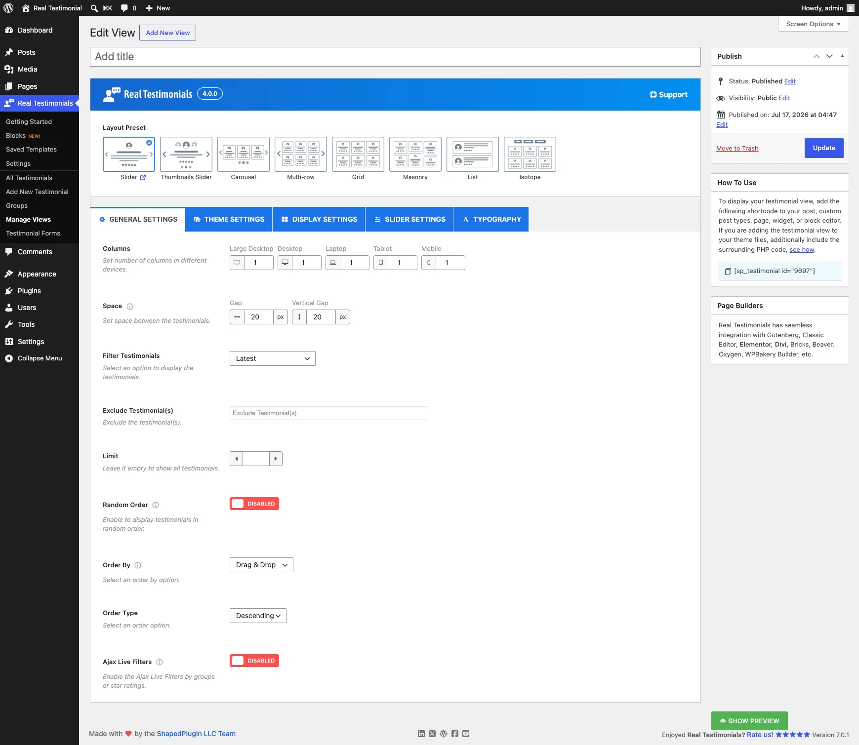
Layout basics
- Columns — the number of columns per device: Large Desktop, Desktop, Laptop, Tablet, and Mobile. Default: 1 everywhere.
- Row — (Multi-row layout only) the number of rows per device.
- Space — the gap between testimonials, horizontal and vertical. Default: 20px.
Choosing testimonials
- Filter Testimonials — picks which testimonials to pull in:
- Latest (default) — your most recent testimonials.
- Groups — only the Groups (categories) you pick.
- Specific — hand-pick individual testimonials.
- Based on Star Rating — only testimonials with the star ratings you check (5-star and 4-star by default).
- Select Group — when filtering by Groups, pick which ones to show.
- Group Relation Type — how multiple selected groups combine:
- IN (default) — testimonials in one or more of the groups.
- AND — testimonials that match all the groups.
- NOT IN — testimonials that match none of the groups.
- Specific Testimonial(s) — when filtering by Specific, choose the exact testimonials.
- Exclude Testimonial(s) — (with Latest or Groups) leave out particular testimonials.
- Limit — how many testimonials to show. Leave it empty to show all.
Ordering
- Random Order — shuffle the testimonials into a random order on each page load.
- Order By — what to sort by: Testimonial ID, Date, Title, Modified, or Drag & Drop (default) — the manual order you set by dragging testimonials on the All Testimonials page.
- Order Type — Ascending or Descending. Default: Descending.
Live filters and pagination
- Ajax Live Filters — (Grid, Masonry, List, Slider, Carousel and Multi-row) adds front-end filter controls so visitors can narrow testimonials by Groups or Star Rating without a page reload. Turn it on and a set of extra options shows up: which filters to show, a Filter Style (Button or Dropdown), a Star Rating Filter as Dropdown toggle (the rating filter becomes a dropdown while the Groups filter stays buttons), a star-rating label style, a Star Rating Filter Orientation (horizontal or vertical), an inline layout toggle, a per-rating counter, an "All" tab with a custom label, plus alignment, colors, border, and margin for the filter buttons.
- Isotope Filter — the Isotope layout gets the same kind of filter bar (this is what makes it filterable), with the All tab, alignment, color, and border options.
- Pagination — Grid, Masonry, List, and Isotope can split long lists into pages. Choose a Pagination Type — Load More Button (Ajax), Ajax Number Pagination, Infinite Scroll (Ajax), or No Ajax (Normal Pagination) (default for grid-type layouts) — and set Testimonial(s) To Show Per Page (default: 12), the button label, alignment, colors, and border.
Theme Settings
A theme here is the card design — how each individual testimonial is drawn. Pick one of the 11 designs (Theme One through Theme Ten, plus a Theme One v2 variant), then use the Configure Theme options below the picker to make it yours. The options adapt to the theme you choose; the common ones are:
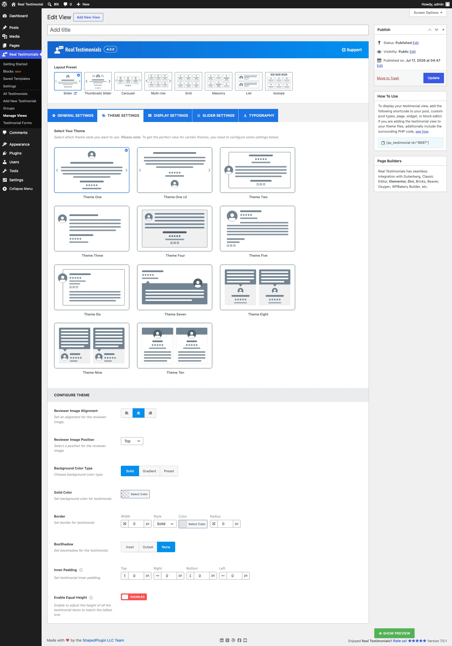
- Reviewer Image Alignment / Position — where the reviewer photo sits on the card. The choices depend on the theme — some offer left/center/right, others top/middle/bottom or corner positions like Left Top and Bottom Right.
- Background Color Type — Solid (default), Gradient (pick your own two colors and direction), or Preset (ready-made gradients like Light Blue, Soft Peach, and Neon Glow).
- Border — width, style, color, and corner radius for each testimonial card.
- BoxShadow — Inset, Outset, or None (default); pick one and you'll get the shadow's offset, blur, spread, and color values.
- Inner Padding — space inside each card. Default: 22px on most themes.
- Reviewer Info styling — most themes also let you style the reviewer-details area separately from the rest of the card: its own Border, an Info Background Color (solid or gradient), and its own Inner Padding. (Not available on Themes Eight and Nine.)
- Enable Equal Height — (Slider, Carousel, and Grid layouts) stretch every card to match the tallest one, so short reviews don't leave a ragged row.
- Theme-specific extras — a few themes add their own controls, like a top background color (Theme Ten) or a speech-bubble arrow position (Themes Seven and Nine). The Thumbnails Slider layout swaps the theme picker for a Thumbnail Dimensions control instead.
Display Settings
This tab controls what shows on each card. It's organized into seven small sub-tabs — toggle an element off and its related options disappear with it.
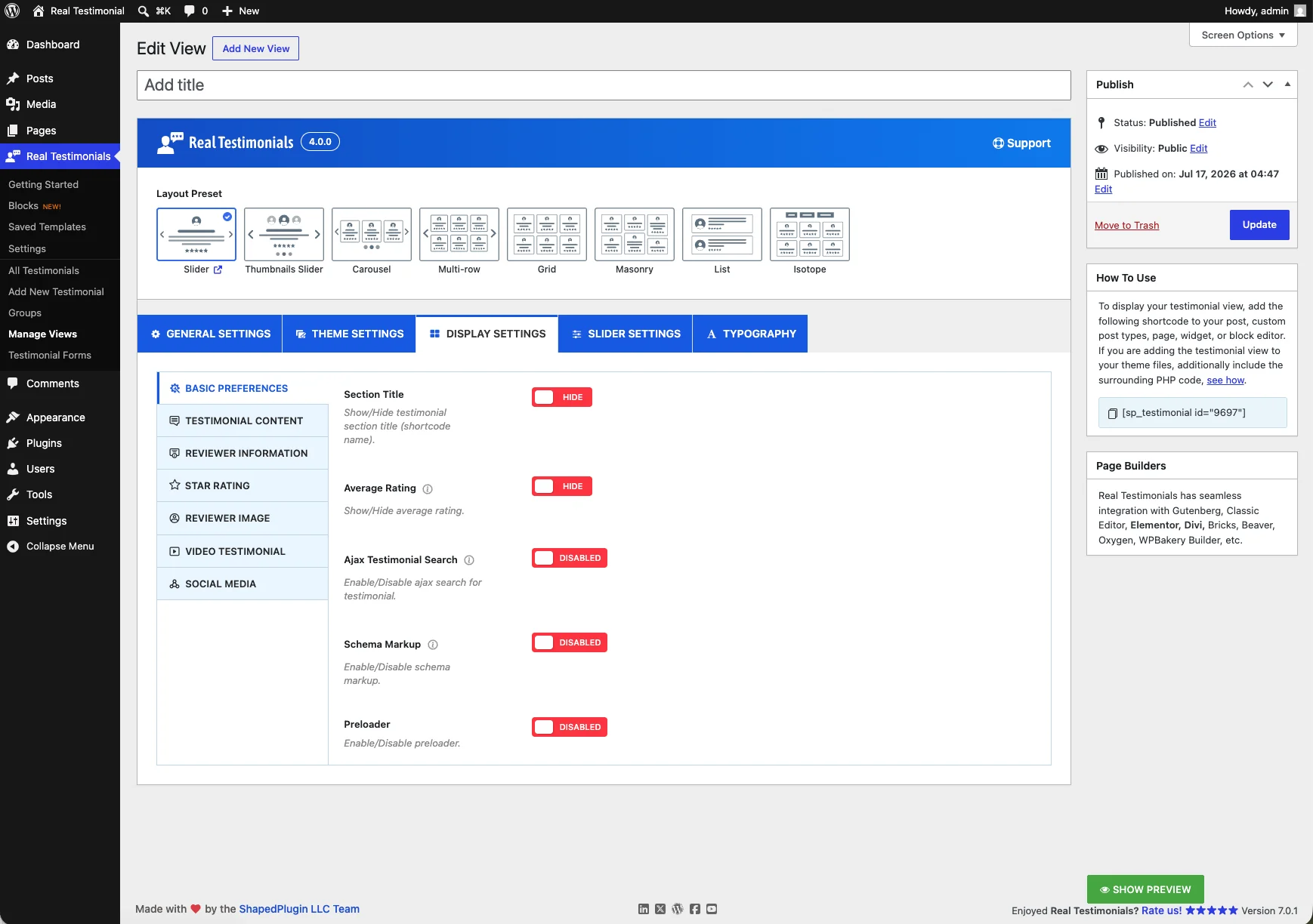
Basic Preferences
- Section Title — show or hide a heading above the whole View (it uses the View's title). Hidden by default.
- Average Rating — show the combined star rating of everything in the View, above the testimonials.
- Ajax Testimonial Search — add a live search box so visitors can search testimonials, with a custom label.
- Schema Markup — turn structured-data (schema) markup on or off, which helps search engines show your review stars in results. Turn it on and you'll also see Item Global Name — the company or product being reviewed (invisible on the page; used as a fallback when a testimonial doesn't set its own).
- Preloader — hide testimonials until they've fully loaded, so the layout doesn't jump.
Testimonial Content
- Testimonial Title — show or hide the testimonial tagline/title, with a length limit (characters or words), an HTML Tag picker (h1–h6, p, span, div — default h3), and an optional quote symbol before it.
- Testimonial Content — show or hide the review text itself:
- Content Display Type — Full or Limit (default).
- Length — the limit, counted in Characters (default: 300) or Words.
- Ellipsis — the symbol after trimmed content. Default:
... - Strip All HTML Tags — remove any HTML from the content. On by default.
- Read More Action Type — what the read-more link does: Expand (default), Popup, Single Testimonial (opens the testimonial's own page — needs the Single Testimonial Template enabled in settings), or Disabled.
- Read More Label / Read Less Label / Read More Color — the link text and colors.
Reviewer Information
- Show/hide toggles for each detail: Full Name (with its own HTML tag, default h4), Designation (the reviewer's role), Company Name, Company Logo (with size and an optional custom color for PNG logos), Location, Phone or Mobile, E-mail Address, Date, and Website.
- Country — when Location is on, choose how the reviewer's country appears: name, name with flag, flag only, or none.
- Date Format — Default (pick a format), Time ago (e.g. "2 weeks ago"), or Custom.
- Designation & Company Linking with Website/Custom Link URL — make the designation and company name link to the reviewer's website, opening in a New Tab (default) or Same Tab.
- Additional Custom Fields — show any extra reviewer fields you've added (needs the Custom Information Fields module).
Star Rating
- Star Rating — show or hide it, then pick one of 15 Rating Icon Styles, the icon colors (empty vs. filled), Rating Icon Size (default: 19px), the gap between icons, a Rating Position (below the reviewer name — default — below the designation, above/below the title, below the content, or below the reviewer image), alignment, and margin.
Reviewer Image
- Reviewer Image — show or hide the photo, with:
- Dimensions — a WordPress image size or Custom (default: 120×120, hard crop), plus an optional 2x image for retina screens.
- Image Shape — Circle (default), Rounded (with a radius), or Square.
- Reviewer Fallback Images — what shows when a testimonial has no photo: Mystery Person (default), Smart Text Avatars (colored initials), or nothing.
- Styling: background, padding, border, and box-shadow.
- Lightbox — click the photo to view it enlarged.
- Zoom Effect — zoom in or out on hover.
- Image Mode — original, or grayscale variants (always, on hover, or grayscale until hover).
Video Testimonial
- Video Testimonial — show or hide video testimonials (on by default). Videos can play Inline or in a Popup (default), with controls for the play icon's size, color, and overlay color.
Social Media
- Social Profiles — show or hide the reviewer's social icons (hidden by default), with alignment, icon border radius (default: 50%, i.e. round), an Icon Color Type of Original (each network's brand color) or Custom (your own colors and border), and margin.
Slider Settings
These options appear for the slider- and carousel-style layouts (Slider, Thumbnails Slider, Carousel, Multi-row). They control motion, navigation, and pagination, across four sub-tabs. (The Ticker carousel style scrolls continuously, so most of these controls don't apply to it.)
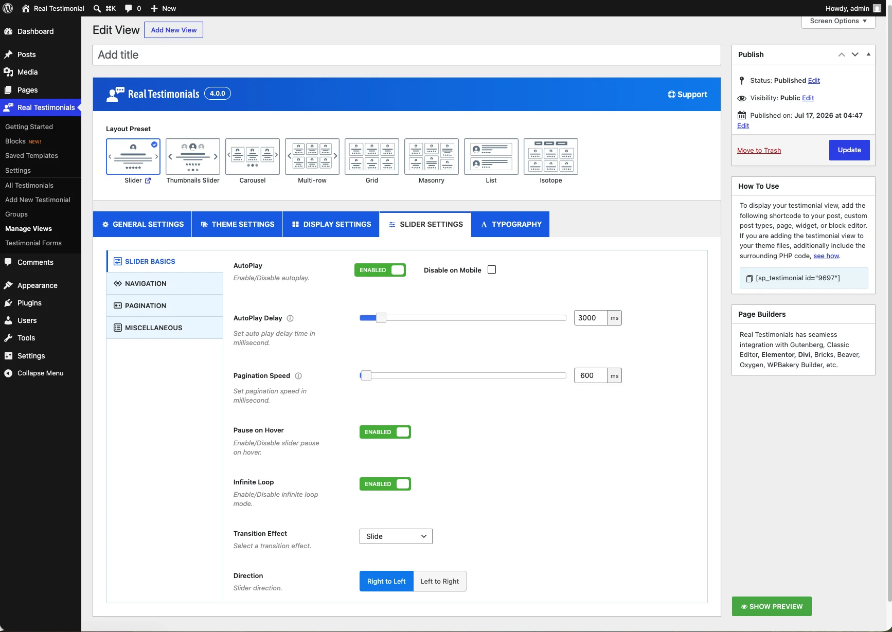
Slider Basics
- AutoPlay — play slides automatically (on by default), with a Disable on Mobile checkbox.
- AutoPlay Delay — how long each slide stays. Default: 3000ms (3 seconds).
- Pagination Speed — the transition speed between slides. Default: 600ms.
- Slide To Scroll — (Carousel) how many testimonials move per scroll, set per device. Default: 1.
- Pause on Hover — stop autoplay while the visitor's cursor is over the slider. On by default.
- Infinite Loop — loop continuously instead of stopping at the last slide. On by default.
- Transition Effect — Slide (default), Fade, Flip Horizontally, or Flip Vertically.
- Direction — slide right-to-left (default) or left-to-right.
Navigation
- Navigation — show or hide the arrows (shown by default), with a Disable on Mobile checkbox.
- Select Position — arrow placement: nine options covering top/bottom left-center-right plus vertically-centered inner, outer, and center.
- Show on Hover — (vertical positions) only reveal the arrows when the visitor hovers over the slider.
- Navigation Arrow Style — pick one of eight arrow icon styles.
- Navigation Icon Size — enlarge or shrink the arrows. Default: 20.
- Navigation Color / Border / Border Radius — the arrows' colors (including hover states), border, and roundness (default: 50%).
Pagination
- Pagination — show or hide it (shown by default), with a Disable on Mobile checkbox.
- Pagination Style — Bullets (default), Dynamic, Strokes, Scrollbar, Fraction, or Numbers.
- Pagination Color — the normal and active colors, plus margin.
Miscellaneous
- Adaptive Slider Height — let the slider's height adjust to each slide instead of staying fixed.
- Touch Swipe — swipe on touch screens. On by default.
- Mouse Draggable — drag with the mouse to navigate. On by default.
- Free Mode — slides glide freely instead of snapping into position. On by default.
- Mousewheel — scroll the slider with the mouse wheel. Off by default.
Typography
Set the fonts for every text element. Each element has a Load … Font toggle — turn it on and that element's full font controls appear: font family and weight (Google Fonts, with a search box), font size, line height, text align, text transform, letter spacing, color, and margins.
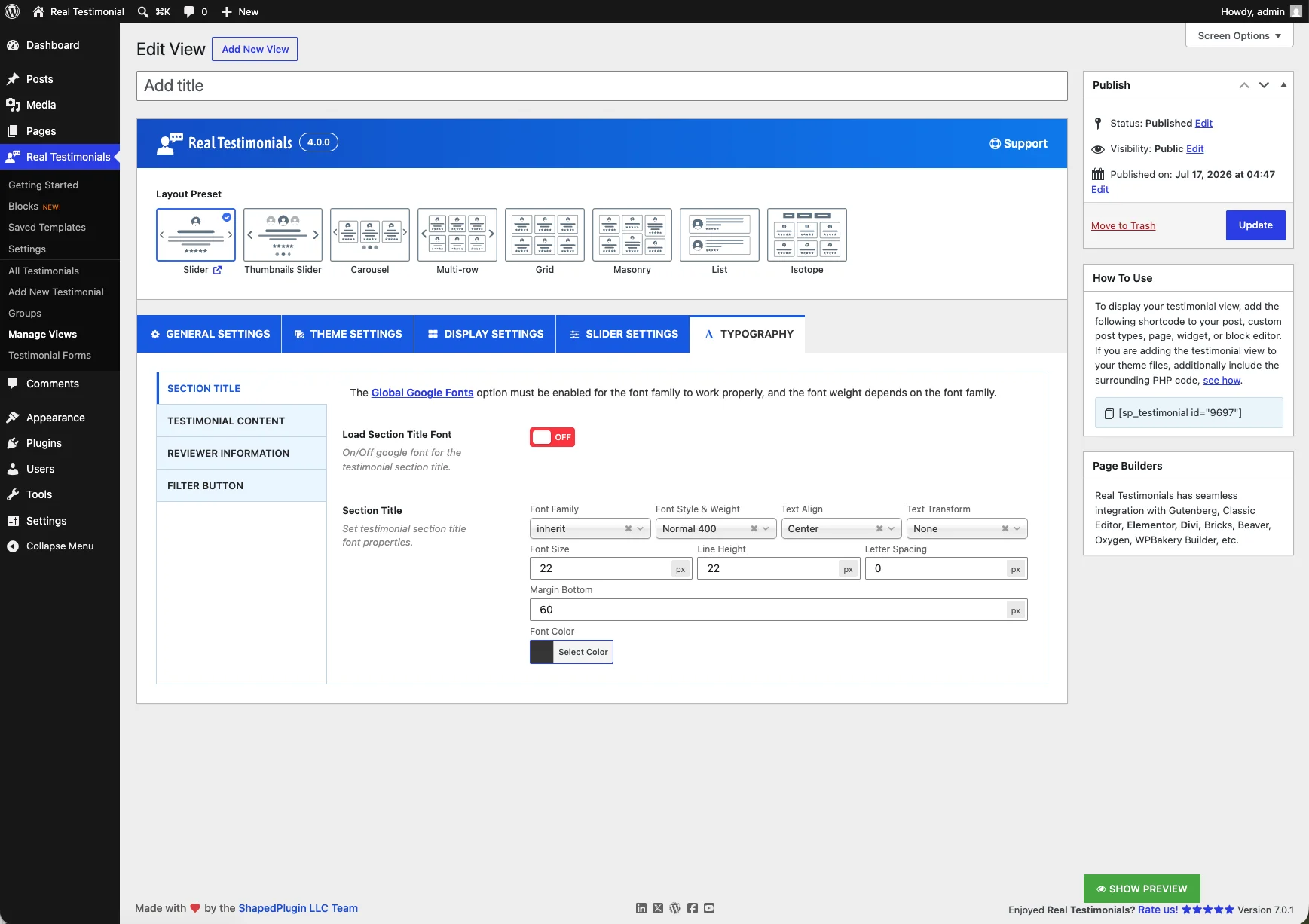
The elements are grouped into four sub-tabs:
- Section Title — the heading above the View. Default size: 22px.
- Testimonial Content — the testimonial title and the review text.
- Reviewer Information — Full Name, Designation & Company Name, Location, Phone or Mobile, E-mail Address, Date, Website, and Additional Custom Fields.
- Filter Button — the Isotope/live-filter buttons.
Google Fonts must be on
For a chosen font family to actually load, enable the Global Google Fonts option on the classic settings screen (Advanced tab). A notice at the top of the Typography tab links straight to it.
Choosing which testimonials show
On the General Settings tab, the Filter Testimonials option decides the View's content: everything (Latest), only certain Groups, a hand-picked set, or only certain star ratings — with an extra Exclude option to leave out individual testimonials. This is the classic version of the block editor's Query Builder.
Place the View on a page
Once you publish, the How To Use box (on the side of the edit screen) shows the shortcode for this View:
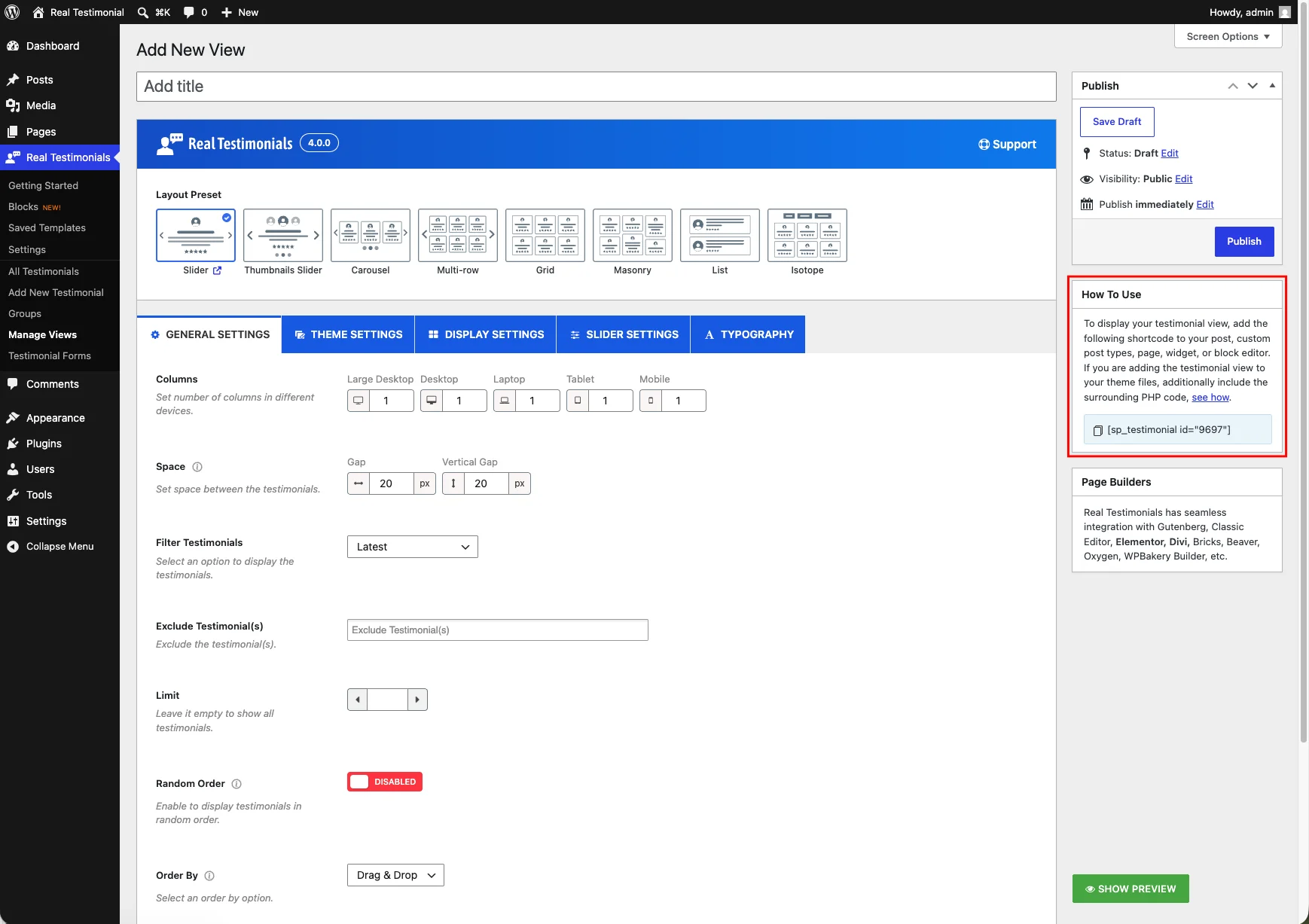
[sp_testimonial id="123"]The number is the View's own ID — the box fills it in for you. (The older [testimonial_pro id="123"] shortcode still works too — it's an alias of the same thing.) A Page Builders box sits alongside How To Use with quick pointers for using the View in your page builder.
Click the shortcode to copy it, then paste it wherever you want the display:
Block editor — add a Shortcode block (or the Real Testimonials Shortcode block, which lets you pick the View from a dropdown instead of pasting) and paste it in.
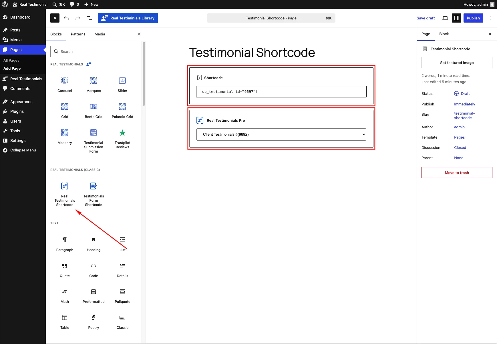
Classic Editor — paste it straight into the content.
Widgets — add the Real Testimonials Pro widget (Appearance → Widgets), which lists your saved Views in a dropdown — no shortcode needed. A Text/Shortcode widget with the pasted shortcode works too.
Page builders — Elementor, Divi, Bricks, WPBakery and others accept shortcodes; Elementor also has a dedicated Real Testimonials widget.
Placing it in a theme template file
If you're editing PHP theme files directly, wrap the shortcode so WordPress runs it:
<?php echo do_shortcode( '[sp_testimonial id="123"]' ); ?>Or use the helper function sp_testimonial( 123 ), which does the same thing.
You'll also find a copy-to-clipboard shortcode next to every View in the Manage Views list, so you can grab it without opening the editor. Each View there has a Duplicate link too — it clones the whole View, with every setting, as a new draft. Handy when you want a variation of an existing display without rebuilding it.
A single testimonial on its own
Sometimes you want to feature just one testimonial — not a whole layout. Open any testimonial under All Testimonials and its How To Use box gives you a single-testimonial shortcode:
[sp_single_testimonial id="45"]The id here is the testimonial's own ID. Paste it the same way as a View shortcode.
Related
- Layout Presets — a closer look at every layout, with live demos.
- Testimonial Forms — collect testimonials with a classic form.
- Real Testimonials Shortcode block — place a View from a dropdown in the block editor.
- Add New Testimonial — create and organize the testimonials your Views display.