

Submission Form
Build a customizable front-end form and collect testimonials — with a rating, photo and even a recorded video — straight from your visitors.
The Testimonial Submission Form block (a building block you drop into a page) lets visitors write reviews right on your site — name, star rating, a few words, optionally a photo or webcam video. No account needed. Each submission lands in your Testimonials list as pending by default, so nothing goes live until you approve it. Once you do, it appears in every display block just like a testimonial you wrote yourself. You can place the form inline on a page or tuck it behind a popup button.
When to use it
- Let happy customers leave a review without emailing you or logging in.
- Collect photo and video testimonials for richer, more believable social proof.
- Gather feedback right after a purchase, an event, or a support interaction — link a "Leave a review" page from your receipt or thank-you email.
How to add it
- Edit the page or post where you want the form, click the + block inserter, and search for Testimonial Submission Form (under the Real Testimonials category).
- Insert it. A ready-to-use form appears with the default fields (the boxes people type into) already in place.
- In the inspector on the right (the settings sidebar), choose whether the form shows Inline on the page or as a Popup, then tune the fields, button and messages.
- Publish the page. That's it — you're collecting reviews.
Finding your way around the inspector
Select the block and open the inspector — the settings sidebar on the right. Like the display blocks, it's a stack of collapsible panels, and most panels have Settings and Style tabs inside:
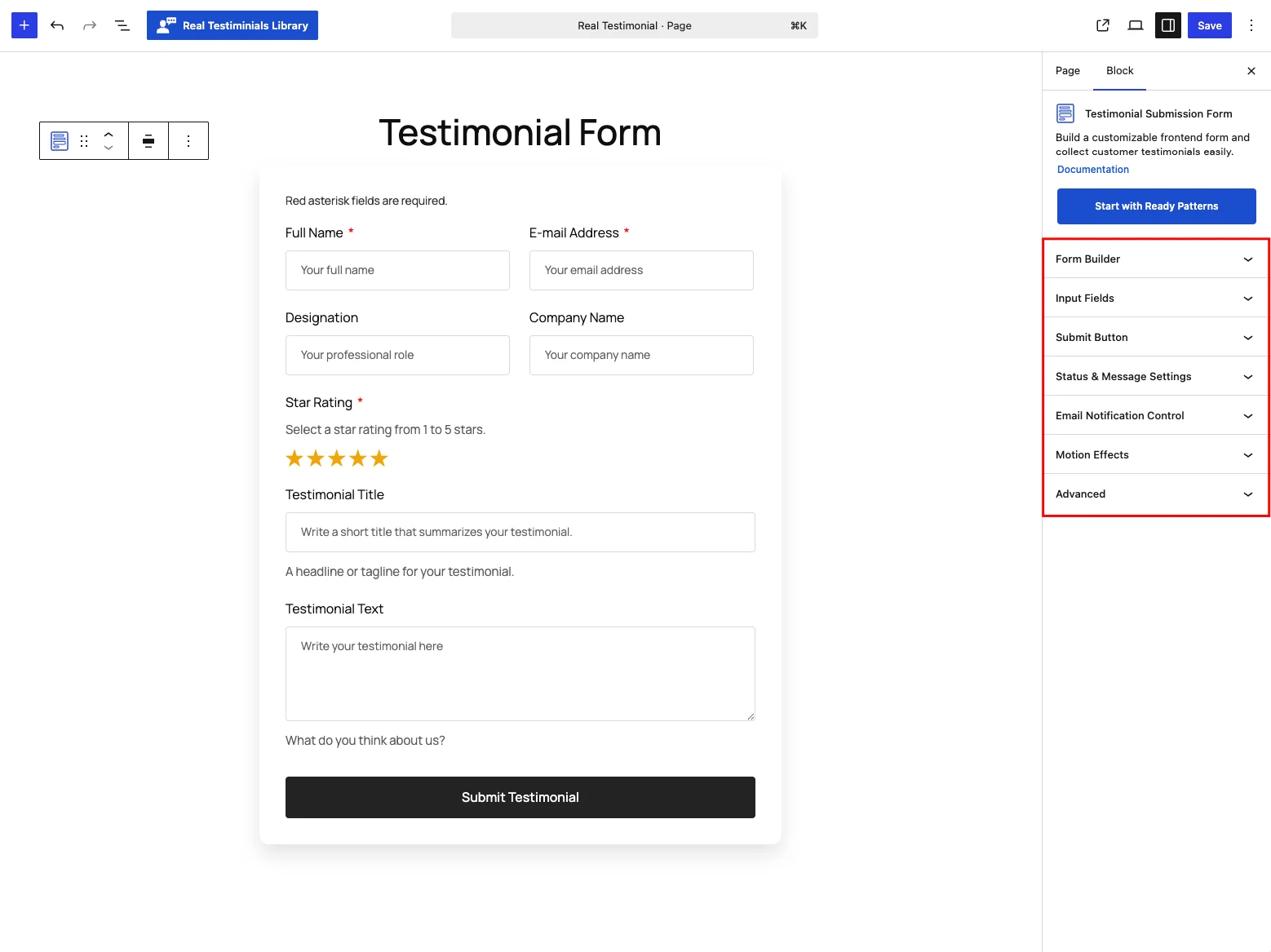
| Panel | What it controls |
|---|---|
| Form Builder | Display mode, the fields themselves, spam protection, terms, and the form's overall layout and box. |
| Popup Settings | The trigger button (Popup mode only). |
| Input Fields | The field layout style, spacing, and the look of labels, notes and inputs. |
| Submit Button | The button's label, icon, width and styling. |
| Status & Message Settings | What happens to a submission and what the visitor sees afterward. |
| Email Notification Control | The three notification emails — Admin, Awaiting and Approval. |
| Motion Effects | Entrance animation and scrolling effects (shared with display blocks). |
| Advanced | Per-device visibility and custom CSS fields (shared with display blocks). |
Now let's go through each panel in detail.
Form Builder
The heart of the block — what the form contains and how it sits on the page.
Settings tab
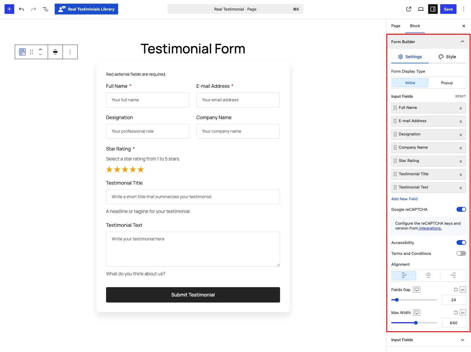
| Control | What it does |
|---|---|
| Form Display Type | Inline (default) — the form sits directly in the page, always visible. Popup — the page shows only a trigger button and the form opens in an overlay. |
| Input Fields | The drag-to-reorder field builder — see The form fields below. RESET restores the default field set. |
| Google reCAPTCHA | Spam protection (reCAPTCHA is Google's "prove you're human" check), on by default. (Shown when the Spam Protection module is active — see Spam protection.) |
| Accessibility | Extra labels that help screen readers and other assistive tools describe the form. On by default. |
| Terms and Conditions | Adds a required consent checkbox with editable Terms Text ("By submitting, you agree to our "), Terms Link Text ("Terms and Conditions.") and a link URL — handy when you need explicit consent, GDPR-style. |
| Alignment | Align the form's content Left (default), Center or Right. |
| Fields Gap | Vertical space between fields — default 24 / 18 / 12 px per device. |
| Max Width | The form's maximum width — default 640 / 640 / 400 px per device. |
The form fields
Everything the visitor fills in is built from the drag-to-reorder list in this panel. Drag a field to move it, click it to expand and edit its wording, click × to remove it, or use Add New Field to pull in one you haven't added yet.
A fresh form ships with these seven fields:
| Field | Required? | Notes |
|---|---|---|
| Full Name | Yes | The reviewer's name. |
| E-mail Address | Yes | Used for reply/notification emails; not shown publicly. |
| Designation | No | Job title or role. |
| Company Name | No | Where they work. |
| Star Rating | Yes | Five clickable stars — 5 stars are pre-selected. |
| Testimonial Title | No | A short headline; becomes the testimonial's title. |
| Testimonial Text | No | The review itself; becomes the testimonial body. |
Click Add New Field to include any of these:
| Field | What it collects | Extra options |
|---|---|---|
| Location | The reviewer's city | Turn on Show Country Selector to add a country dropdown as well. |
| Phone or Mobile | A phone number | Saved as digits plus + and - — any other characters are stripped. |
| Website | A URL | |
| Groups | Which group the review belongs to | Select Categories limits which groups are offered; Allow Multiple Selection lets the visitor pick more than one. |
| Photo | A profile photo | Becomes the testimonial's image. Max 5 MB — JPG, PNG, GIF or WebP. |
| Video URL | A video testimonial | Video Type: By URL accepts a link; Record lets the visitor record with their webcam — set the Record Label (default Leave A Video Review), the Record Button Text (default Record video), a Recording Time limit (1–5 minutes, default 2) and the Format (WebM or MP4). Recorded uploads can be up to 64 MB. |
| Social Profile | Links to the reviewer's social accounts | Select Social Networks limits which of the 35 supported networks appear. |
| Custom | Any extra info you define | Pick the Field Type: text, number, email, link or date. |
Expand any field to set its Label, Placeholder, a Note (small helper text under the field), whether it's Required, and its Field Width (a percentage, so you can put two fields side by side). The Title and Text fields add a Length control — leave it Unlimited, or set Limited and cap it by words or characters, up to 200 (a characters limit is enforced hard; a words limit shows a live counter). The limits start at 10 words for the Title and 60 words for the Text.
Some fields depend on a module
The Social Profile and Custom field options rely on the Reviewer Social Profiles and Custom Information Fields modules. If a module is off, its field is hidden in the editor and isn't collected on the front end.
Style tab
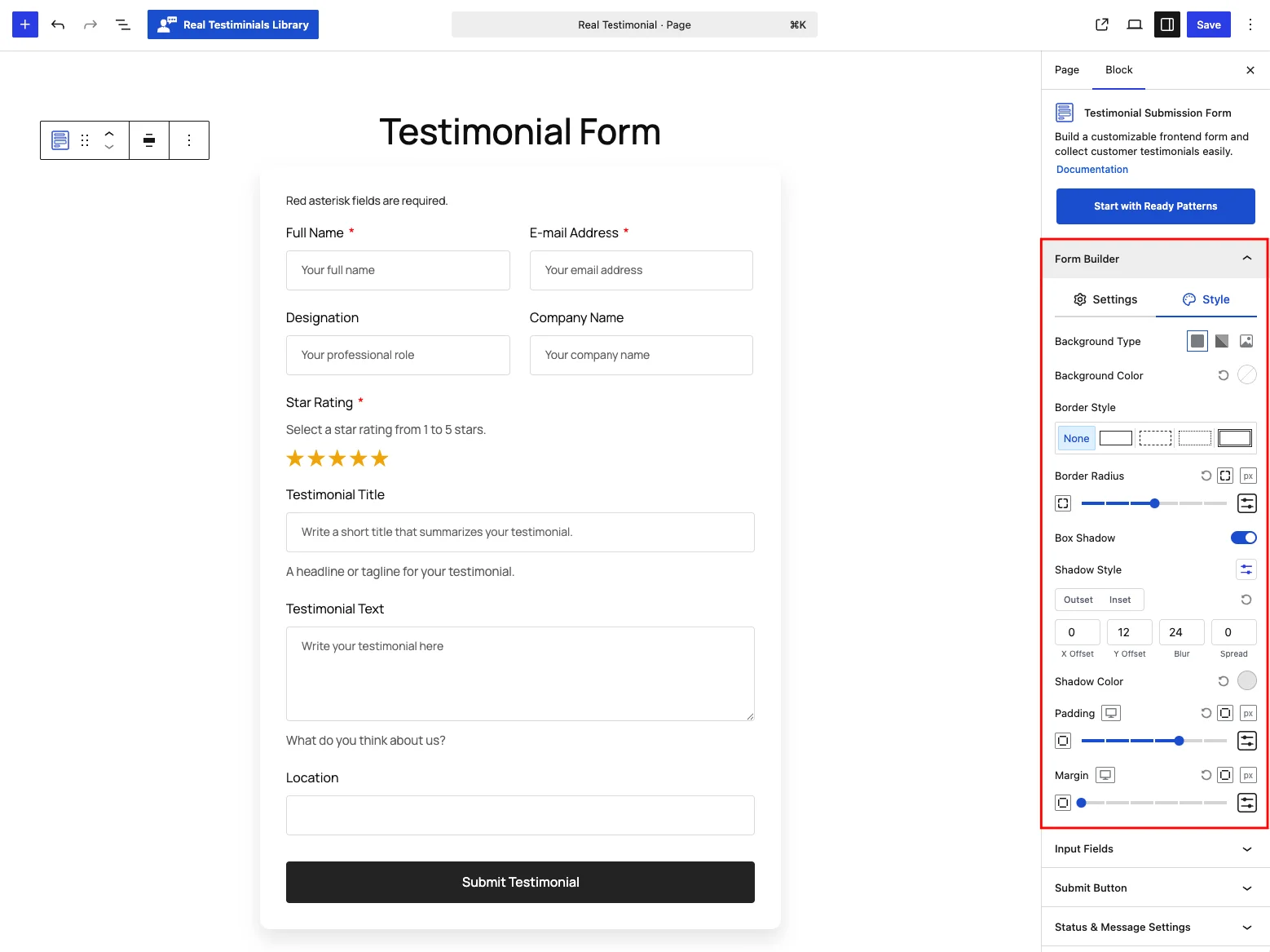
The form's outer box: Background Type (solid, gradient or image), Border Style and width, Border Radius (default 12 px), Box Shadow (on by default, a soft drop shadow), Padding (default 32 px) and Margin.
Popup Settings
(Shown only when Form Display Type is Popup.) Sets the trigger button's Label (default Write a Review) and Alignment on the Settings tab, plus full styling on the Style tab — typography, color and background in Normal / Hover states, border, radius, padding and margin.
Input Fields
Controls how the fields themselves are laid out and styled.
Settings tab
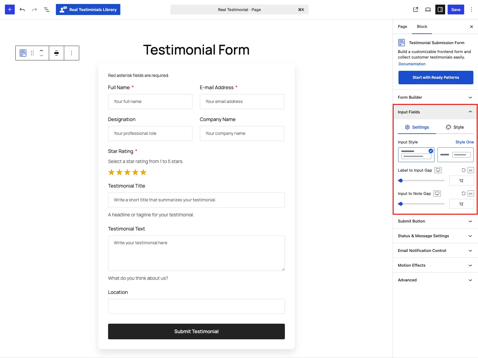
| Control | What it does |
|---|---|
| Input Style | Style One (default) — name, email, designation and company sit at 50% width for a two-column look. Style Two — every field full width. |
| Label to Input Gap | Space between a field's label and its input, default 12 px. |
| Input to Note Gap | Space between the input and its helper note, default 12 px. |
Style tab
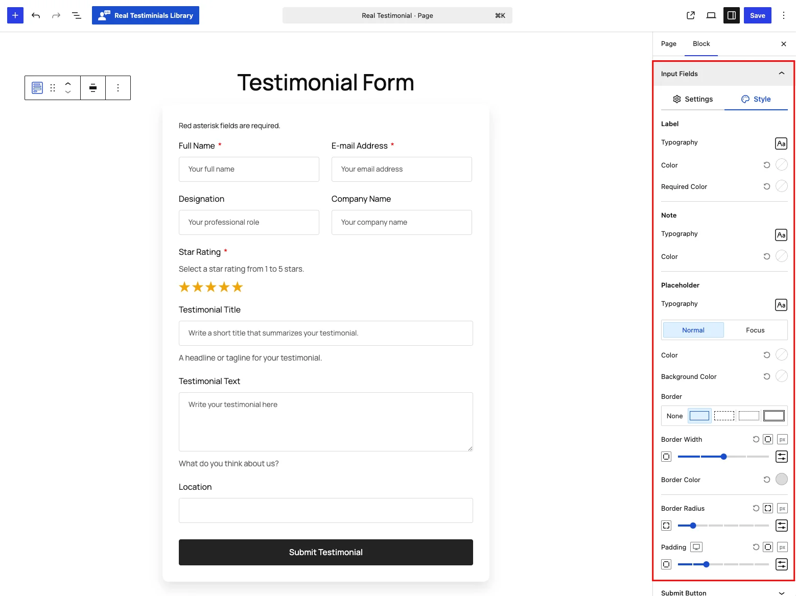
Three sections:
- Label — Typography (default 16 px), Color, and the Required Color used for the asterisk.
- Note — Typography (default 15 px) and Color for the helper text.
- Placeholder — the inputs themselves: Typography (default 14 px), Color and Background Color in Normal / Focus states, plus the input Border (default a light-gray solid line), Border Radius (4 px) and Padding.
Submit Button
The button visitors click to send their review.
Settings tab
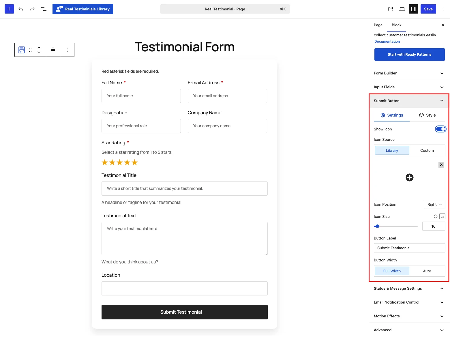
| Control | What it does |
|---|---|
| Show Icon | Add an icon to the button. Pick it from the Library or upload a Custom one, then set the Icon Position (Left / Right) and Icon Size (default 16 px). |
| Button Label | The button text, default Submit Testimonial. |
| Button Width | Full Width (default) or Auto — Auto adds a Button Alignment choice. |
Style tab
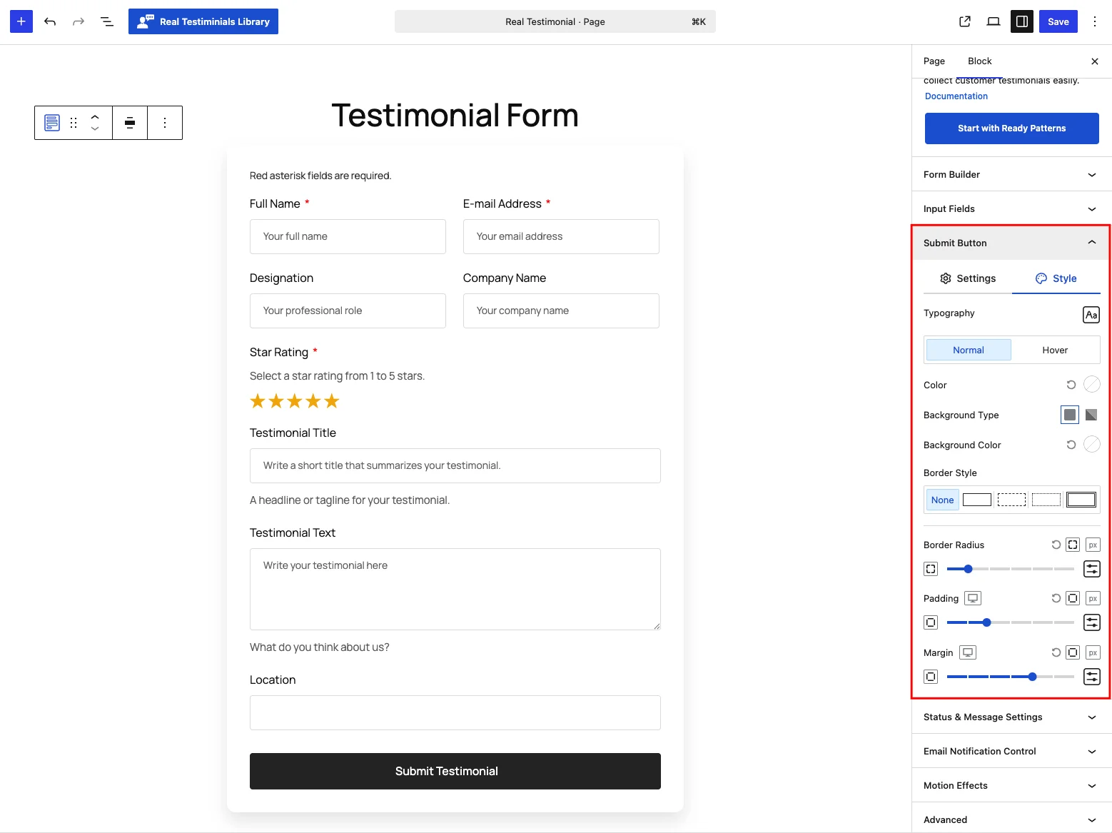
Typography, then Color and Background in Normal / Hover states, plus Border Style, Border Radius (default 4 px), Padding and Margin.
Status & Message Settings
This panel decides what happens to a submission and what the visitor sees afterward.
Settings tab
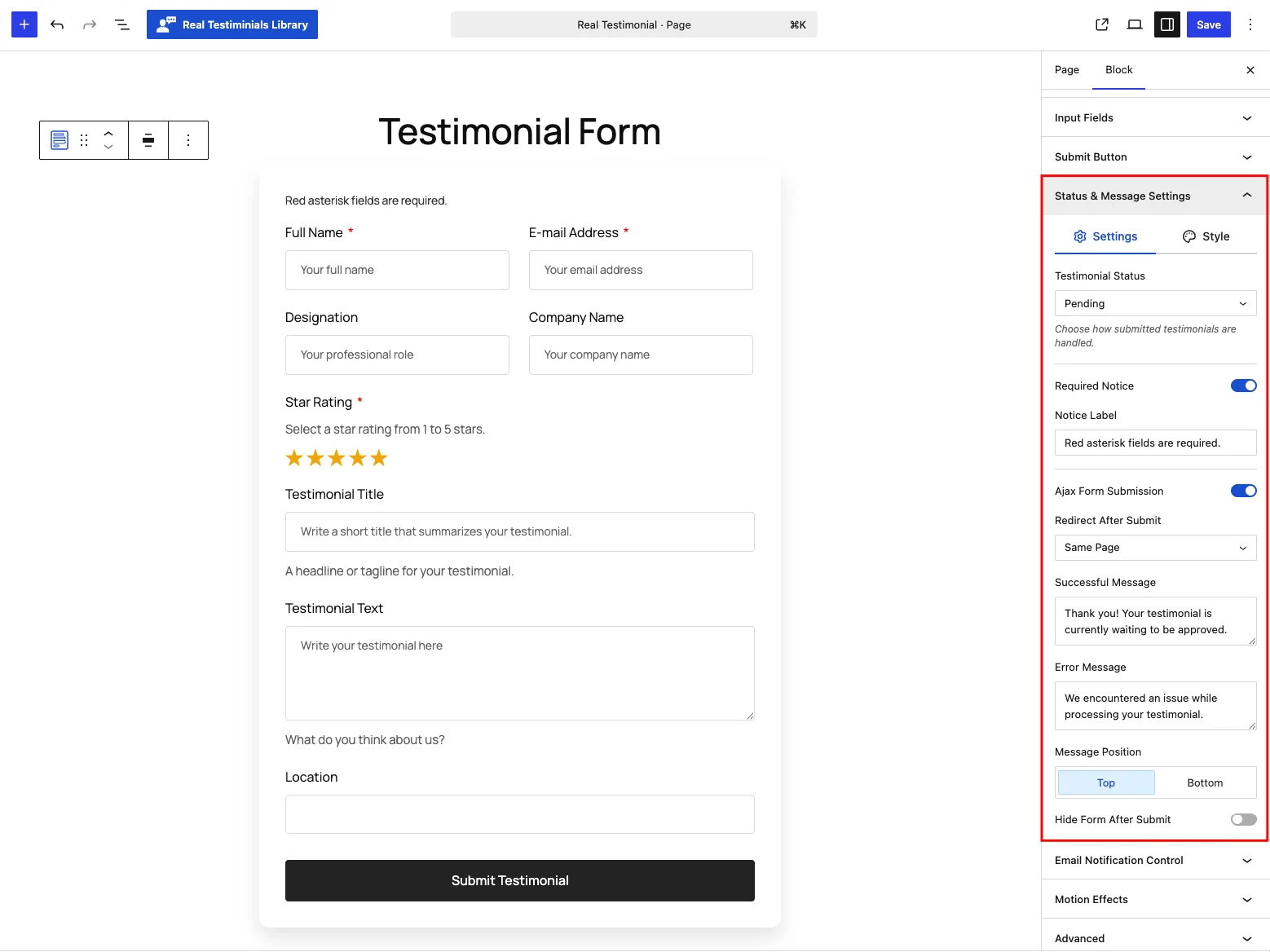
| Control | What it does |
|---|---|
| Testimonial Status | How each submission is saved: Pending (default — waits for your approval), Private, Draft, Auto Publish (goes live immediately), or Auto Publish Based on Star Rating. |
| Minimum Rating to Publish | (Rating-based status only) Publish automatically only if the rating is at least this many stars (default 4); lower ratings stay pending. |
| Required Notice + Notice Label | Show a reminder (default "Red asterisk fields are required.") if someone submits with a required field empty. |
| Ajax Form Submission | Send the review without reloading the page (this is what "Ajax" means). On by default. |
| Redirect After Submit | Same Page (default), To a Page (pick one), or To a Custom URL. |
| Successful Message | Shown after a successful submission (default "Thank you! Your testimonial is currently waiting to be approved."). |
| Error Message | Shown if something goes wrong (default "We encountered an issue while processing your testimonial."). |
| Message Position | Show the message at the Top (default) or Bottom of the form. |
| Hide Form After Submit | Remove the form once it's been submitted. |
Style tab
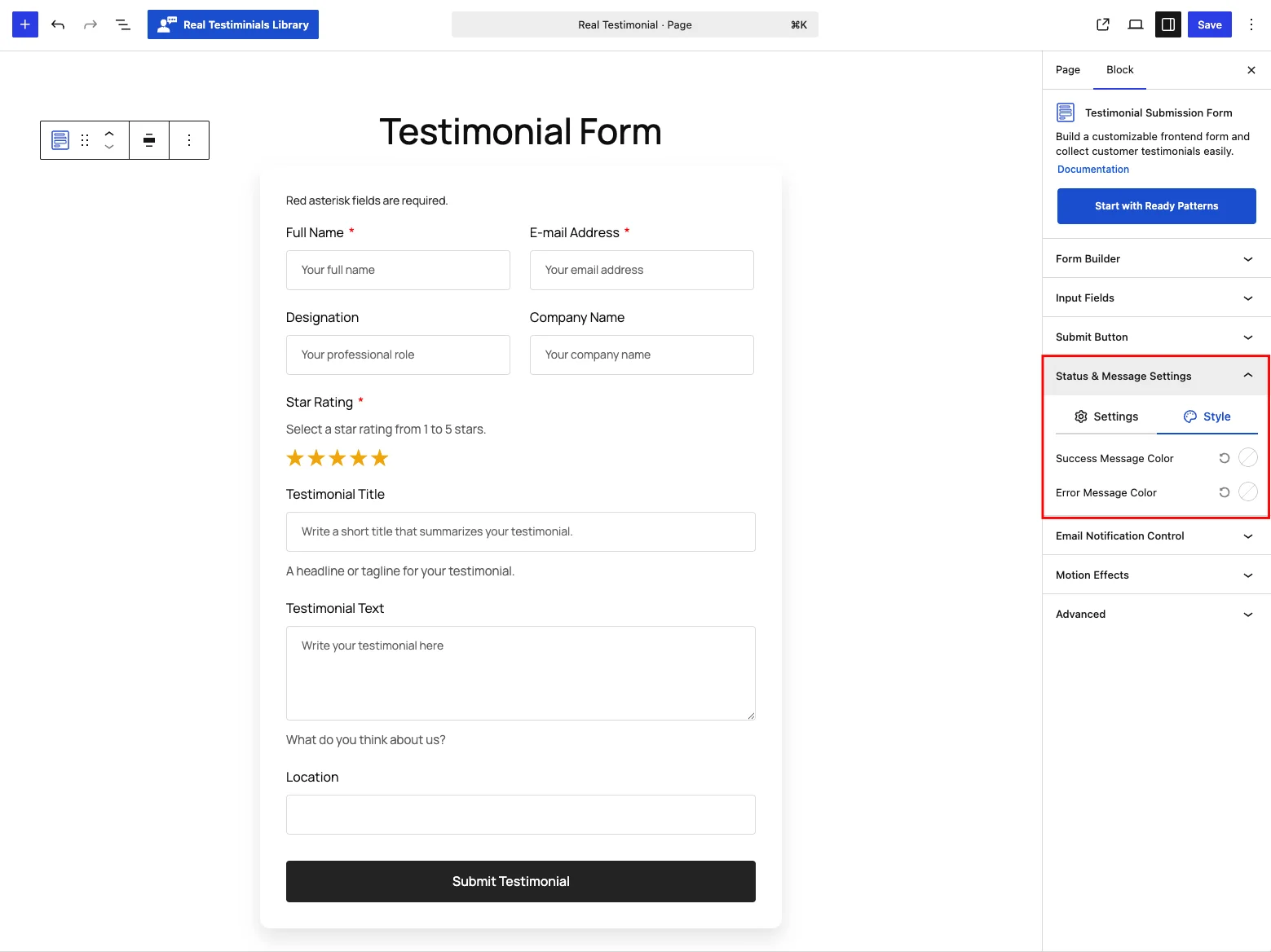
Two colors: Success Message Color and Error Message Color.
Email Notification Control
Three emails you can switch on and word yourself — configured right here in the block, not in a global settings page. The tabs at the top switch between them, and all three are on by default:
- Admin — sent to you on every submission (default To: your site admin email).
- Awaiting — sent to the reviewer when their testimonial is not published yet (pending / draft / private) — a friendly "we got it" note.
- Approval — sent to the reviewer when their testimonial is published immediately (Auto Publish, or a rating that meets your threshold).
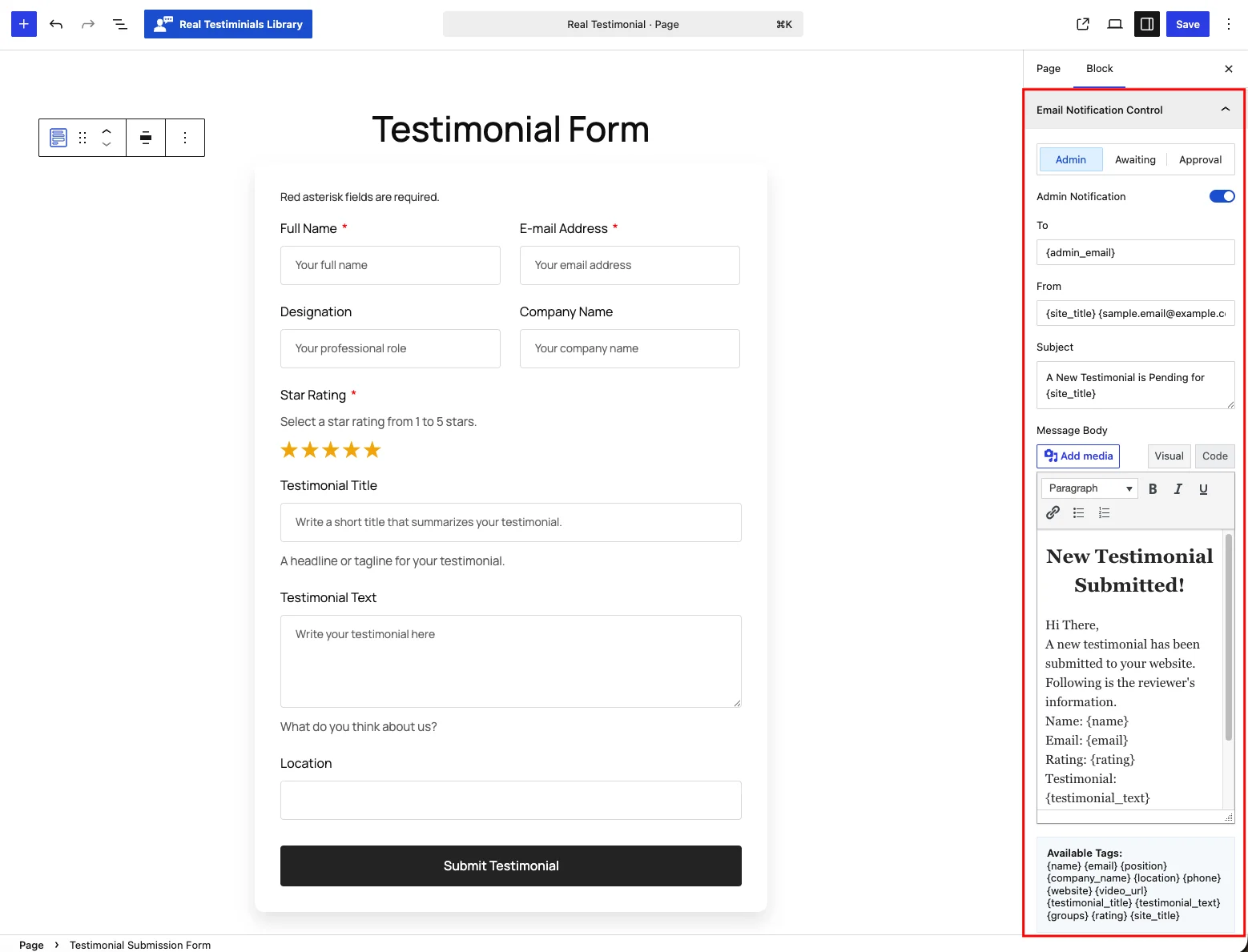
The Admin tab has a To address; the Awaiting and Approval tabs have a Reply To instead (the email goes to the reviewer). Each tab also sets its own From, Subject and rich-text Message Body:
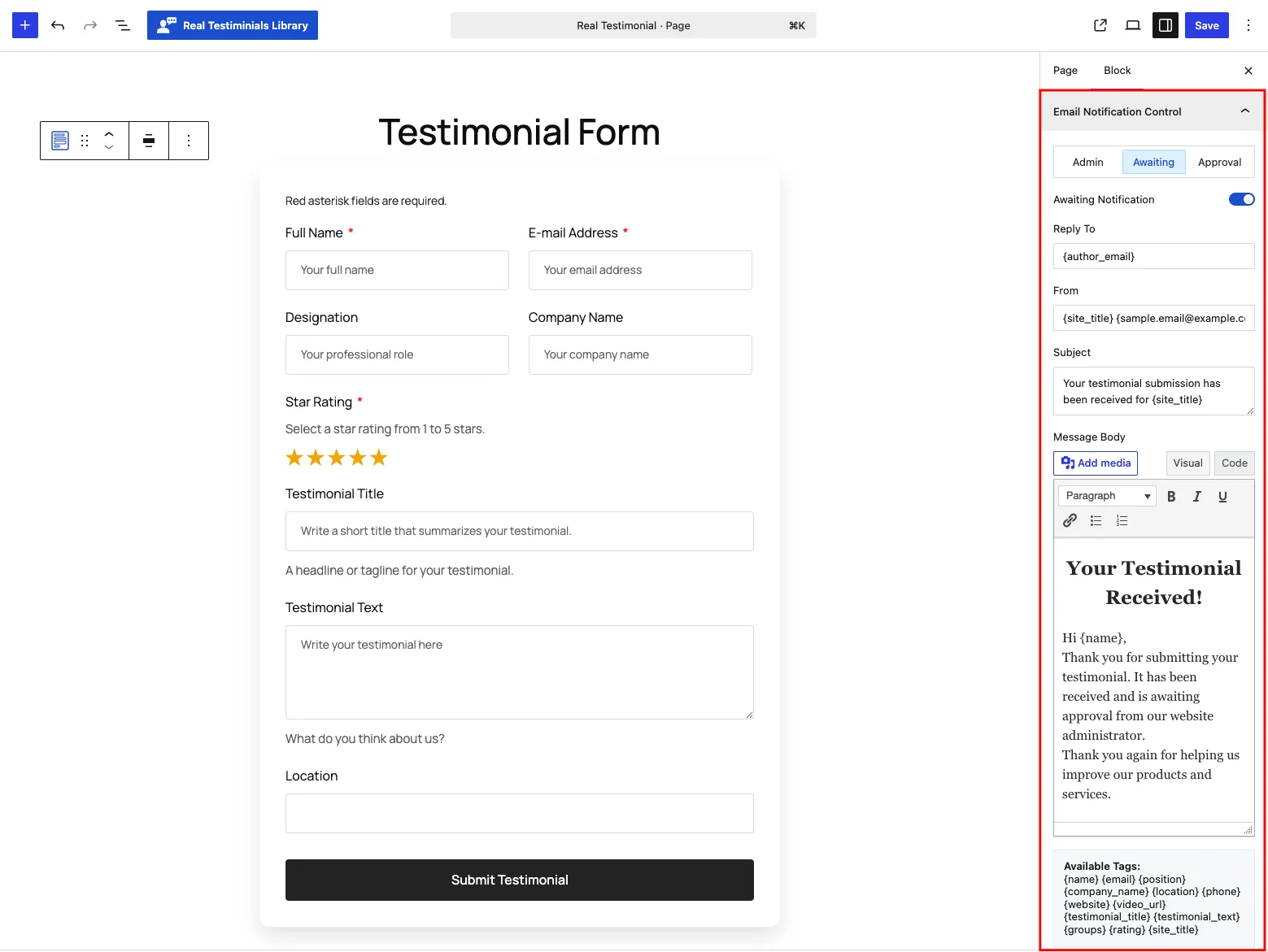
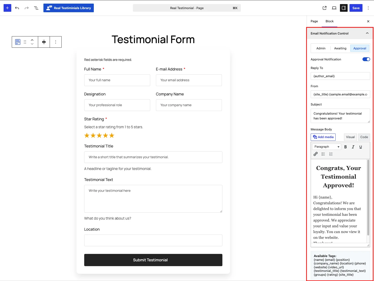
You can drop merge tags into any field to insert the submitted data — the full list appears under the editor as Available Tags:
{name} · {email} · {position} · {company_name} · {location} · {phone} · {website} · {video_url} · {testimonial_title} · {testimonial_text} · {groups} · {rating} · {site_title}
Motion Effects
(Shown when the Motion Effects module is on.) Add an entrance animation and a scroll effect to the form — the same controls documented on the Carousel page.
Advanced
Two tabs — Visibility (Hide on Desktop / Tablet / Mobile) and Advanced (Custom CSS Class and Custom CSS ID). These work exactly like the display blocks' Advanced Settings; the form skips that panel's background/spacing tab because the form's box is styled in Form Builder → Style instead.
Video and photo testimonials
The Photo and Video URL fields turn a plain form into a rich one:
- An uploaded photo becomes the testimonial's image automatically.
- A video can be a link the visitor pastes, or a clip they record on the spot with their webcam (Record / Stop, up to your time limit).
Recording needs HTTPS
Browsers only allow camera and microphone access on secure origins, so webcam recording only works when your site is served over HTTPS. A pasted video URL works anywhere.
Spam protection
When the Spam Protection module is enabled, the Google reCAPTCHA toggle appears in the Form Builder panel. Turning it on adds Google's "prove you're human" check to the form and confirms it when someone submits, so bots get blocked.
Keys live in Integrations, not the block
The reCAPTCHA version and site/secret keys come from Settings → Integrations, not from the block. The block toggle only switches the feature on. If the keys aren't set, reCAPTCHA is silently skipped (admins see a warning in the editor). Add your keys before you count on it.
Every submission is also protected by a WordPress nonce (a one-time security token), and uploaded files are checked for type and size — 5 MB for photos (JPG/PNG/GIF/WebP), 64 MB for video (MP4/WebM/MKV).
What happens when someone submits
Here's the full journey, step by step:
- The visitor fills in the form and clicks submit.
- The plugin verifies the security nonce and, if enabled, the reCAPTCHA.
- It re-reads your block's settings from the server (so they can't be tampered with) and sanitizes every field.
- A new testimonial is created with the Testimonial Status you chose — Pending by default, so it stays unpublished until you review it.
- Group selections are saved as groups; an uploaded photo becomes the testimonial image; a recorded or linked video is attached.
- Your configured notification emails go out.
- The visitor sees your Successful Message (and the form hides or the page redirects, if you set that up). If anything failed, they see your Error Message instead.
You then find the new testimonial in Testimonials → All Testimonials, ready to review, edit and publish. See Add New Testimonial for what each saved field means.
Tips & best practices
- Keep it short. Name, rating and a message convert best. Make everything else optional, and hide fields you don't need.
- Use Pending status (the default) for a public form so you can vet reviews before they appear. Reserve Auto Publish for trusted, private audiences.
- Turn on Spam Protection and add your reCAPTCHA keys before publishing a public form.
- Popup mode with a "Leave a review" button keeps landing pages clean.
- Set real From/Reply-To addresses on your notification emails for better deliverability.
- Remember the star rating defaults to 5 — even a required rating field is effectively pre-satisfied, so most submissions will arrive as 5-star unless the reviewer changes it.
Prefer a classic shortcode form?
You can also build a submission form the classic way in the admin and drop it anywhere with a shortcode — a short bit of text in square brackets that WordPress swaps out for the real form. See the Testimonials Form Shortcode block.