

Slider
Display testimonials one by one with a smooth slider.
The Slider shows a single testimonial per slide, giving each review the full spotlight. It supports richer transitions than the Carousel — including Ken Burns and Coverflow — and it's a great fit for a hero-style featured quote.
When to use it
- A large, featured testimonial in a hero or between sections.
- Long-form quotes that deserve one-at-a-time focus.
- A polished, animated transition between reviews.
How to add it
- Click the + block inserter and search for Slider.
- Pick a card design when prompted.
- Open Query Builder to choose which testimonials appear, then pick a sliding effect and switch on arrows or dots.
Layouts
The Slider always shows one card per slide, so its Layouts panel skips the column controls entirely. Like the Carousel, the panel has two tabs — Settings for the layout and Slider for movement.
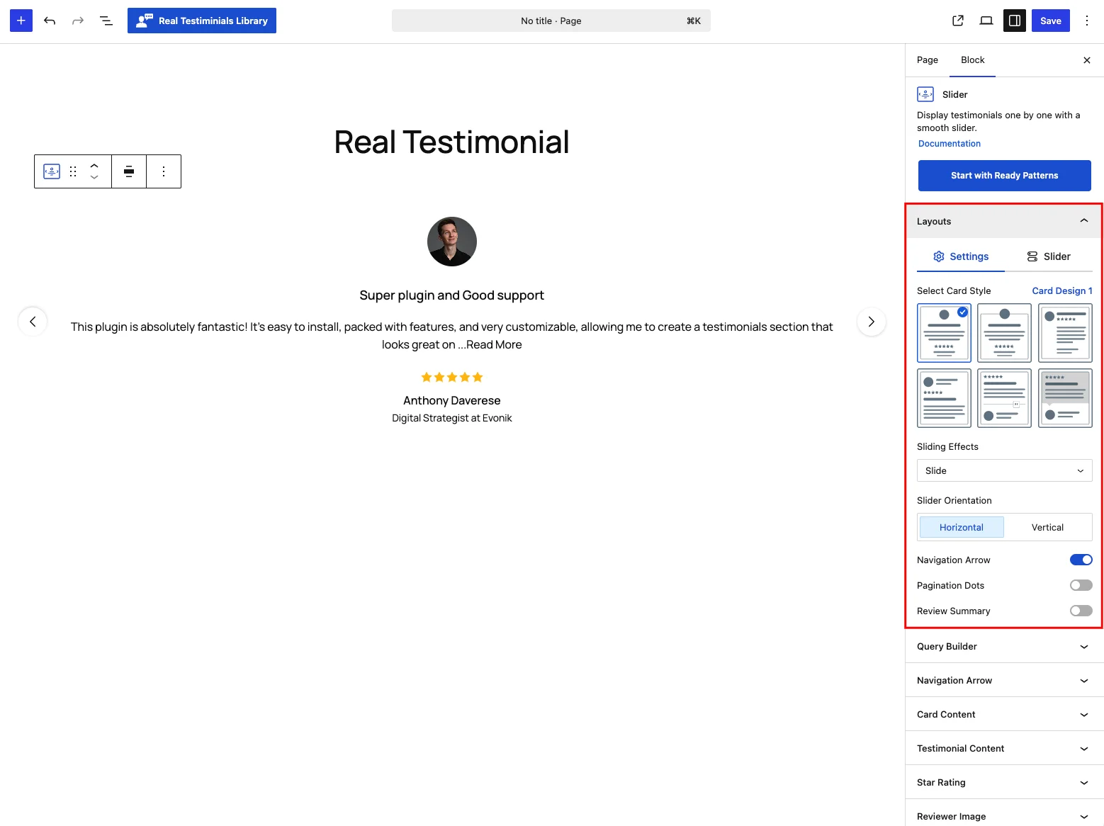
On the Settings tab:
| Control | What it does |
|---|---|
| Select Card Style | Choose one of the six card designs. |
| Sliding Effects | The Slider exposes the full effects list in one dropdown: Slide (default), Spring, Fade, Flip, Cube, Ken Burns or Coverflow. The Carousel only offers Coverflow through its style presets — here you pick it directly. |
| Slider Orientation | Horizontal (default) or Vertical. |
| Navigation Arrow | Show prev/next arrows — opens the Navigation Arrow panel. Off by default. |
| Pagination Dots | Show dots below the slider — opens the Pagination Dots panel. Off by default. |
| Review Summary | Add a Review Summary child block above the slider. |
The Slider tab holds the same movement controls as the Carousel — AutoPlay, Autoplay Delay, Carousel Speed, Slide to Scroll, direction, Pause on Hover, Infinite Loop, Adaptive Height, keyboard navigation, mouse-wheel and free scroll. They're documented in full under Carousel → Carousel tab.
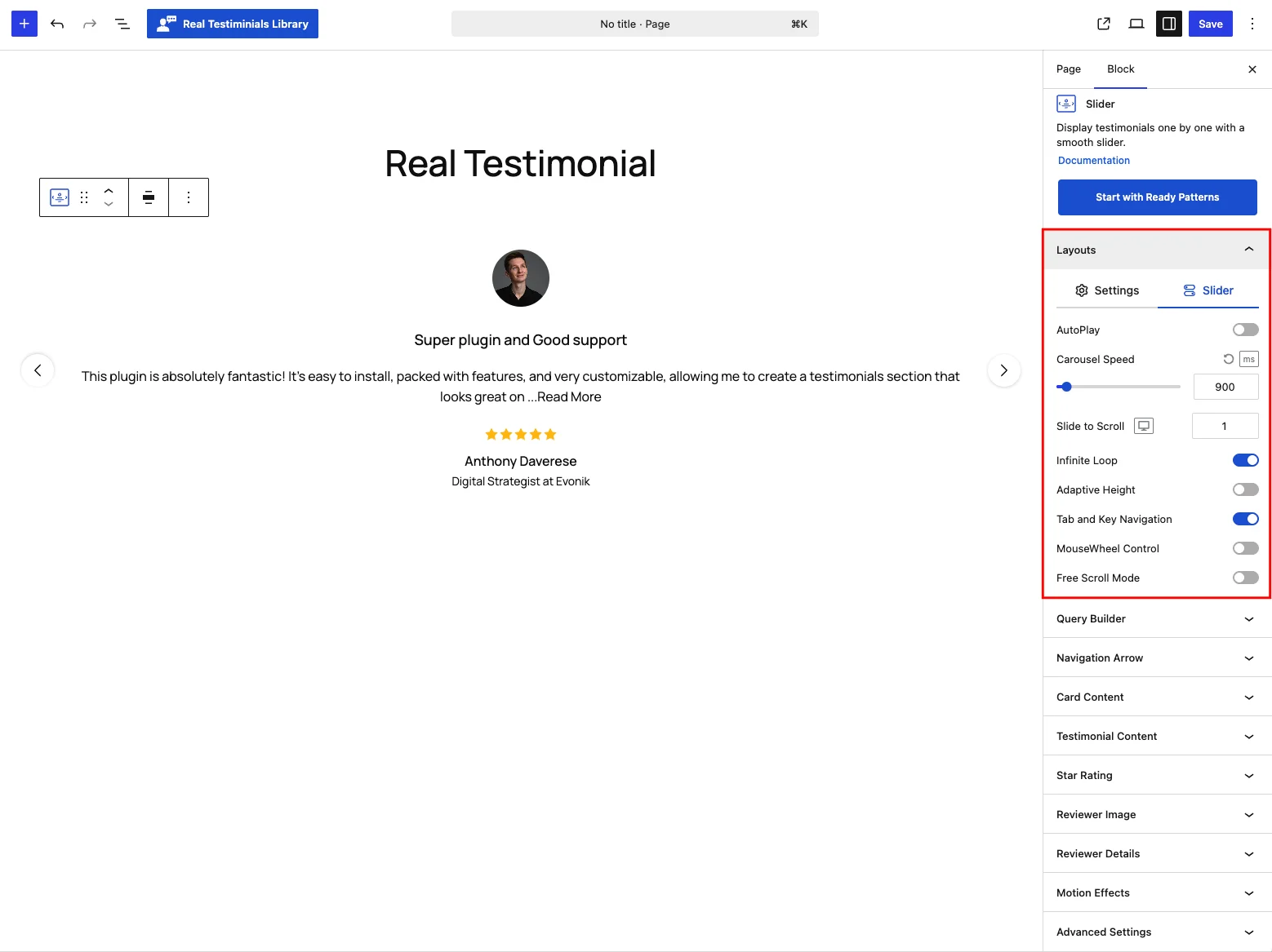
Because the Slider shows one testimonial at a time, its card border defaults to none so a single quote sits cleanly in a hero.
Add-ons on the Slider
The Slider can host a Review Summary above it, but — because it shows one testimonial at a time — it doesn't offer Live Frontend Filter, Ajax Testimonial Search or Ajax Pagination. Reach for the Grid or Carousel if you need those.
Query Builder
This panel decides which testimonials the slider shows. Pull the latest ones, one or more groups, a hand-picked set, or only high star ratings — then set the display limit and the order (or shuffle randomly). See the full breakdown in the Carousel reference.
Navigation Arrow
Shown when the Navigation Arrow toggle is on, this panel styles the prev/next arrows — 12 arrow icons, size, position and offsets, plus colors, background, shadow and radius in normal and hover states. See the full breakdown in the Carousel reference.
Pagination Dots
Shown when the Pagination Dots toggle is on, this panel styles the indicator below the slider — seven styles (dots, strokes, scrollbar, fraction and more), sizes, spacing and colors. See the full breakdown in the Carousel reference.
Card Content
This panel controls the testimonial card itself: toggle and drag-to-reorder the parts on it (photo, title, text, rating, name and more), set the alignment and a hover effect, and style the card's background, border, shadow, corners and padding. See the full breakdown in the Carousel reference.
Testimonial Content
This panel shapes the title and the quote — heading tag, full or trimmed length with a Read More action (expand, popup or link), optional quote symbols, plus typography and colors for both. See the full breakdown in the Carousel reference.
Star Rating
This panel styles the rating on each card: pick from 16 icon styles (stars, hearts, thumbs and more), set the size and spacing, and choose the filled and empty colors. See the full breakdown in the Carousel reference.
Reviewer Image
This panel controls the reviewer photo: resolution, aspect ratio and size, the fallback avatar for testimonials without a photo, retina loading, and click-to-play video testimonials. See the full breakdown in the Carousel reference.
Reviewer Details
This panel handles the who-said-it line — the name's heading tag, a verified badge, how company info, location and date are displayed, and typography for each part. See the full breakdown in the Carousel reference.
Social Media
Shown when the Social Profiles card part is on, this panel sizes and styles the reviewer's social icons — icon size, clickable area, gap and colors. See the full breakdown in the Carousel reference.
Motion Effects
This panel adds movement as the block scrolls into view — an entrance animation (fade, slide, zoom, bounce) and an optional scrolling effect, per device. See the full breakdown in the Carousel reference.
Advanced Settings
This panel covers the whole block: a background with padding and margin, per-device visibility (show or hide the block on desktops, tablets or mobile devices), and custom CSS class and ID fields for your own styling. See the full breakdown in the Carousel reference.
Tips
- Use a wide or full-width alignment so a single testimonial fills the section.
- Ken Burns adds a slow zoom to reviewer images — great for photo-heavy testimonials.
- Enable Adaptive Height so the slider resizes cleanly to each quote's length.
- To show several testimonials at once, use the Carousel instead.