

Video Testimonials
Show off the video testimonials you've collected in a carousel or a grid, playing in a popup or right inside the card.
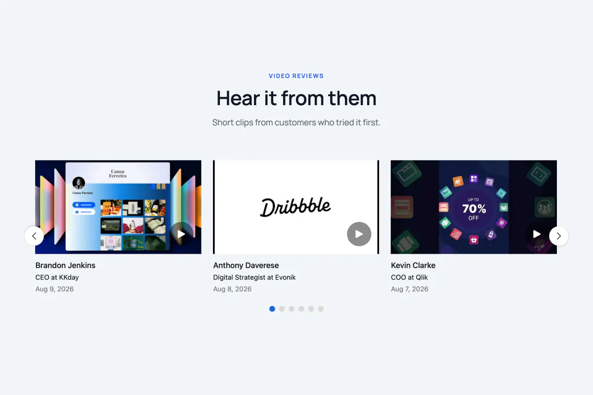
The Video Testimonials block (a ready-made content element you drop into the WordPress editor) shows the video side of your testimonials. Grid and Carousel show written reviews. This one shows clips, both the ones visitors recorded through the Record Video block and the ones you added yourself from the dashboard.
When to use it
- You've gathered real video clips and want them on a landing page, not sitting unseen in the admin.
- You think seeing a real person say it will land better than a written quote.
- You have a handful of strong clips. Video is heavy, so a page of thirty is rarely a good idea.
You need videos before this block shows anything
The block only shows testimonials that have a video attached. If it looks empty, you haven't collected any yet. Add the Record Video block to a page so visitors can send one, or add clips yourself from Real Testimonials → Video Testimonials.
How to add it
- Click the + block inserter in the editor.
- Search for Video Testimonials (under the Real Testimonials category) and select it.
- A Select Layout box appears where the block will go. Pick Carousel or Grid. Want a head start? The same box offers Start with Ready Patterns (a fully styled design from the pattern library) and Build with AI (describe the block you want in plain words).
- Open Query Builder in the inspector (the settings sidebar on the right) to choose which clips appear.
Once the block is set up, you can select it and click Refine with AI in its toolbar to describe a change, such as "show four clips per row and play them inline". Build with AI explains how both AI buttons work. The other editor shortcuts, like Ready Patterns and Documentation at the top of the inspector, are covered on the Carousel page.
Finding your way around the inspector
The inspector is the settings sidebar on the right of the editor. Don't worry if you can't see every panel below at once. Panels marked (Carousel only) or (Grid only) show up only on that layout, and the content panels show up only when the matching part is switched on in Card Content.
| Panel | What it controls |
|---|---|
| Layouts | Carousel or Grid, the card style, columns, gaps, and which child blocks to attach. |
| Carousel Settings (Carousel only) | Autoplay, speed, looping and how many clips move at a time. |
| Navigation Arrow (Carousel only) | The previous/next arrows. |
| Pagination Dots (Carousel only) | The dots under the carousel. |
| Query Builder | Which video testimonials appear. |
| Card Content | Which parts appear on the card, their order, and their alignment. |
| Video Settings | The clip itself: how it plays, the play button, the shape and the thumbnail. |
| Testimonial Content | The title and the written quote, when shown. |
| Star Rating | The rating icons, when shown. |
| Reviewer Image | The reviewer's photo, when shown. |
| Reviewer Details | The name, job title, company and date. |
| Motion Effects | Entrance animation as the block scrolls into view. |
| Advanced Settings | Background, spacing, per-device visibility, custom CSS class and ID. |
There's no Social Media panel on this block. If you switch on the Social Profiles part, the icons keep their default size and colors.
Layouts
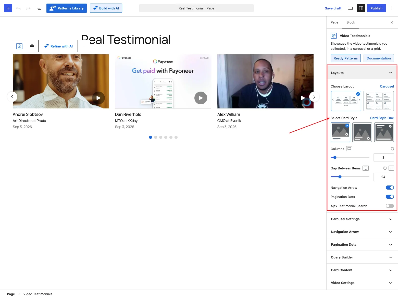
| Control | What it does |
|---|---|
| Choose Layout | Carousel (clips slide across) or Grid (clips in even columns). |
| Select Card Style | Card Style One, Two or Three. Each puts the clip and the details in a different place. See Card styles below. |
| Columns | How many clips across, up to 20. Default 3. |
| Gap Between Items | Horizontal space between clips, up to 100 px. Default 24 px. |
| Row Gap (Grid only) | Vertical space between rows, up to 100 px. Default 24 px. |
| Navigation Arrow (Carousel only) | Previous/next arrows. On by default. |
| Pagination Dots (Carousel only) | Dots under the carousel. On by default. |
| Ajax Pagination (Grid only) | Loads more clips in pages by attaching the Ajax Pagination child block. Switching to the Carousel turns it off, because a carousel pages itself. |
| Ajax Testimonial Search | Adds a live search box. |
You won't find Review Summary or Live Frontend Filter here, unlike the written-testimonial blocks. A summary would count your written reviews, not your clips. To show only clips from certain groups, use the Groups filter in Query Builder instead.
Card styles
All three card styles show the same parts. Only the placement changes:
| Card style | Layout |
|---|---|
| Card Style One | The clip on top, everything else below it. |
| Card Style Two | A full-bleed clip with all the details laid over its bottom edge. |
| Card Style Three | A full-bleed clip with the reviewer details at the top and the title and quote at the bottom. |
When you pick a style, a few Video Settings reset to suit it:
- Card Style One sets the clip to 16:9 and puts the play button at the bottom.
- Card Style Two sets the clip to 4:3 (a taller frame leaves room for the text laid over it) and puts the play button at the bottom.
- Card Style Three sets the clip to 4:3 and moves the play button to the top right, out of the way of the reviewer details.
You can change any of these afterwards in Video Settings.
Carousel Settings
Carousel only. This is where you decide how the carousel moves: autoplay and its delay, speed, how many clips one step moves, autoplay direction, pause on hover and infinite loop. You'll also find Adaptive Height, Tab and Key Navigation, MouseWheel Control and Free Scroll Mode. They're the same controls the Carousel block uses, and the Carousel reference explains each one.
Navigation Arrow
Carousel only, when the toggle is on. Use this panel to size, position and color the previous/next arrows. For a control-by-control walkthrough, head to the Carousel reference.
Pagination Dots
Carousel only, when the toggle is on. Pick the dot style here and set its size, spacing and colors. These match the Carousel block's dots, documented in the Carousel reference.
Query Builder
This block has its own Query Builder. It's close to the shared one, but shaped for video.
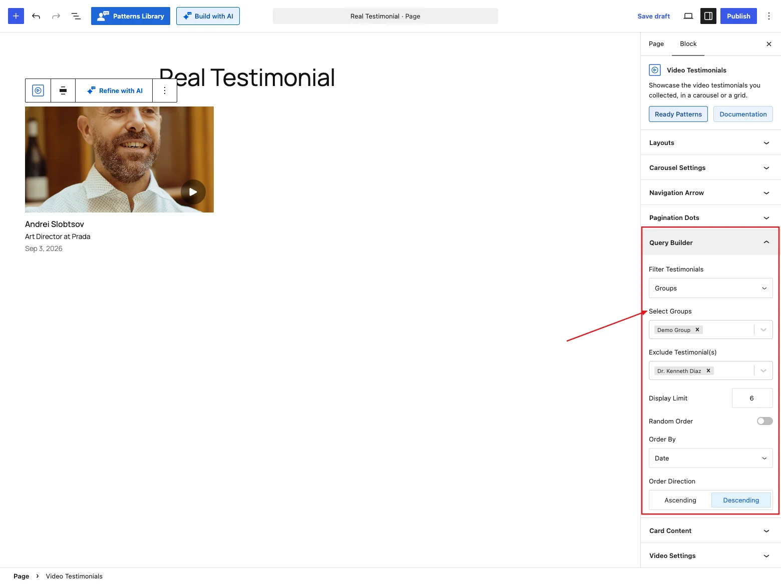
| Control | What it does |
|---|---|
| Filter Testimonials | Latest (default), Groups, Specific (hand-pick clips) or Based on Star Rating. |
| Select Groups (Groups only) | Show only the clips filed in the groups you pick. You add a clip to a group when you add or edit it under Real Testimonials → Video Testimonials. |
| Select Video Testimonials (Specific only) | Choose exactly which clips to show, in the order you want. |
| Star Rating (Based on Star Rating only) | Only 5 Stars, 4 Stars & Up, 3 Stars & Up, 2 Stars & Up or 1 Star & Up. |
| Exclude Testimonial(s) | Leave specific clips out. Handy for hiding one without unpublishing it. |
| Display Limit | How many clips to show. Default 6. |
| Random Order | Shuffles the clips on each load. |
| Order By (Random Order off) | Date, Title or Modified. |
| Order Direction (Random Order off) | Ascending or Descending. |
If you've used the shared Query Builder before, the one new thing is the Exclude field. The written blocks don't have it.
Card Content
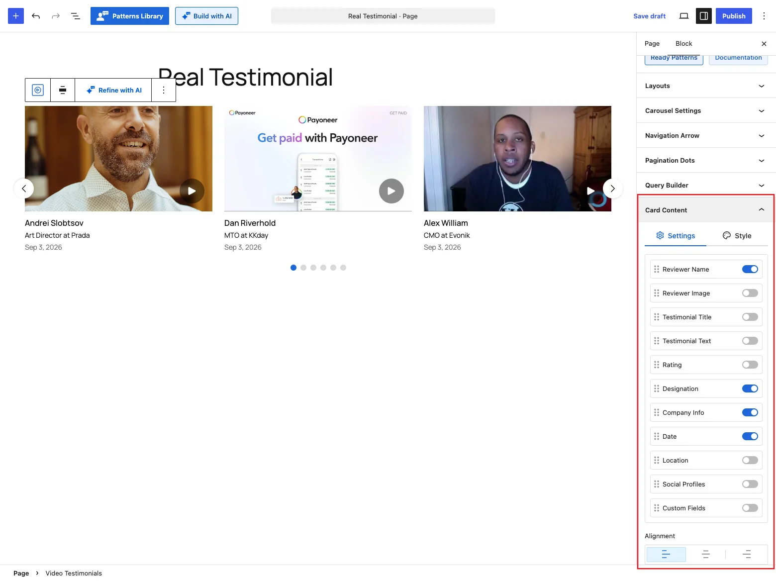
This panel decides what appears on each card. (You pick the card style itself in Layouts.)
| Control | What it does |
|---|---|
| (parts list) | Toggle each part on or off, and drag to reorder them. The reviewer's name, job title, company info and the date start on. Location, social profiles and custom fields start off. They're optional on every collection screen, so most clips leave them blank. Switch them on if you do collect them. |
| Alignment | Lines up the card text Left (default), Center or Right. |
When the reviewer's photo is shown, only the name, job title, company and location sit in the narrow column beside it. The title, quote, date, custom fields and social icons get the full width of the card, so longer text doesn't get squeezed.
A clip with no rating shows no stars
Written testimonials fall back to five stars when nobody set a rating. Video clips don't. An unrated clip shows no star row at all, instead of claiming a perfect score nobody gave.
The Style tab handles the card's background, border, shadow, corners and padding. It works the same as on the other blocks, so the Carousel reference applies here too.
Video Settings
If you only open one panel on this block, make it this one. It decides how the clip actually plays.
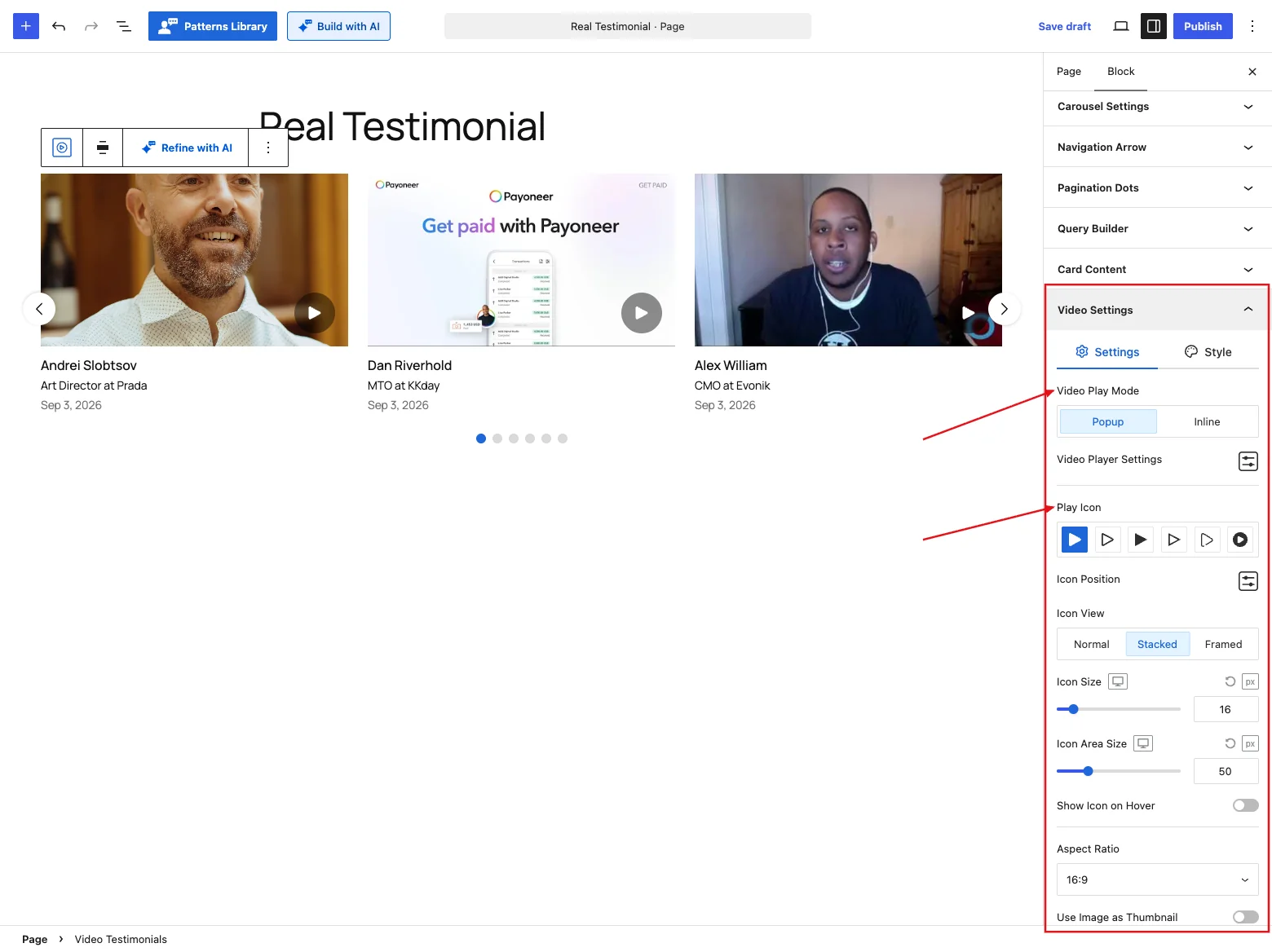
Settings tab
| Control | What it does |
|---|---|
| Video Play Mode | Popup (default) opens the clip in a lightbox over the page. Inline plays it inside the card. Inline only works on the live page: in the editor, clips always open in a popup so you can still preview them. |
| Video Player Settings | A popover with four player toggles: Autoplay (on), Start Muted (off), Loop (off) and Player Controls (on). See How Autoplay behaves below. |
| Play Icon | The play button on the thumbnail. Pick one of six icons: Play Solid (default), Play Outline, Circle Outline, Circle Fill, Square Outline or Square Rounded. |
| Icon Position | A popover setting Horizontal (Left / Center / Right), Vertical (Top / Center / Bottom) and the two offsets (default 16 px). An offset is hidden when its side is set to Center. |
| Icon View | Normal (bare glyph), Stacked (default) or Framed. |
| Icon Size | Default 16 px. |
| Icon Area Size (Stacked and Framed) | The circle behind the glyph. Default 50 px. |
| Show Icon on Hover | Hides the play button until someone hovers the card. |
| Aspect Ratio | Original, 16:9 (default), 4:3, 1:1, 3:4, 9:16 or Custom. |
| Custom Ratio (Custom only) | Your own width-to-height ratio. |
| Use Image as Thumbnail | Uses the reviewer's photo as the clip's cover image. Off by default. |
| Fallback Thumbnail (Use Image as Thumbnail on) | A default cover for clips that have neither a reviewer image nor a poster image of their own. |
How Autoplay behaves
The Autoplay toggle behaves differently depending on the play mode:
- Popup: the clip starts as soon as its popup opens. Turn Autoplay off and the visitor presses play inside the popup instead.
- Inline: each clip starts by itself, muted, once at least half of its card has scrolled into view. A clip in a carousel slide waits until that slide is shown. Browsers block videos that start with sound on their own, so an autoplaying clip is always muted, even with Start Muted off. Visitors can unmute it from the player controls.
With Inline and Autoplay off, nothing plays until a visitor clicks the play button, and then it plays with sound unless Start Muted is on.
Style tab
- Overlay: a shade over the thumbnail, on by default. Out of the box it's a soft dark gradient at the bottom rather than a flat tint, so text laid over the clip stays readable.
- Overlay Type: solid color or gradient, with separate Normal and Hover states.
- Padding and Margin around the clip.
Where your clips come from changes how they play
A clip uploaded or recorded on your own site plays in the browser's built-in video player. A YouTube or Vimeo link plays in that provider's player instead. The plugin only connects to the provider when the clip actually starts, so a page of ten clips doesn't open ten connections on load.
Testimonial Content
Here you shape the title and the written quote. You can set the heading tag, show the full text or trim it with a Read More action, add quote symbols, and adjust typography and colors. It's the same panel the Carousel block has, so the details are in the Carousel reference.
If Read More opens a popup, the clip plays at the top in a 16:9 frame, with the full quote and the reviewer details below it. The popup uses the same four player toggles as the card. To change the space around the text, use Padding under Popup Settings (default 24 px). Your card padding doesn't affect the popup.
A clip without a title shows no title on the card. Titles and reviewer names are kept separate, so a missing title is never filled in with the reviewer's name.
Star Rating
Style the rating here. There are 16 icon styles to choose from, plus size, spacing, and colors for filled and empty icons. The Carousel reference shows them all.
Reviewer Image
You'll notice this panel is slimmer than on the other blocks. That's because the photo here is just a small avatar next to the reviewer's name. Its Settings tab has:
| Control | What it does |
|---|---|
| Image Resolution | Which size of the uploaded photo loads: Original, Thumbnail (default), Medium or Large. Thumbnail is plenty for a small avatar and keeps the page light. |
| Aspect Ratio | The avatar's shape. Default 1:1. Custom reveals a Custom Aspect Ratio field. |
| Image Width | Default 36 px (32 px on phones). |
| Image Height (Original aspect ratio only) | Default 36 px (32 px on phones). With any other ratio, the height follows from the width. |
| Reviewer Fallback Images | What to show when a reviewer has no photo. Default No Fallback Image. The options work as described in the Carousel reference. |
There's no retina or video control here. The clip has its own Video Settings panel.
Reviewer Details
This panel handles the who-said-it line. You can set the name's heading tag, choose how company info, location and date are displayed, and style each part. It mirrors the Carousel block's panel, covered in the Carousel reference.
Motion Effects
When the Motion Effects module is on, this panel lets the block animate in as visitors scroll to it. You get an entrance animation and an optional scrolling effect, set per device. The Carousel reference has the details.
Advanced Settings
This panel applies to the whole block. Use it for a background with padding and margin, to hide the block on certain devices, or to add a custom CSS class and ID. It's identical to the Carousel's, so check the Carousel reference for specifics.
Tips
- Popup play mode is the safer default. With Inline, Autoplay is on out of the box, so every clip on screen starts playing (muted) as visitors scroll. Turn Autoplay off if you'd rather they choose what to watch.
- Keep the Display Limit low. Video is heavy, and eight good clips beat thirty mediocre ones.
- Give clips a proper title in the dashboard. It's what people read before deciding to press play, and a clip without one shows no title at all.
- File your clips into groups (a product, a service, a location) when you add them. Then the Groups filter can put the right clips on the right page.
- Card Styles Two and Three lay text over the clip, so they work best with footage that's calm at the top and bottom. A person talking to camera suits them better than busy b-roll.