

Review Badge
Add a small trust badge with your overall rating, a star row and your review count, either inline with your content or floating in a corner of every page.
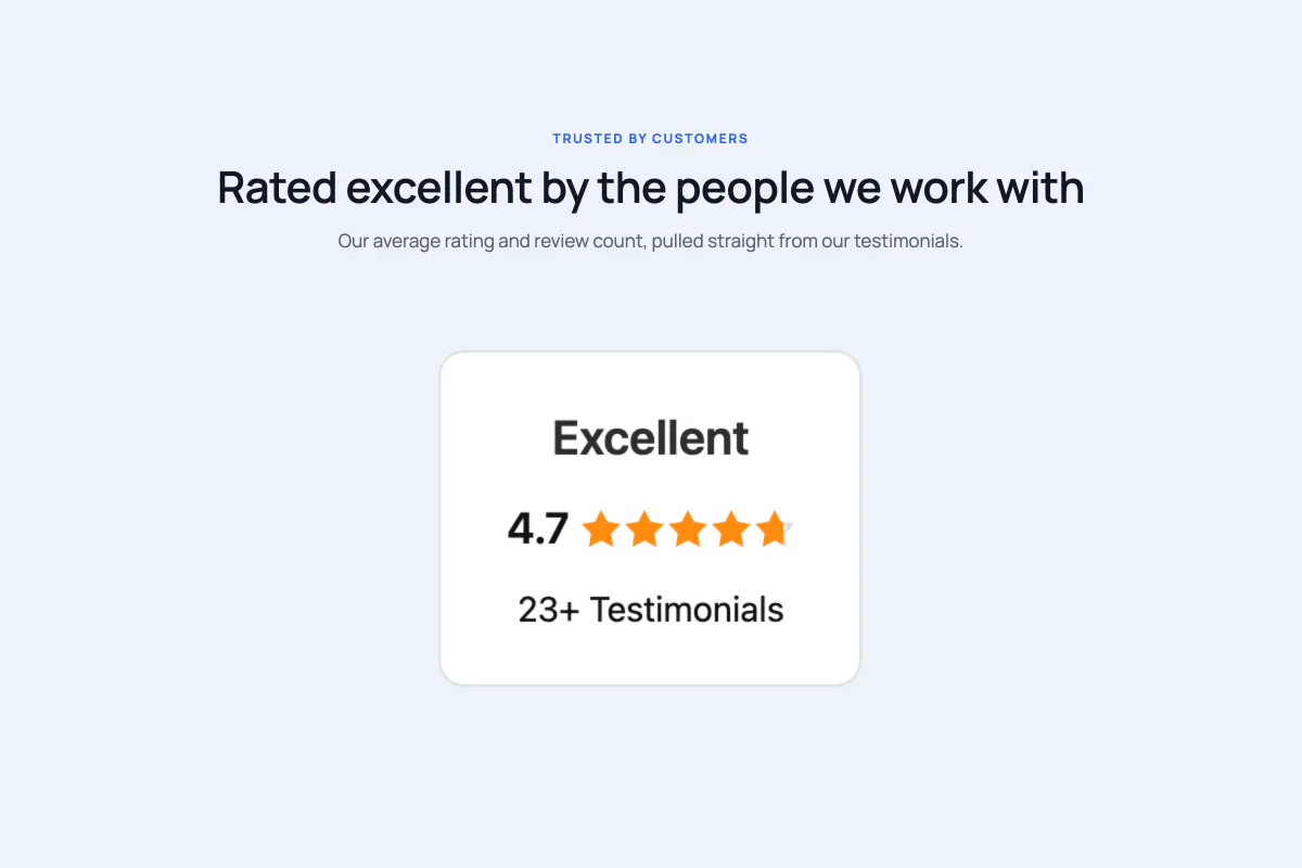
The Review Badge block (a ready-made content element you drop into the WordPress editor) doesn't show testimonials. It shows the summary of them: your average rating, a star row, a count, and optionally a small cluster of reviewer photos. It's the little "Excellent ★★★★★ Based on 214 reviews" badge you've seen on checkout pages and in site footers.
Since it's one small badge rather than a set of cards, it has far fewer settings than the other blocks: just three panels instead of thirteen.
When to use it
- Next to a Buy or Sign up button, where a wall of reviews would be a distraction but a single credibility mark helps.
- Floating in a page corner sitewide, so your rating follows visitors around without taking up layout space.
- In a header, footer or sidebar, or anywhere else with room for one line rather than a whole section.
How to add it
- Click the + block inserter in the editor.
- Search for Review Badge (under the Real Testimonials category) and select it.
- A Select Display Style box appears in the block's place. Pick Design One, Design Two or Design Three. If you'd rather start from something finished, the same box has Start with Ready Patterns (a fully styled badge from the pattern library) and Build with AI (describe the badge you want in plain words).
- That's it. The badge reads your published testimonials straight away; there's nothing to configure before it works.
Later, if you want to tweak it, select the badge and click Refine with AI in its toolbar to describe a change, such as "make it float in the bottom-left corner with a dark background". Build with AI explains how both AI buttons work, and the Carousel page covers the other editor shortcuts, such as Ready Patterns and Documentation at the top of the inspector.
What it counts
The badge always summarises every published testimonial, not a page of them. There's no Display Limit to set and no Query Builder panel. A badge that said "based on 10 reviews" just because a limit happened to be 10 would be misleading, so the block ignores paging on purpose and counts them all.
Only testimonials carrying a 1–5 star rating feed the average. Reviews with no rating still exist on your site; they just don't move the number.
Half stars are real
If your average works out to 4.3, the badge draws exactly that: four full stars and a partly filled fifth, rather than rounding up to five or down to four.
Finding your way around the inspector
The inspector is the settings sidebar on the right of the editor. Click the badge once and you'll see three panels:
| Panel | What it controls |
|---|---|
| Review Badge | The design, whether it sits inline or floats, what clicking it does, and the badge's own background, border and spacing. |
| Badge Content | What's written on it: the label, the review count, the verified tick, the reviewer photos and the star icons. |
| Advanced Settings | Per-device visibility plus custom CSS class and ID fields. |
Review Badge
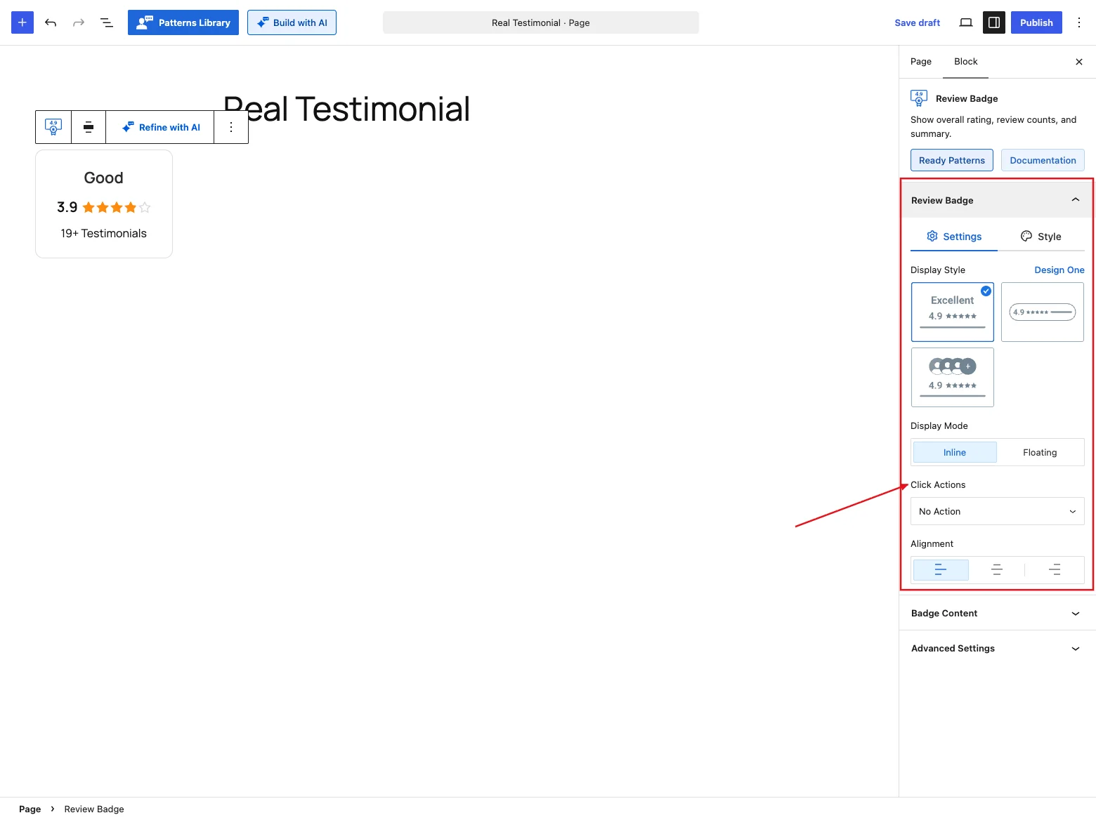
Settings tab
| Control | What it does |
|---|---|
| Display Style | The three badge designs (see the table below). Picking one rewrites several settings at once, so switch design before you fine-tune colors and spacing. |
| Display Mode | Inline (default) sits the badge in the flow of your content. Floating pins it to a corner of the browser window. |
| Floating Position (Floating only) | Bottom Right (default), Bottom Left, Top Right or Top Left. |
| Click Actions | What happens when someone clicks the badge: No Action (default), Open Custom URL or Scroll to Section. With No Action, the badge isn't a link at all. |
| Custom URL (Open Custom URL) | Where the badge links to, plus an Open in New Tab toggle. |
| Section ID (Scroll to Section) | The ID of the section on the page to scroll to. Handy for jumping to your full testimonials list. |
| Alignment (Inline only) | Left (default), center or right within its container. A floating badge is pinned to a corner instead, so this control is hidden in Floating mode. |
Style tab
Styling here applies to the badge box itself, with separate Normal and Hover states:
- Background Type: solid color (default
#FFFFFF) or a gradient. - Border: a 1 px solid light-grey line (
#DDDDDD) by default. Set the style to none to remove it, or pick a different color for the Hover state. - Box Shadow: the lift under the badge. Off by default.
- Border Radius: default 12 px (Design Two starts at 100 px, which is what makes it a pill).
- Padding: default 24 px top/bottom, 30 px left/right (Design Two starts at 12 px top/bottom to keep the pill slim).
- Margin: space around the badge.
The three designs
| Design | Shape | Reviewer photos | Review line starts as |
|---|---|---|---|
| Design One | Compact card | None | {count}+ Testimonials |
| Design Two | Wide pill | 3 overlapping photos | Based on {count} Reviews |
| Design Three | Tall card | 4 photos, the last showing the total | Read our {count}+ Testimonials |
Switching design overwrites your styling
Each design carries its own preset. Corner radius, padding, font sizes, photo size, overlap and the Review Text wording all change when you pick a new one. Choose your design first, then style it and rewrite the review line.
Badge Content
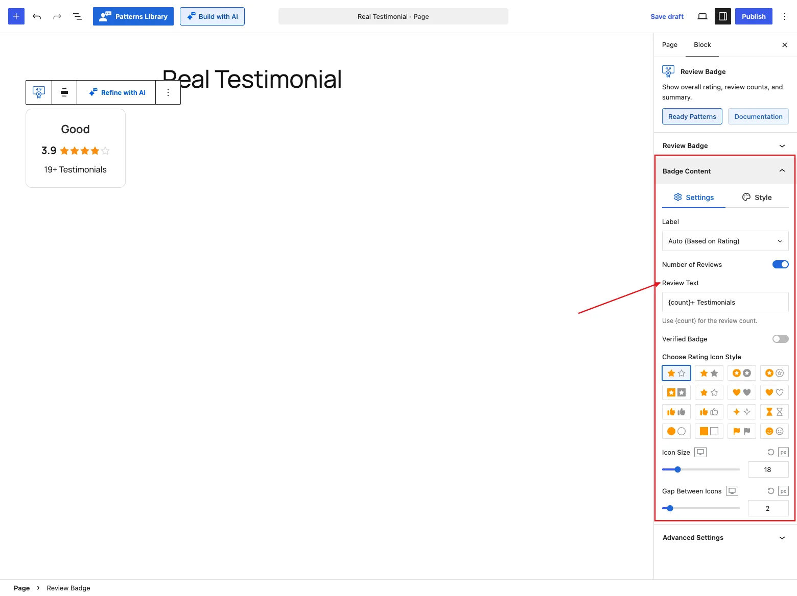
Settings tab
| Control | What it does |
|---|---|
| Label | The word above the stars. Auto (Based on Rating) (default) picks it from your average: Excellent at 4.5 and up, then Good, Average, Poor, Bad. Custom lets you write your own (default Excellent). Hide removes it. |
| Custom Label (Custom only) | Your own wording. |
| Number of Reviews | Shows the review line under the stars. On by default. |
| Review Text (Number of Reviews on) | The wording of that line. Type {count} where the number should go, for example Loved by {count} customers. The default is {count}+ Testimonials, and picking a Display Style fills in that design's wording (see the three designs). |
| Verified Badge | Adds a blue verified tick. Off by default. |
| Verified Badge Size (Verified Badge on) | Default 20 px. |
| Reviewer Image Size (Design Two and Three) | Size of the photo cluster. Default 28 px (48 px on Design Three). |
| Avatar Overlap (Design Two and Three) | How far each photo tucks behind the one before it. Default −10 px (−20 px on Design Three). A negative number means they overlap. |
| Choose Rating Icon Style | The star icon set. You get the same 16 styles as the other blocks (stars, hearts, thumbs and more). |
| Icon Size | Default 18 px. |
| Gap Between Icons | Default 2 px. |
Style tab
Three sections, each with its own typography, color and margin controls:
- Label: the Excellent line.
- Rating: the numeric average, plus Fill Star Color and Empty Star Color.
- Review Number: the Based on 214 Reviews line.
Advanced Settings
On the badge, this panel has just two tabs: Visibility (show or hide the badge on desktops, tablets or mobile devices) and Advanced (custom CSS class and ID). Both are covered in the Carousel reference.
Floating badges only float on the live site
In the editor a floating badge stays put in the canvas so it can't cover your other blocks while you work. Preview or view the page to see it pinned to the corner.
Tips
- Pair the badge with a Scroll to Section click action and the ID of your testimonials section. Visitors who want the detail are then one click away.
- If your average is strong but your review count is still small, set Label → Hide and let the stars speak; add the count back once the number is impressive.
- Floating mode shows on every page the block is on. Put it in a sitewide template area (a footer or header template part) rather than on one page.
- Turn on Verified Badge only if your reviews really are verified. It's a trust mark, and misusing it costs you more than it gains.