

Carousel
Display your testimonials in a rotating carousel — with arrows, dots, autoplay and smooth slide effects.
The Carousel block (a ready-made content element you drop into the WordPress editor) rotates through several testimonials at once, automatically or on demand — a compact, eye-catching band of social proof. Pick a style, set how many cards show, and let visitors browse with arrows, dots, swipe or the keyboard.
This page doubles as the complete inspector reference: the panels the Carousel shares with every other display block are documented here in full, and the other block pages link back instead of repeating them.
How to add the Carousel block
Here's how to add a Carousel to any page or post:
- Go to your WordPress dashboard.
- Open Pages → Add New (or edit an existing page or post).
- In the block editor, click the + (Add Block) button.
- Search for Carousel under the Real Testimonials category.
- Click to insert the block, then pick one of the six card designs when prompted — it immediately previews your published testimonials.
The block supports Wide and Full width from the editor toolbar's alignment button (it starts out Wide), so the carousel can stretch beyond your theme's normal content width if you want it to.
Finding your way around the inspector
You control everything from the block inspector — the settings sidebar that appears on the right whenever the block is selected. It's a stack of collapsible panels, one per area of the block:
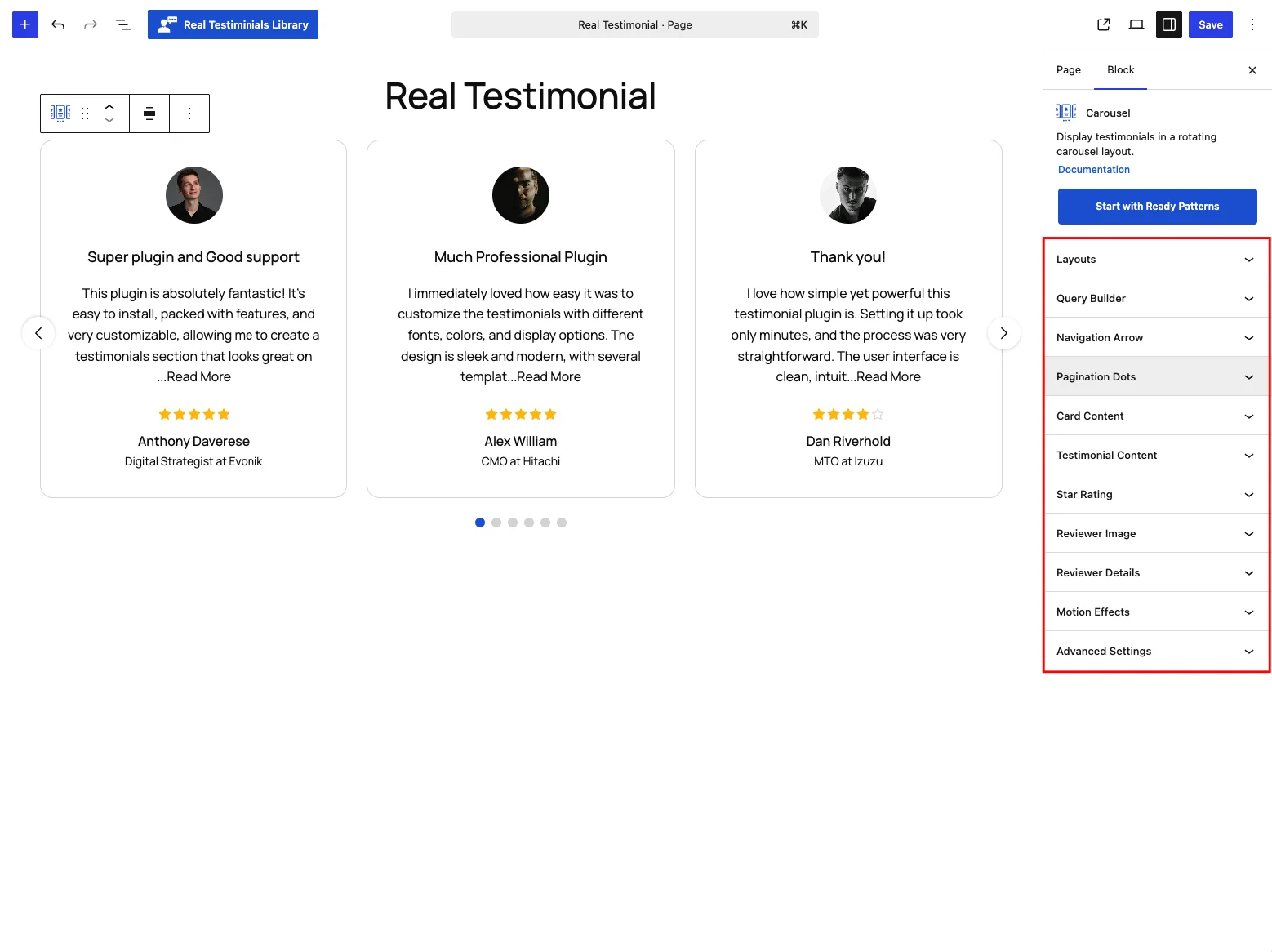
Most panels have two tabs inside: Settings (what shows and how it behaves) and Style (colors, typography and spacing). Switch to Style in one panel and every other panel follows, so you can move down the sidebar styling everything in one pass.
A quick map of what lives where:
| Panel | What it controls |
|---|---|
| Layouts | Carousel style, card design, columns, sliding behavior, and toggles for arrows, dots and add-ons. |
| Query Builder | Which testimonials appear, in what order, and how many. |
| Navigation Arrow | The prev/next arrows (when switched on). |
| Pagination Dots | The dots / progress indicator (when switched on). |
| Card Content | Which parts appear on each card, their order, and the card box itself. |
| Testimonial Content | The testimonial title and text — length, Read More, quotes. |
| Star Rating | Rating icon style, size and colors. |
| Reviewer Image | The reviewer photo — size, ratio, fallbacks, video testimonials. |
| Reviewer Details | Name, designation, company, location and date. |
| Social Media | The reviewer's social profile icons (when that card part is on). |
| Motion Effects | Entrance animation and scrolling effects. |
| Advanced Settings | Block background, spacing, visibility and custom CSS class/ID fields. |
Now let's go through each panel in detail.
Layouts
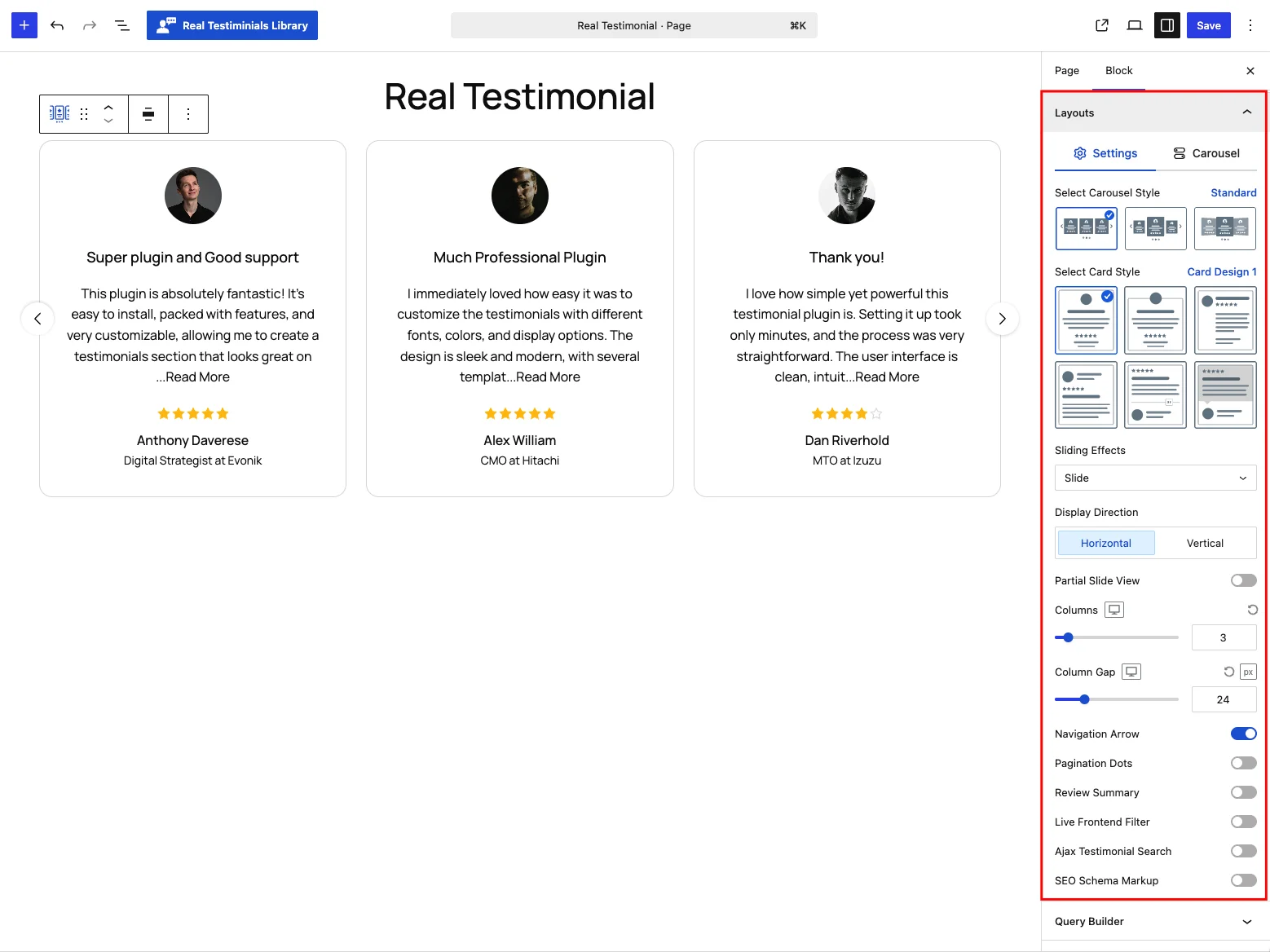
The Layouts panel sets the carousel's overall shape and behavior. It has two tabs: Settings for the layout itself, and Carousel for autoplay and movement.
Settings tab
| Control | What it does |
|---|---|
| Select Carousel Style | Pick a carousel preset: Standard (default), Center or Coverflow. Choosing Coverflow switches the sliding effect to Coverflow automatically; switching back to Standard resets it to Slide. Picking Center or Coverflow also turns Partial Slide View off — those two are presets of their own, so only Standard keeps the Sliding Effects and Partial Slide View options available. |
| Select Card Style | Choose one of the six card designs (Card Design 1–6) — the same set every display block uses. Switching designs also rearranges and locks certain card parts to fit the design (see Card Content). |
| Sliding Effects | (Standard style only) How each slide transitions: Slide (default), Spring, Fade, Cube or Flip. Choosing Spring hides the Display Direction option (it always runs horizontally). |
| Display Direction | Scroll Horizontal (default) or Vertical. |
| Partial Slide View | (Standard style, horizontal only) Peek the neighboring slide so visitors can tell there's more to swipe. Off by default. Switching it on opens a popover with Show Partial View — which side peeks: Left, Right (default) or Both — and Partial Offset (0.1–0.9 in 0.05 steps, default 0.3) for how much of the neighboring card shows through. |
| Columns | How many cards show at once, set per device. Range 1–20; default 3 on desktop, 2 on tablet, 1 on mobile. |
| Column Gap | Space between cards, up to 100 px — default 24 px on desktop, 16 px on tablet, 12 px on mobile. Labeled Gap when the direction is vertical. |
Below those, a set of toggles switches on the carousel's extras:
| Toggle | What it turns on |
|---|---|
| Navigation Arrow | The prev/next arrows — on by default. Opens the Navigation Arrow panel. |
| Pagination Dots | The dots beneath the carousel — off by default. Opens the Pagination Dots panel. |
| Review Summary | A Review Summary child block — a smaller block that lives inside this one — showing the average rating and total reviews. |
| Live Frontend Filter | A Live Frontend Filter child block for on-page filtering. |
| Ajax Testimonial Search | An Ajax Testimonial Search box that filters results as visitors type, without reloading the page. |
| SEO Schema Markup | Adds hidden rating info that helps Google show star ratings next to your page in search results. (Shown only when the SEO Schema module is on.) |
Child blocks are added for you
Switching on Review Summary, Live Frontend Filter or Ajax Testimonial Search automatically wraps the carousel in a Testimonial Group and inserts the matching child block — no manual nesting needed.
Carousel tab
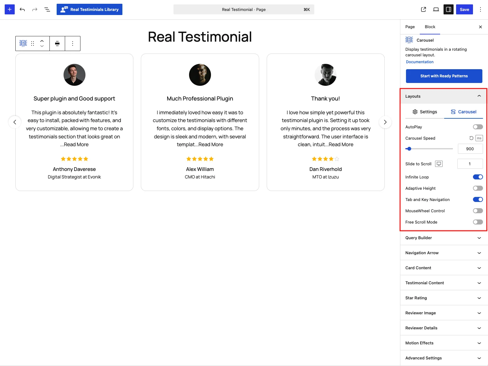
The second tab controls autoplay and exactly how the carousel moves.
| Control | What it does |
|---|---|
| AutoPlay | Rotate through the cards on their own. Off by default — visitors browse with the arrows, dots, swipe or keyboard until you switch it on. |
| Autoplay Delay | (AutoPlay on) How long each card stays put before the carousel advances — 100–10,000 ms in 100 ms steps, default 900 ms. Raise it if visitors need more reading time. |
| Carousel Speed | How long the slide transition itself takes — 100–10,000 ms in 50 ms steps, default 900 ms. Lower feels snappier, higher feels smoother. |
| Slide to Scroll | How many cards advance with each step — 1 to 10 (default 1), set per device. |
| Carousel Direction | (AutoPlay on) Autoplay Left to Right (default) or Right to Left. When the direction is vertical, the choices become Bottom to Top and Top to Bottom. |
| Pause on Hover | (AutoPlay on) Stop autoplay while the pointer is over the carousel, then resume when it leaves. On by default. |
| Infinite Loop | Wrap from the last card back to the first so the carousel never hits a dead end. On by default. |
| Adaptive Height | Match the carousel's height to the current card instead of the tallest one. Off by default — leave it off if you'd rather the layout below the carousel never shifts. |
| Tab and Key Navigation | Let visitors move between cards with the Tab and arrow keys — better accessibility. On by default. |
| MouseWheel Control | Advance the carousel with the mouse wheel. Off by default. |
| Free Scroll Mode | Let cards drag freely and coast to a stop instead of snapping to each slide. Off by default. |
Query Builder
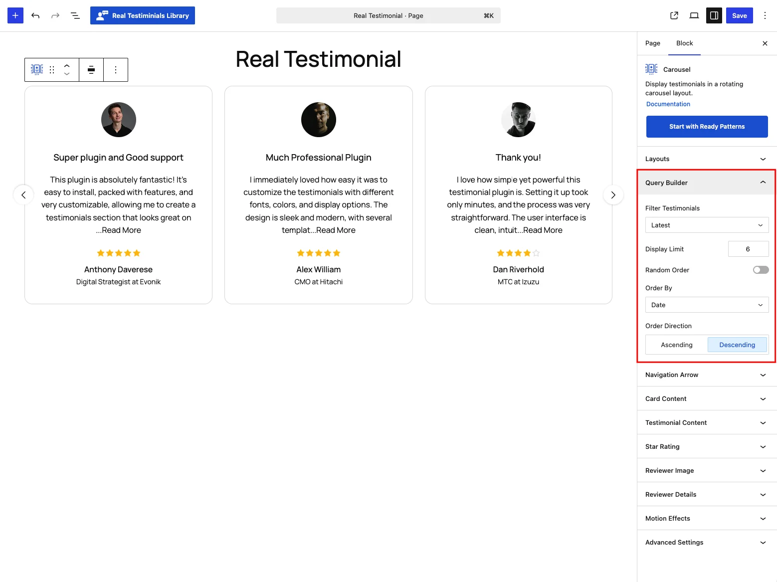
The Query Builder decides which testimonials the carousel shows — pull the latest ones, a group, only high ratings, or a hand-picked set.
| Control | What it does |
|---|---|
| Filter Testimonials | Latest (default — most recent first), Groups, Specific, or Based on Star Rating. Each choice reveals its own follow-up control below. |
| Select Groups | (Groups) Pick one or more groups to pull from — a testimonial only needs to belong to one of them to qualify. |
| Select Testimonials | (Specific) Hand-pick individual testimonials by title. Only the ones you select appear, in the order set by the sorting controls below. |
| Star Rating | (Based on Star Rating) Set a minimum rating: Only 5 Stars, 4 Stars & Up, 3 Stars & Up, 2 Stars & Up, or 1 Star & Up. |
| Display Limit | How many testimonials to show (default 6). |
| Random Order | Shuffle the order on each page load. Off by default. Switching it on hides the two sorting controls below — random and sorted can't both apply. |
| Order By / Order Direction | (When Random Order is off) Sort by Date, Title or Modified (last-edited date), Ascending or Descending. Default: Date, Descending — newest first. |
Navigation Arrow
This panel appears when the Navigation Arrow toggle is on in the Layouts panel (it's on by default for the Carousel). It controls the prev/next arrows.
Settings tab
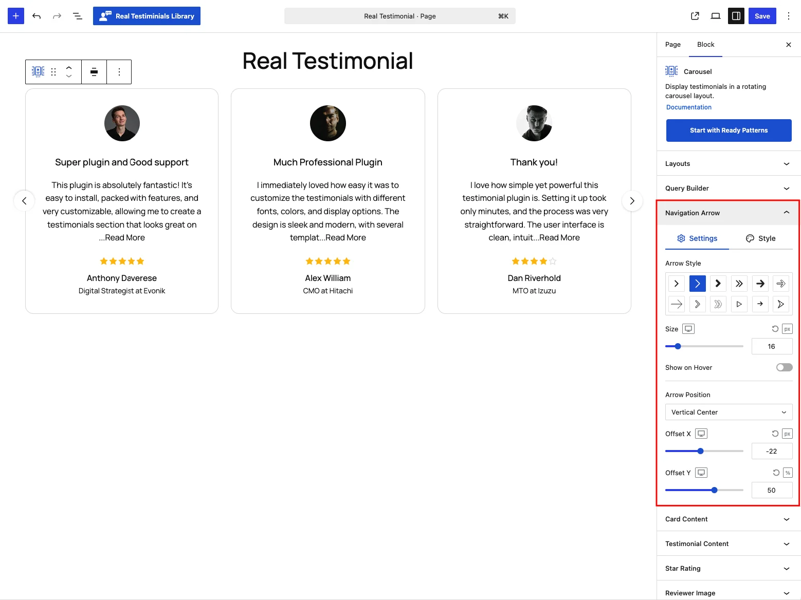
| Control | What it does |
|---|---|
| Arrow Style | Choose from 12 arrow icons: Chevron Solid, Chevron Outline (default), Chevron Bold, Double Chevron, Arrow Solid, Arrow Outline, Arrow Minimal, Chevron Border Line, Double Chevron Outline, Triangle Outline, Arrow Line and Arrow Send. |
| Size | Icon size up to 100 (px, % or em) — default 16 px, per device. |
| Gap | Space between the two arrows, up to 100 px, default 10 px. (Shown for every position except Vertical Center, where the arrows sit on opposite sides.) |
| Show on Hover | Reveal the arrows only when the visitor hovers over the carousel. Off by default. |
| Arrow Position | Vertical Center (default — the classic left/right arrows), or a corner: Top Left / Center / Right, Bottom Left / Center / Right. |
| Offset X | Nudge the arrows horizontally, −200 to 200 (px or %). |
| Offset Y | Nudge them vertically, −200 to 200 (px or %). |
Changing the Arrow Position resets the two offsets to a sensible starting point for you: Vertical Center sets them to −22 px / 50% (arrows hanging just outside the carousel, vertically centered), while any of the corner positions sets them to 0 px / −12% (arrows floating just above or below the cards). Fine-tune from there.
Style tab
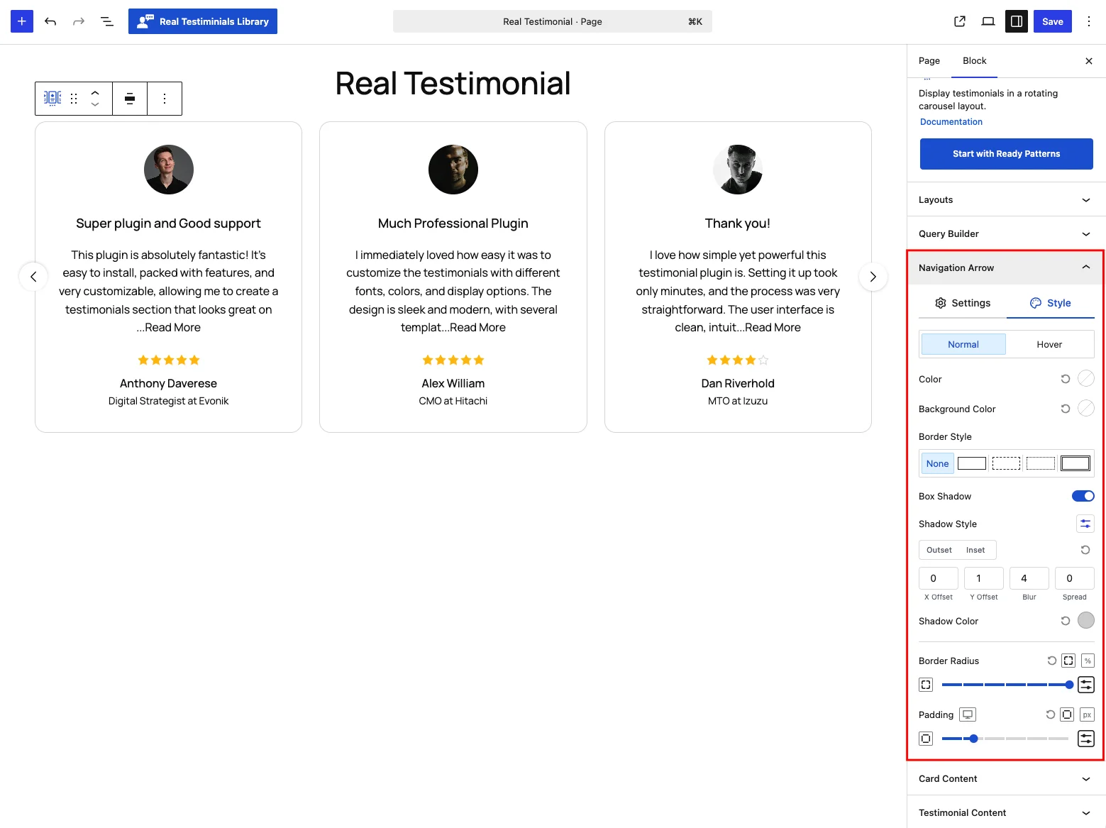
Style the arrows in two states — Normal and Hover (use the toggle at the top of the tab to switch which state you're editing):
- Color and Background Color — the hover state defaults to a white icon on the brand-blue (
#1E67D8) background; the normal state inherits from your theme until you set a color. - Border — style (solid, dashed, dotted or double — none by default), width per side and color, with separate colors for each state.
- Box Shadow — on by default with a soft drop shadow; switch it to Inset or adjust the offset, blur, spread and color. The hover state has its own shadow, off by default.
- Border Radius — per corner; the default 50% keeps the arrows circular.
- Padding — space inside the arrow button, default 12 px on every side.
Pagination Dots
This panel appears when the Pagination Dots toggle is on in the Layouts panel. It controls the indicator beneath the carousel.
Settings tab
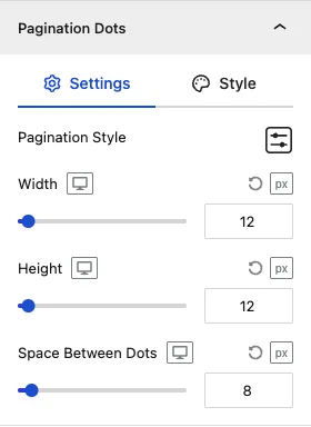
| Control | What it does |
|---|---|
| Pagination Style | Choose the indicator type: Dots (default), Dynamic (the active dot grows, neighbors shrink), Strokes (short bars), Scrollbar (a draggable track), Stepper (a segmented progress bar), Fraction (a "2 / 6" counter) or Numbers (one numbered button per slide). |
| Width | Indicator width, up to 200 (px / % / em). (Hidden for the Scrollbar style, which always spans its track.) |
| Active Width | Width of the active indicator, default 50 px — the current stroke stretches wider than the rest. (Strokes style only.) |
| Height | Indicator height, up to 200 (px / % / em). |
| Space Between Dots | Gap between indicators, up to 100 px, default 8 px. (Hidden for the Fraction style — a counter has nothing to space out.) |
Picking a style loads a fitting default size, so you rarely need to touch Width and Height: Dots and Dynamic start at 12×12 px, Strokes at 12×8 px, Scrollbar at 5 px tall, Stepper at 30×8 px, Fraction at 60×25 px and Numbers at 30×30 px.
Here's how the seven pagination styles compare:
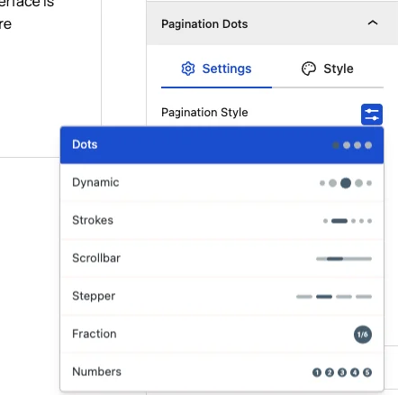
Style tab
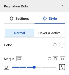
- Typography — (Fraction and Numbers styles) font family, weight, size, line height and letter spacing for the counter text.
- Color in two states, Normal and Hover & Active — the active dot (or number) uses the second one.
- Background Color — (Fraction and Numbers styles) the box behind the text, also per state.
- Margin — space around the pagination, default 24 px above.
Card Content
The Card Content panel controls the testimonial card itself: which parts appear on it, in what order, and how the card box looks.
Settings tab
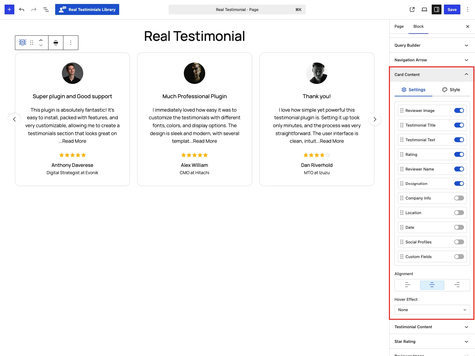
- Card parts list — a drag-and-drop list of everything a card can show: Reviewer Image, Testimonial Title, Testimonial Text, Rating, Reviewer Name, Designation, Company Info, Location, Date, Social Profiles and Custom Fields. Toggle a part on or off, or drag it to reorder. The first six are on by default; Company Info, Location, Date, Social Profiles and Custom Fields start off. Social Profiles and Custom Fields only appear in the list when their module is enabled — turning a module off hides the row but keeps your settings for when you re-enable it.
- Alignment — align card content Left, Center (default) or Right.
- Show Quotes — (Card Design 5 only) display a decorative quote mark. On by default.
- Hover Effect — animate the whole card on mouseover: None (default), Scale Up, Scale Down, or Slide Up / Down / Left / Right.
- Transition Duration — (when a hover effect is chosen) the animation speed, 0–2,000 ms in 50 ms steps, default 600 ms.
Some parts can't be dragged because the card design pins them in place: Card Designs 4–6 lock Reviewer Image, Reviewer Name and Designation (they form the fixed author row), and Card Design 3 locks Reviewer Image, Reviewer Name and Rating. You can still toggle a locked part off — you just can't move it.
Style tab
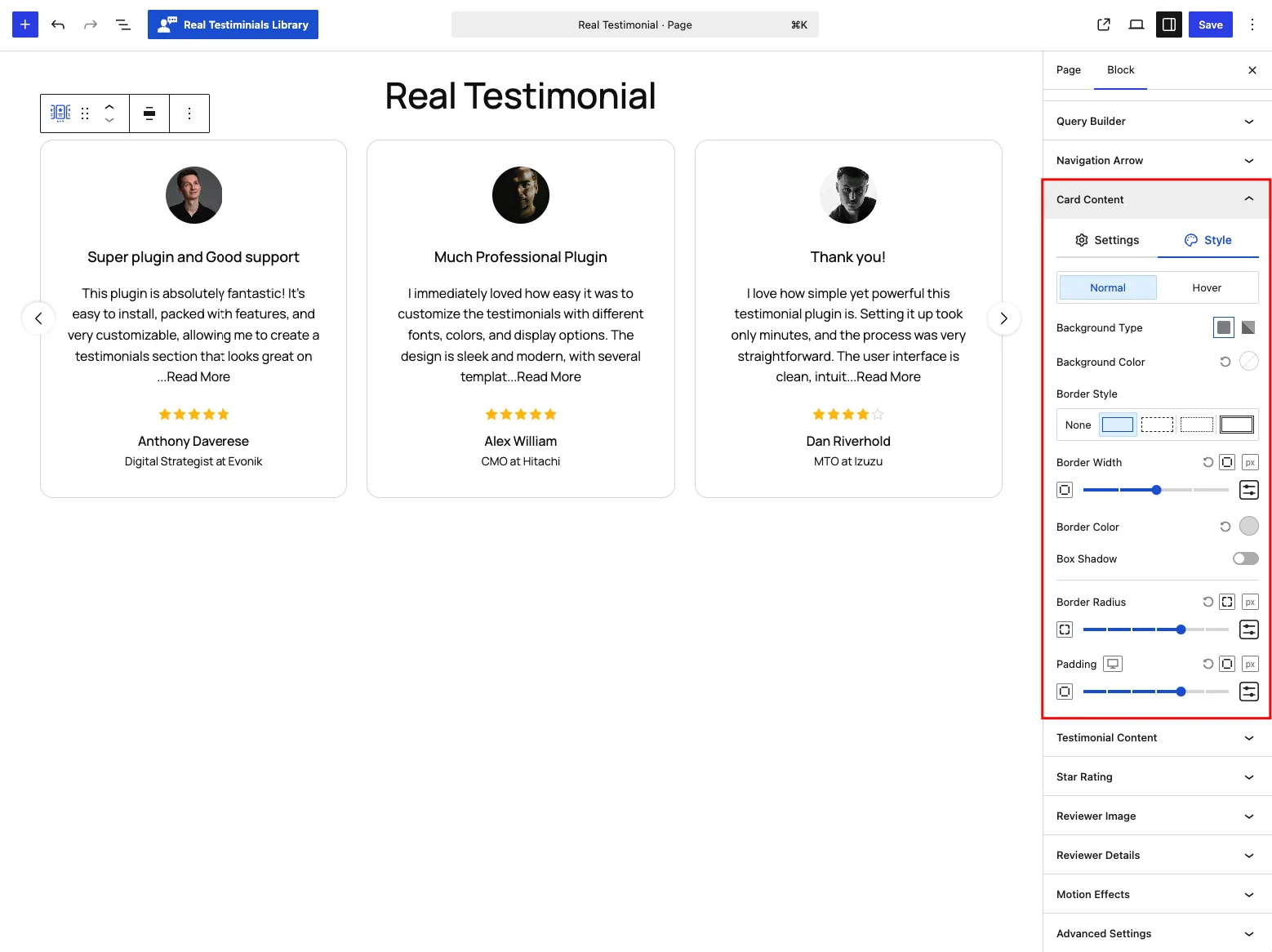
Style the card in Normal and Hover states (switch states with the toggle at the top):
- Background Type — a solid color or a gradient behind the whole card, per state.
- Content Background — (Card Design 6 only) a separate background for the text area, since that design splits the card into an image half and a content half.
- Border — style, width per side and color — default: a solid 1 px light-gray (
#DDDDDD) border, with its own color per state. - Box Shadow — off by default; enable and tune the offset, blur, spread and color, with a separate shadow for the hover state.
- Border Radius — rounded corners, per corner, default 16 px.
- Padding — space inside the card, default 32 px on every side, set per device.
Testimonial Content
This panel shapes the two text parts of a card — the testimonial title and the testimonial text (the quote itself).
Settings tab
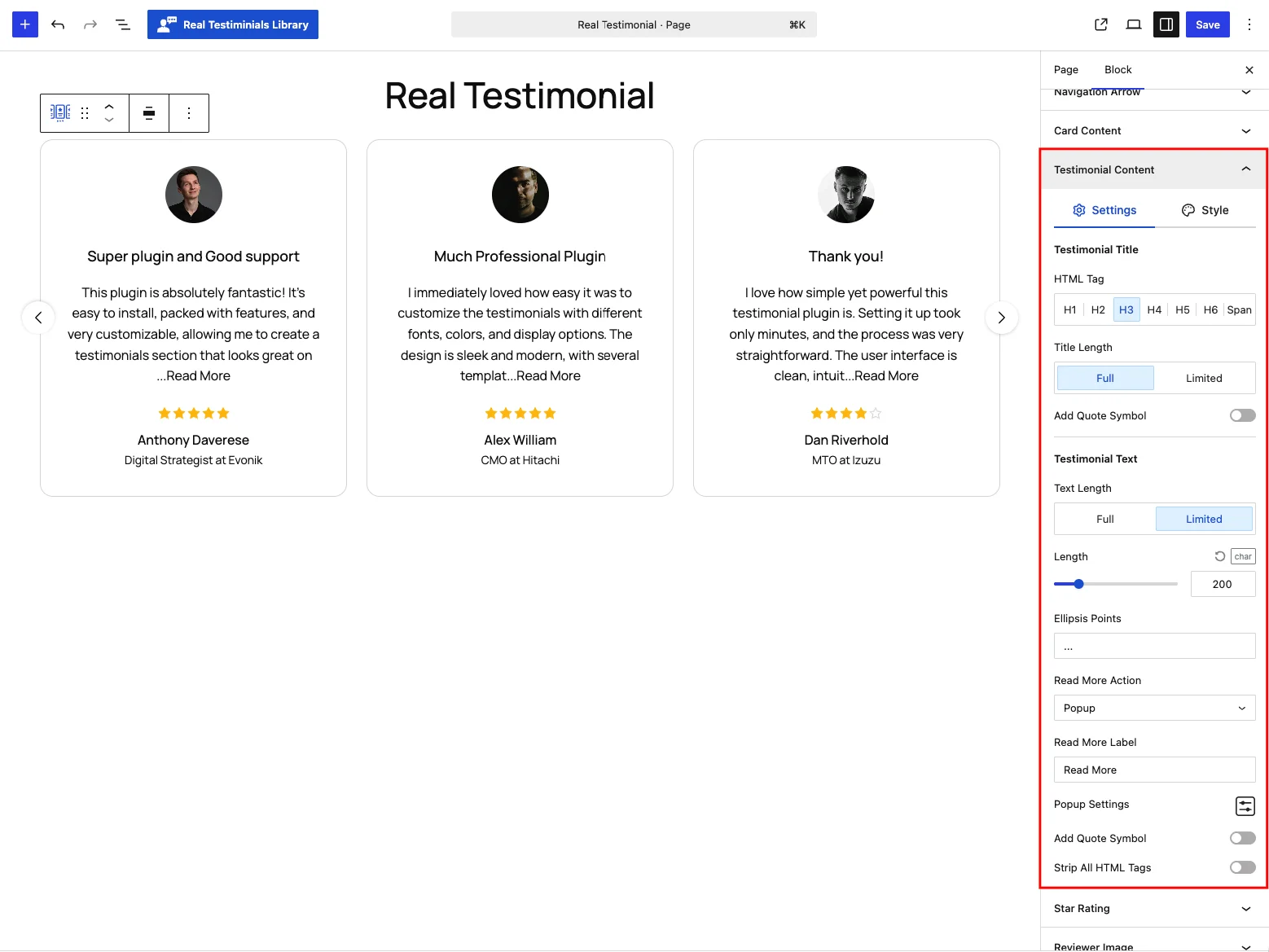
Testimonial Title
| Control | What it does |
|---|---|
| HTML Tag | The heading tag used for the title — H1–H6 or Span (default H3). Pick a tag that fits your page's heading structure. |
| Title Length | Full (default) or Limited. Limited reveals a Length slider (1–200, in words or characters — default 50 words) and an Ellipsis Points field for what shows at the cut-off (default ...). |
| Add Quote Symbol | Wrap the title in decorative quote marks. Off by default. |
Testimonial Text
| Control | What it does |
|---|---|
| Text Length | Full or Limited (default). Limited trims the quote to a length — default 200 characters — so cards stay even. |
| Length / Ellipsis Points | (Limited) the cut-off — 1 to 1,000, in words or characters — and what shows at the end (default ...). |
| Read More Action | (Limited) What happens when a trimmed quote's link is clicked: Expand inline, open a Popup (default), jump to the Single Testimonial page, or Disabled (no link — the text is simply trimmed). |
| Read More Label | (Limited) The link text, default "Read More". |
| Popup Settings | (Popup action) a popover with the popup's Width (300–1,200 px — default 660 px on desktop, 600 on tablet, 480 on mobile), text Color, Background Color and Background Overlay Color (the dimmed area behind the popup). |
| Add Quote Symbol | Show a decorative quote mark with the text. Off by default. |
| Strip All HTML Tags | Remove any HTML formatting stored in the testimonial (bold, links, line breaks) and show plain text. Off by default. |
Style tab
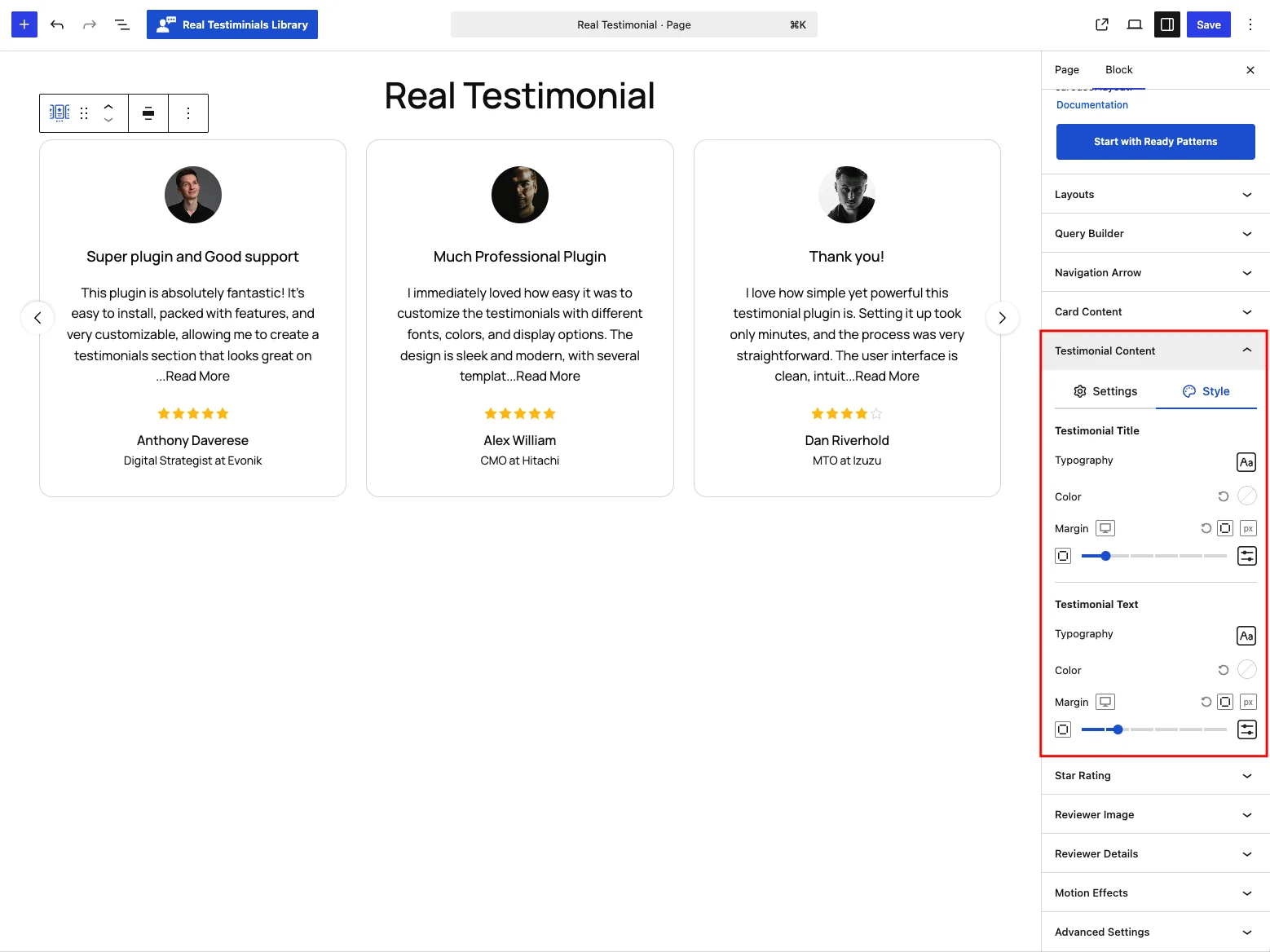
Separate controls for the title and the text, each with:
- Typography — font family, weight, size, line height and letter spacing. The title defaults to 18 px medium (16 px on mobile); the text to 16 px regular (15 px tablet, 14 px mobile).
- Color — inherits from your theme until you set one.
- Margin — default 8 px above and below for both, set per device.
Star Rating
Controls how the star rating on each card looks.
Settings tab
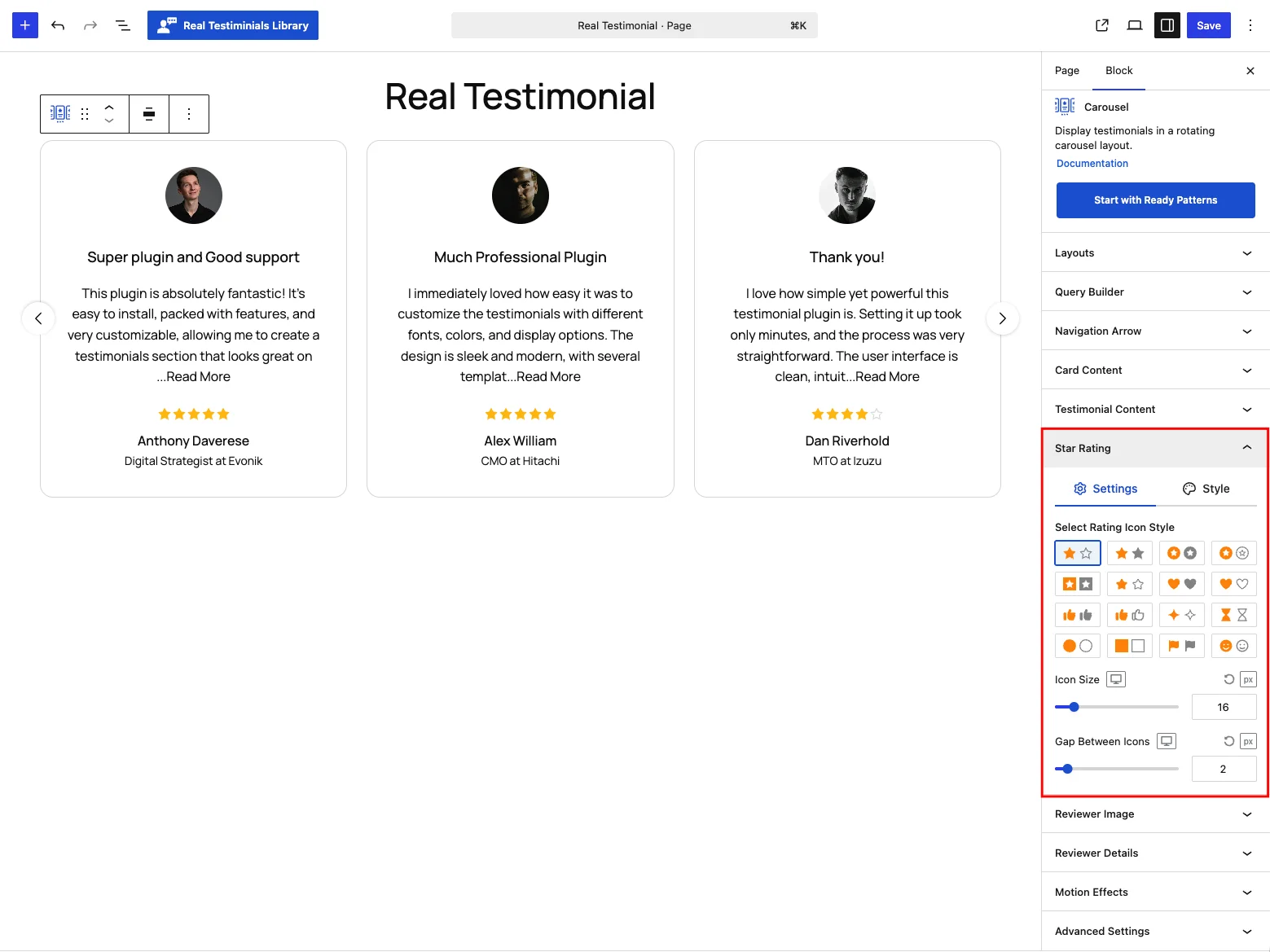
| Control | What it does |
|---|---|
| Select Rating Icon Style | 16 icon sets — filled and outlined stars, circled and squared stars, hearts, thumbs-up, hourglasses, circles, flags and smileys. Each set pairs a "filled" icon for earned points with an "empty" one for the rest; the default is a filled star with a stroked outline. |
| Icon Size | 10–50 px — default 16 px on desktop, 14 on tablet, 12 on mobile. |
| Gap Between Icons | Up to 20 px, default 2 px. |
Style tab
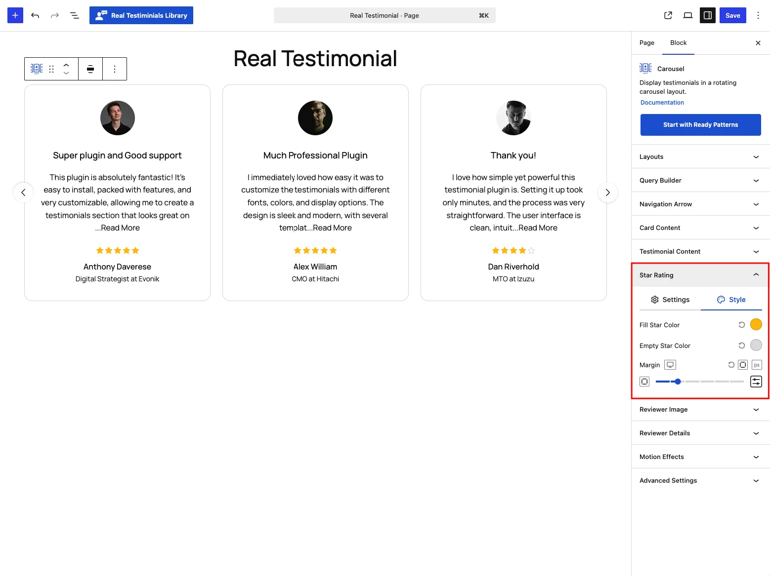
- Fill Star Color — the earned stars, default
#FFC107(gold). - Empty Star Color — the remainder, default
#E0E0E0(light gray). - Margin — space around the rating row, default 12 px above and below.
Reviewer Image
Controls the reviewer's photo (avatar) on each card.
Settings tab
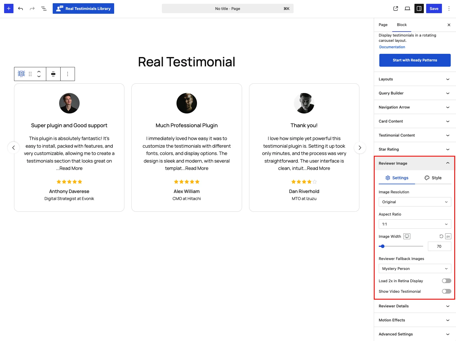
| Control | What it does |
|---|---|
| Image Resolution | Which WordPress image size to load: Original (default), Thumbnail, Medium or Large. Smaller sizes load faster — since avatars show small, Thumbnail is usually plenty. |
| Aspect Ratio | The photo's crop shape: 1:1 (default — square), 16:9, 4:3, 3:2, 21:9, Original (no crop), or Custom — picking Custom reveals a field where you type your own ratio, e.g. 5:4. |
| Image Width | 30–500 px, default 70 px, per device. (An Image Height control with the same range appears when the ratio is Original, since there's no ratio to derive it from.) |
| Reviewer Fallback Images | What shows when a testimonial has no photo: Mystery Person (default — a generic silhouette), Smart Text Avatars (colored initials from the reviewer's name), Gravatar (looked up by the reviewer's email), Custom (opens a media picker to choose your own image), or No Fallback Image (the space collapses). |
| Load 2x in Retina Display | Serve a double-resolution image on high-density screens so avatars stay crisp. Off by default. |
| Show Video Testimonial | Play the testimonial's video when the image is clicked, with a play icon overlay. Off by default; switching it on adds a Video Icon Size control (12–64 px, default 16 px) and turns on the video styling options on the Style tab. |
Style tab
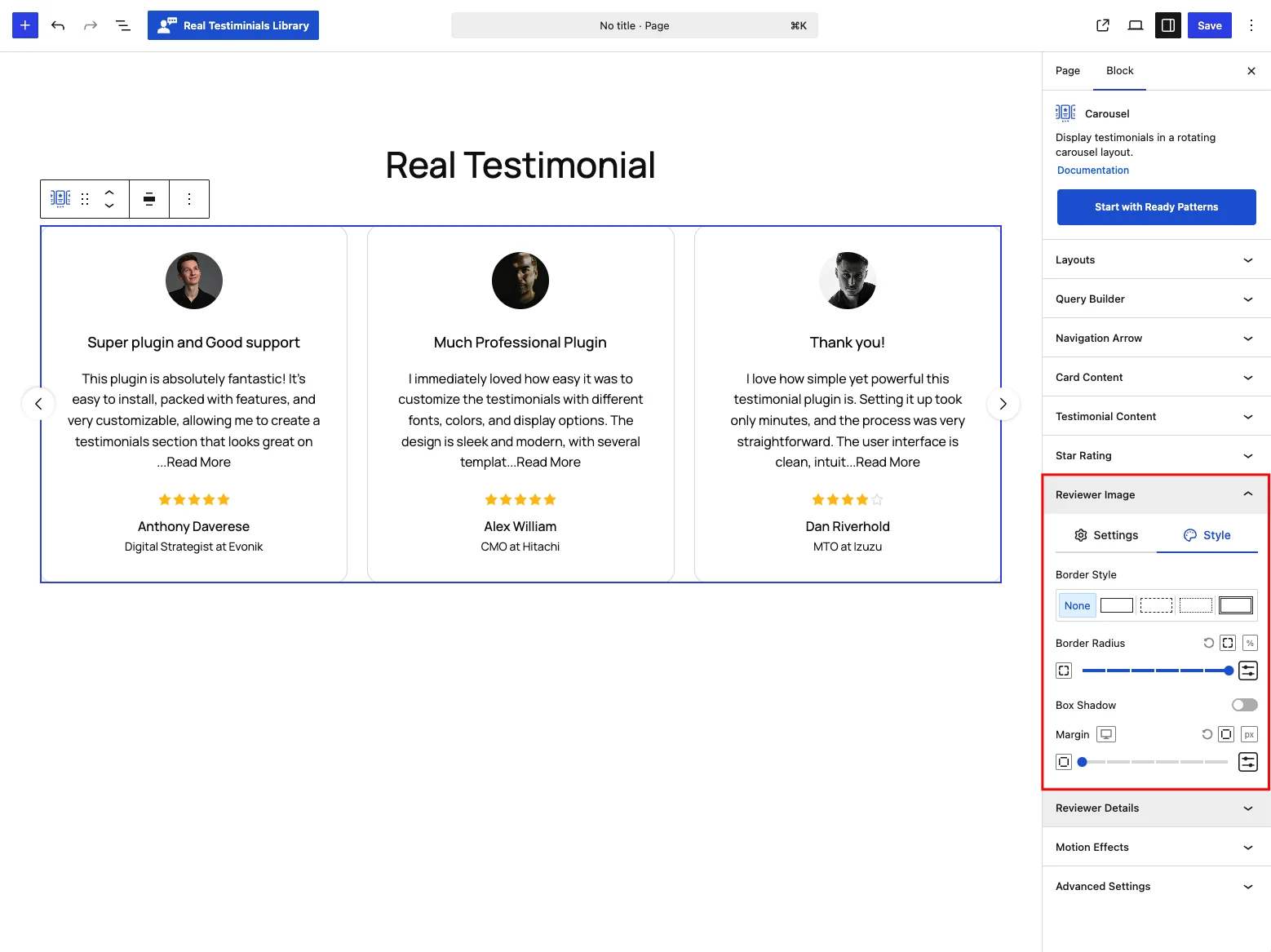
- Border — style, width and color, off by default.
- Border Radius — the default 50% keeps avatars circular; set it in px or % per corner.
- Box Shadow — off by default; tune offset, blur, spread and color.
- Margin — space around the image, default 12 px below.
- With Show Video Testimonial on: a Video Icon Color for the play button, plus a Show Video Overlay toggle (on by default) that tints the photo behind the icon — with its own Video Overlay Color and Video Overlay Opacity (0–100%, default 50%).
Reviewer Details
Controls the who-said-it line — name, designation, company, location and date.
Settings tab
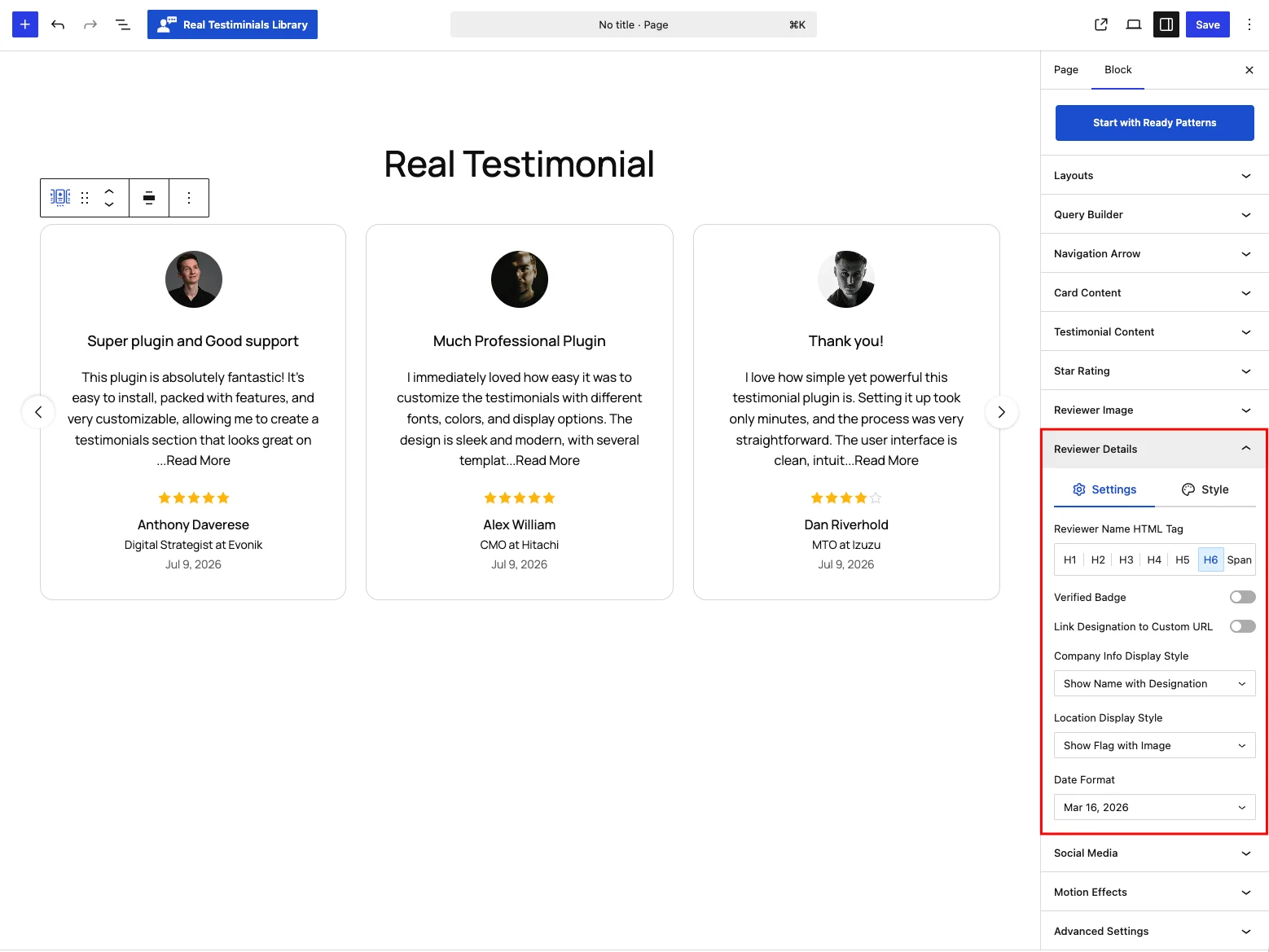
| Control | What it does |
|---|---|
| Reviewer Name HTML Tag | H1–H6 or Span (default H6). Use Span if the names shouldn't take part in your page's heading outline. |
| Verified Badge | Show a checkmark badge beside reviewers you've marked as verified. Off by default. |
| Link Designation to Custom URL | Make the designation a link to the URL saved on the testimonial. Off by default; switching it on adds a Link Open In choice — New Tab (default) or Same Tab. |
| Company Info Display Style | (Company Info part on) Show Name with Designation (default), Show Logo, Show Logo Beside Reviewer Info, or Show URL. |
| Location Display Style | (Location part on) Show Flag with Image (default — a small flag over the reviewer photo), Country Name, or Country Name with Flag. |
| Date Format | (Date part on) five date presets — Mar 16, 2026 (default), March 16, 2026, 2026-03-16, 03/16/2026, 16/03/2026 — or Time ago ("2 weeks ago"). |
Style tab
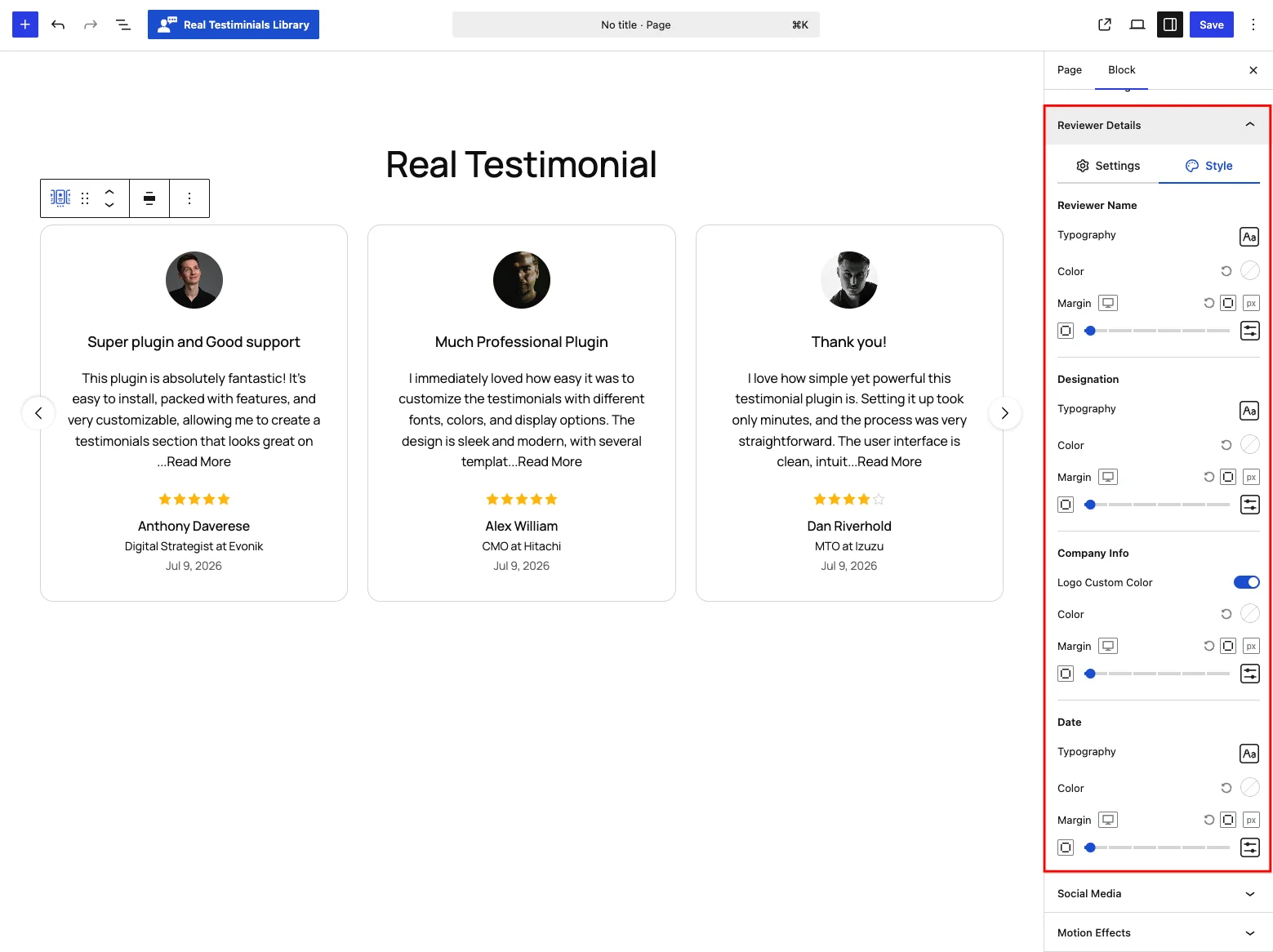
Typography, Color and Margin for each detail — a section only appears here once its card part is switched on in Card Content:
- Reviewer Name — default 16 px medium (14 px on mobile).
- Designation — default 14 px (12 px on mobile).
- Company Info — a Logo Custom Color toggle (on by default) that recolors company logos to your chosen color instead of keeping their original colors, plus Color and Margin.
- Location — same typography set. (Hidden while the display style is Show Flag with Image — a flag has no text to style.)
- Date — default 14 px.
- Custom Fields — default 14 px; appears when the part is on and the Custom Information Fields module is enabled.
Social Media
This panel appears when the Social Profiles card part is on (and the Reviewer Social Profiles module is enabled). It sizes and styles the social icons on each card.
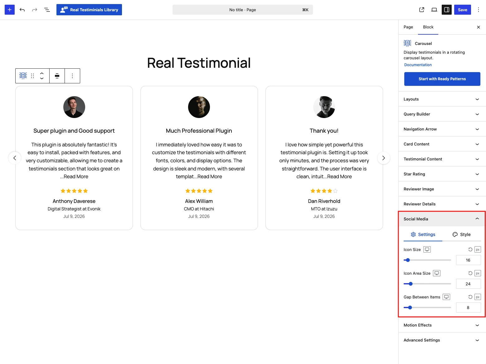
Settings tab: Icon Size (8–100 px, default 16 px), Icon Area Size — the clickable area around each icon (8–120 px, default 24 px) — and Gap Between Items (up to 60 px, default 8 px), all per device.
Style tab: a Custom Styling toggle turns on Icon Color and Background Color in Normal / Hover states — leave it off and each network keeps its preset brand look instead. Below those: Border (off by default), Box Shadow (off by default, separate hover shadow), Border Radius (default 4 px) and Margin (default 8 px above).
Motion Effects
Add movement as the block scrolls into view. This panel appears when the Motion Effects module is on.
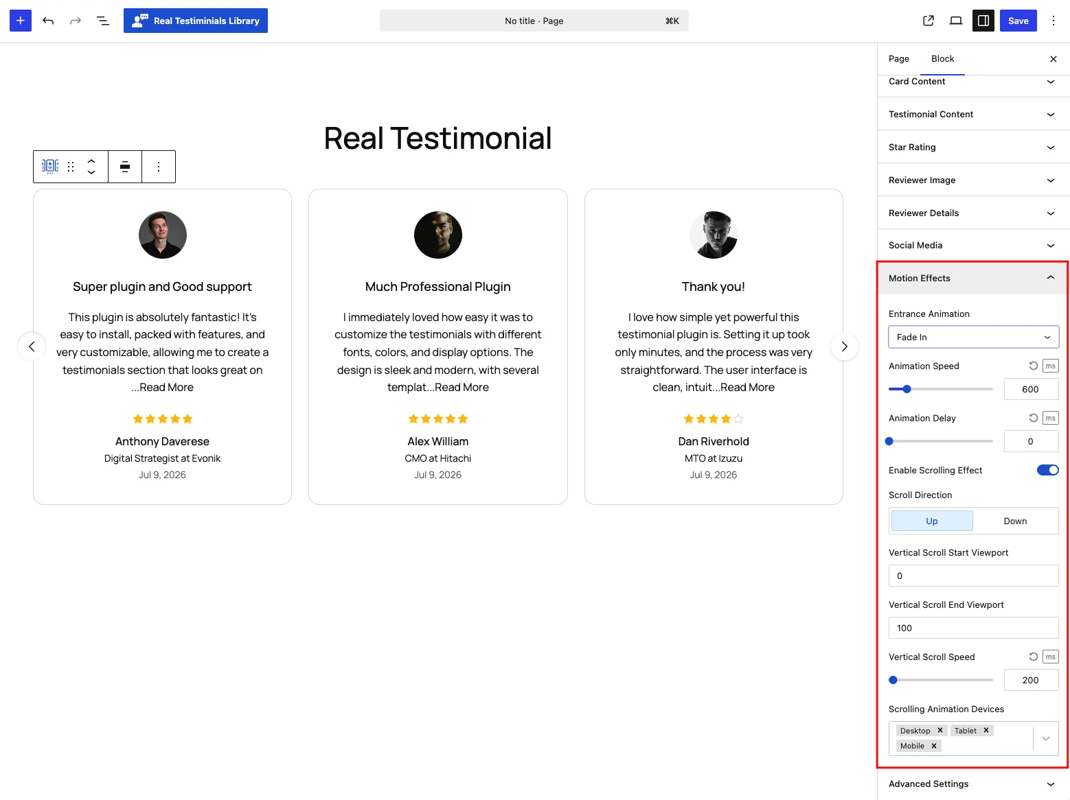
| Control | What it does |
|---|---|
| Entrance Animation | How the block first appears as it scrolls into view: None (default), Fade In, Slide Up / Down / Left / Right, Zoom In or Bounce. |
| Animation Speed / Animation Delay | (when an animation is chosen) 100–3,000 ms speed (default 600 ms) and up to 2,000 ms delay before it starts (default 0). |
| Enable Scrolling Effect | A parallax-style movement while the visitor scrolls. Off by default. |
| Scroll Direction | (Scrolling effect on) Move the block Up (default) or Down as the page scrolls. |
| Vertical Scroll Start / End Viewport | Where in the viewport the effect begins and ends (0–100, defaults 0 and 100). |
| Vertical Scroll Speed | How strongly the block shifts, 0–5,000 ms, default 200 ms. |
| Scrolling Animation Devices | Run the effect on Desktop, Tablet and/or Mobile (all on by default). |
Advanced Settings
Container-level controls for the whole block. This panel has three tabs: General, Visibility and Advanced.
General tab
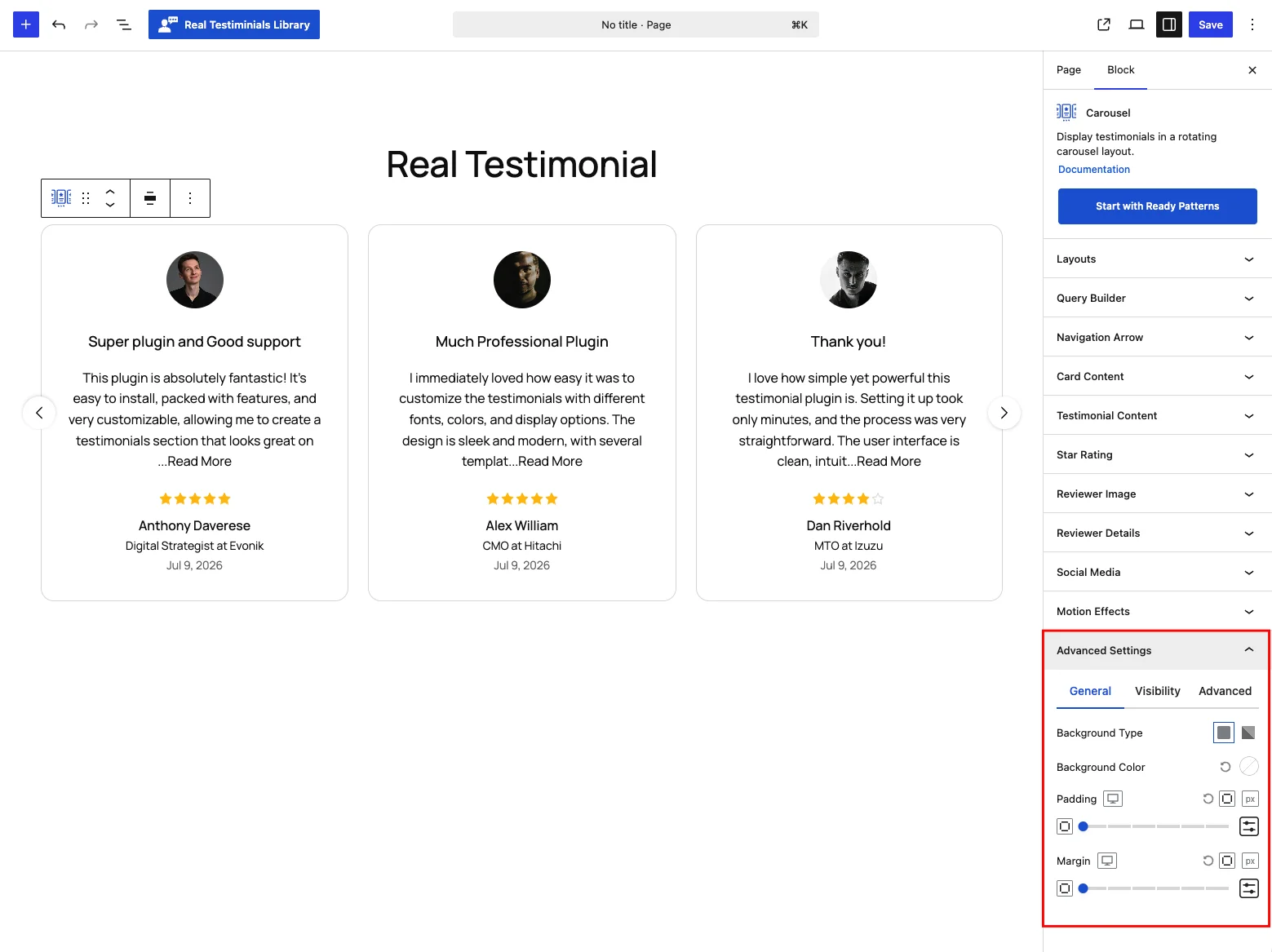
- Background Type — a solid color or gradient behind the whole block, including the space around the cards.
- Padding and Margin — space inside and around the block, per side and per device (default 0).
Visibility tab
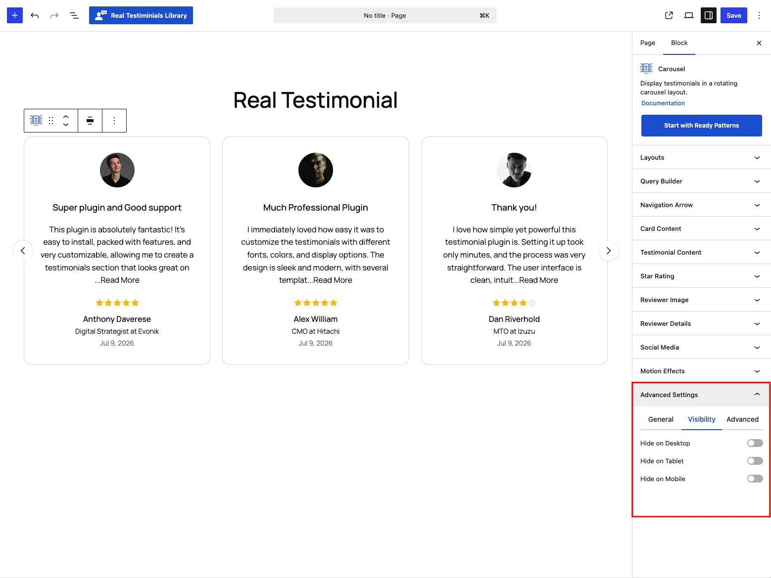
- Hide on Desktop, Hide on Tablet, Hide on Mobile — show the block only on the devices you choose. Handy for building a separate mobile layout.
Advanced tab
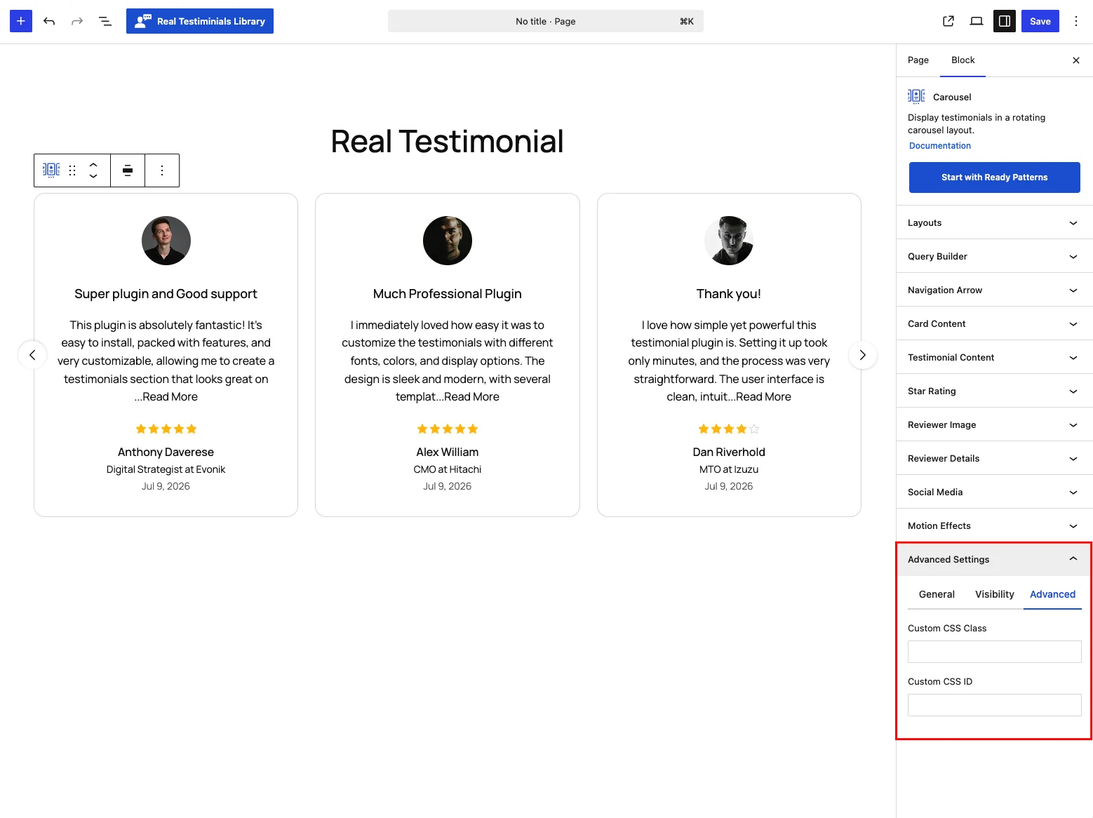
- Custom CSS Class and Custom CSS ID — name tags added to the block so you can target just this one carousel from your theme's custom CSS (or JavaScript). Handy if you know a little CSS and want to style this carousel on its own.
Tips
- Keep Columns at 1 on mobile so quotes stay easy to read.
- Pair AutoPlay with Pause on Hover so visitors can stop to read.
- Coverflow or Partial Slide View hints there's more to swipe.
- For one testimonial per slide with richer effects (Ken Burns, Coverflow), use the Slider instead.