

Stacked Cards
Show testimonials as a deck: one card at a time with the next ones peeking out behind it, or the whole set fanned out like a hand of cards.

The Stacked Cards block (a ready-made content element you drop into the WordPress editor) treats your reviews as a physical deck rather than a flat grid. It has two quite different looks. The Slider shows one review at a time with the following cards stacked behind it. The Stacked Cards fan spreads every review out sideways, overlapping, like cards held in one hand.
When to use it
- A hero or landing section where you want one strong review front and centre, with a visible hint that there are more behind it.
- A tight space that still needs to suggest volume. The deck says "there's plenty more" without listing everything.
- A playful, less corporate feel than a straight grid or carousel.
How to add it
- Click the + block inserter in the editor.
- Search for Stacked Cards (under the Real Testimonials category) and select it.
- A Select Layout box appears in the block's place. Choose Slider or Stacked Cards; the block starts with Card Design 1. If you'd rather start from something finished, the same box has Start with Ready Patterns (a fully styled design from the pattern library) and Build with AI (describe the block you want in plain words).
- Open Query Builder in the inspector (the settings sidebar on the right) to choose which testimonials appear.
After that, you can select the block and click Refine with AI in its toolbar to describe a change, such as "show three cards behind the front one and slow the autoplay down". Build with AI explains how both AI buttons work, and the Carousel page covers the other editor shortcuts, such as Ready Patterns and Documentation at the top of the inspector.
You can switch layout later from the Layouts panel. One thing to know: switching to the Stacked Cards fan resets the card to Card Design 1 and re-applies that design's alignment, part order and spacing. So pick the layout first and style the card afterwards.
Layouts
The controls you see depend entirely on the layout you picked, so this panel looks quite different in each mode.
| Control | What it does |
|---|---|
| Select Layout | Slider (one card at a time, others stacked behind) or Stacked Cards (the fan). |
| Layer Effect Depth (Stacked Cards only) | How far the fanned cards spread apart, 0–100. Default 50. Lower values overlap the cards more tightly; higher values spread the hand wider. |
| Stacked Card Settings (Slider only) | A popover with the deck's movement and depth controls (see below). |
| Select Card Design / Choose Card Design | The card design (Card Design 1–6). All six shared designs are available on both layouts. The label reads Select on the Slider and Choose on the fan. |
| Ajax Pagination (Stacked Cards only) | Loads more cards in pages and attaches the Ajax Pagination child block (a smaller block that sits inside this one). Off by default. Switching to the Slider turns it off, because the deck steps through its cards itself. |
| Navigation Arrow (Slider only) | Previous/next arrows. On by default. |
| Pagination Dots (Slider only) | Dots under the deck. On by default. |
| Review Summary | Adds an aggregate Review Summary above the block. |
| Live Frontend Filter | Adds filter controls so visitors can narrow down the cards live. |
| Ajax Testimonial Search | Adds a live search box. |
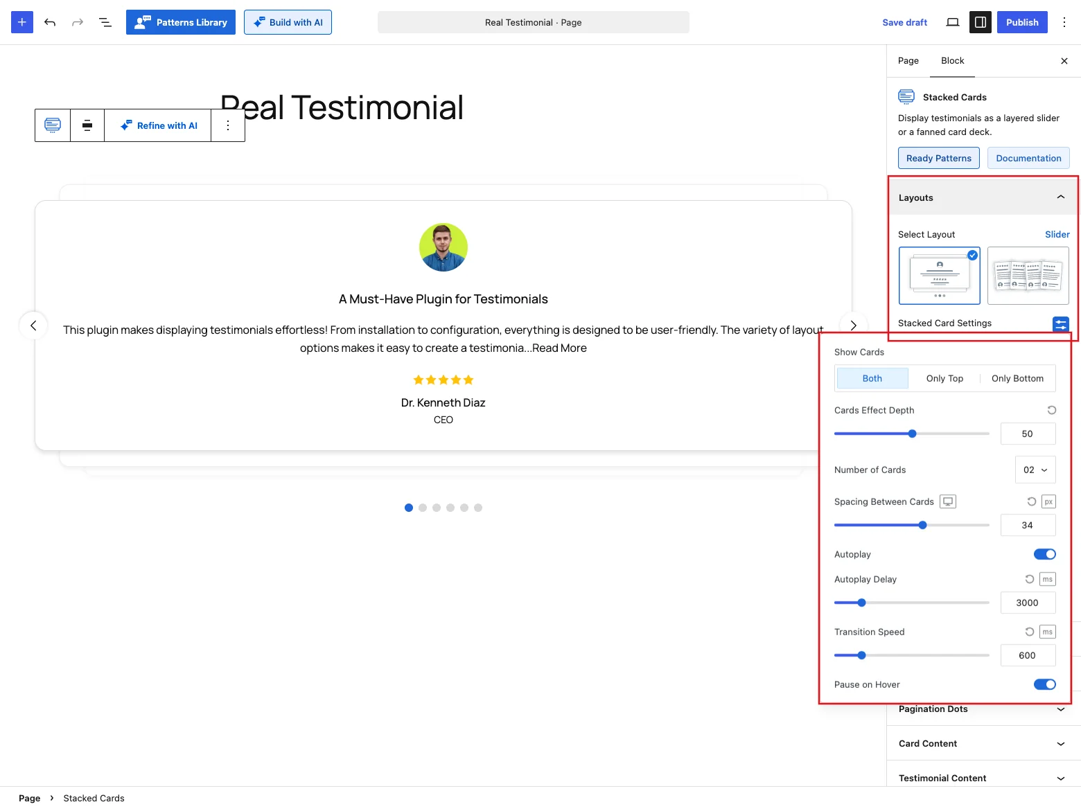
Stacked Card Settings (Slider only)
| Control | What it does |
|---|---|
| Show Cards | Where the pile sits around the card being read: Both (the default, with cards still to come above it and cards already read below it), Only Top or Only Bottom. |
| Cards Effect Depth | How far back the stacked cards sit, 0–100. Default 50. |
| Number of Cards | How many real testimonial cards show on each side of the front one: 01, 02 (default) or 03. With Both and 02, that's two above and two below. It's capped at three per side, because beyond that it stops reading as a stack. |
| Spacing Between Cards | Gap between the stacked edges, up to 60 px. Default 34 px on desktops, 27 px on tablets and 20 px on phones. |
| Autoplay | Advances the deck on its own. On by default. |
| Autoplay Delay (Autoplay on) | How long each card stays, 500–15,000 ms. Default 3000 ms. |
| Transition Speed | How long the swap animation takes, 100–3,000 ms. Default 600 ms. |
| Pause on Hover (Autoplay on) | Stops the rotation while the pointer is over the deck. On by default. |
How the fan sizes itself
The fan has no View Items or Columns control, and that's on purpose. The width of each card is worked out from how many reviews the block actually renders, so the whole hand always fits inside the block. That means your Query Builder Display Limit is what sets the fan's density. Ask for more reviews and the cards get narrower and overlap more; ask for fewer and they spread out.
The same goes for cards that change after the page loads. When a visitor filters with a Live Frontend Filter, searches, or loads another page with Ajax Pagination, the new cards land in the hand and the fan re-measures itself around however many there now are.
The fan flattens on phones
Below 767 px the fan drops the tilt and overlap and becomes a plain vertical stack. A rotated, overlapping hand of cards would be unreadable at phone width.
On desktop, hovering a fanned card lifts it slightly out of the hand. On the Slider, clicking one of the cards peeking out of the pile brings it straight to the front. The Slider also responds to click-and-drag and to the arrow keys, and it pauses autoplay when the pointer is over it or the browser tab is in the background.
The deck works in the editor too. The arrows, dots, autoplay, pause on hover and dragging all behave as they will on the live page, so you can check the motion without previewing.
Query Builder
Choose which testimonials go into the deck. You can use the latest ones, one or more groups, a hand-picked set, or only high star ratings, and set the display limit and order (or shuffle them). See the Carousel reference for every option.
Navigation Arrow
You'll see this panel on the Slider when the Navigation Arrow toggle is on. Use it to size, position and color the previous/next arrows. It matches the Carousel's version, which is covered in the Carousel reference.
If you set Arrow Position to one of the top or bottom options, the arrows get a row of their own above or below the deck. The deck keeps enough room around it that the cards peeking out of the pile never cover them.
Pagination Dots
Also Slider-only, this panel appears when the Pagination Dots toggle is on. Pick a dot style and set its size, spacing and colors. Details in the Carousel reference.
Card Content
This panel is about the card itself. Turn its parts on or off and drag them into order (photo, title, text, rating, name and more), set the alignment and a hover effect, and style the background, border, shadow, corners and padding. The full breakdown is in the Carousel reference.
On this block the card has a soft box shadow switched on by default, so each card in the pile stands out from the one behind it. Turn it off on the Style tab if you prefer flat cards.
Testimonial Content
Shape the title and the quote here: heading tag, full or trimmed text with a Read More action (expand, popup or link), optional quote symbols, and typography and colors for both. For specifics, see the Carousel reference.
Star Rating
Style each card's rating with one of 16 icon styles (stars, hearts, thumbs and more), then set the size, spacing, and filled and empty colors. More in the Carousel reference.
Reviewer Image
The reviewer photo's settings live here: resolution, aspect ratio and size, a fallback avatar for testimonials without a photo, retina loading, and click-to-play video testimonials. Check the Carousel reference for each one.
Reviewer Details
This panel styles who said it: the name's heading tag, a verified badge, how company info, location and date are displayed, and the typography for each. You'll find the details in the Carousel reference.
Social Media
Once the Social Profiles card part is on and the Reviewer Social Profiles module is enabled, this panel lets you style the reviewer's social icons: size, clickable area, gap and colors. Read more in the Carousel reference.
Motion Effects
This panel needs the Motion Effects module turned on. It adds an entrance animation as the deck scrolls into view (fade, slide, zoom, bounce) and an optional scrolling effect, both set per device. The options are listed in the Carousel reference.
Advanced Settings
Settings for the whole block: a background with padding and margin, per-device visibility (show or hide the block on desktops, tablets or mobile devices), and custom CSS class and ID fields for your own styling. They work as described in the Carousel reference.
Tips
- Keep the fan to a handful of reviews. Because the Display Limit drives the card width, a limit of 20 gives you twenty slivers.
- On the Slider, Number of Cards: 01 with a low Cards Effect Depth gives a subtle "there's one more behind this" hint rather than an obvious deck.
- The fan has no arrows or dots. If you want visitors to step through reviews themselves, use the Slider layout.
- The deck honours wide and full width alignment from the block toolbar.