

Spotlight
Put one review in the spotlight at a time, shown as a tab set, an expanding carousel or a grid of reviewer faces.
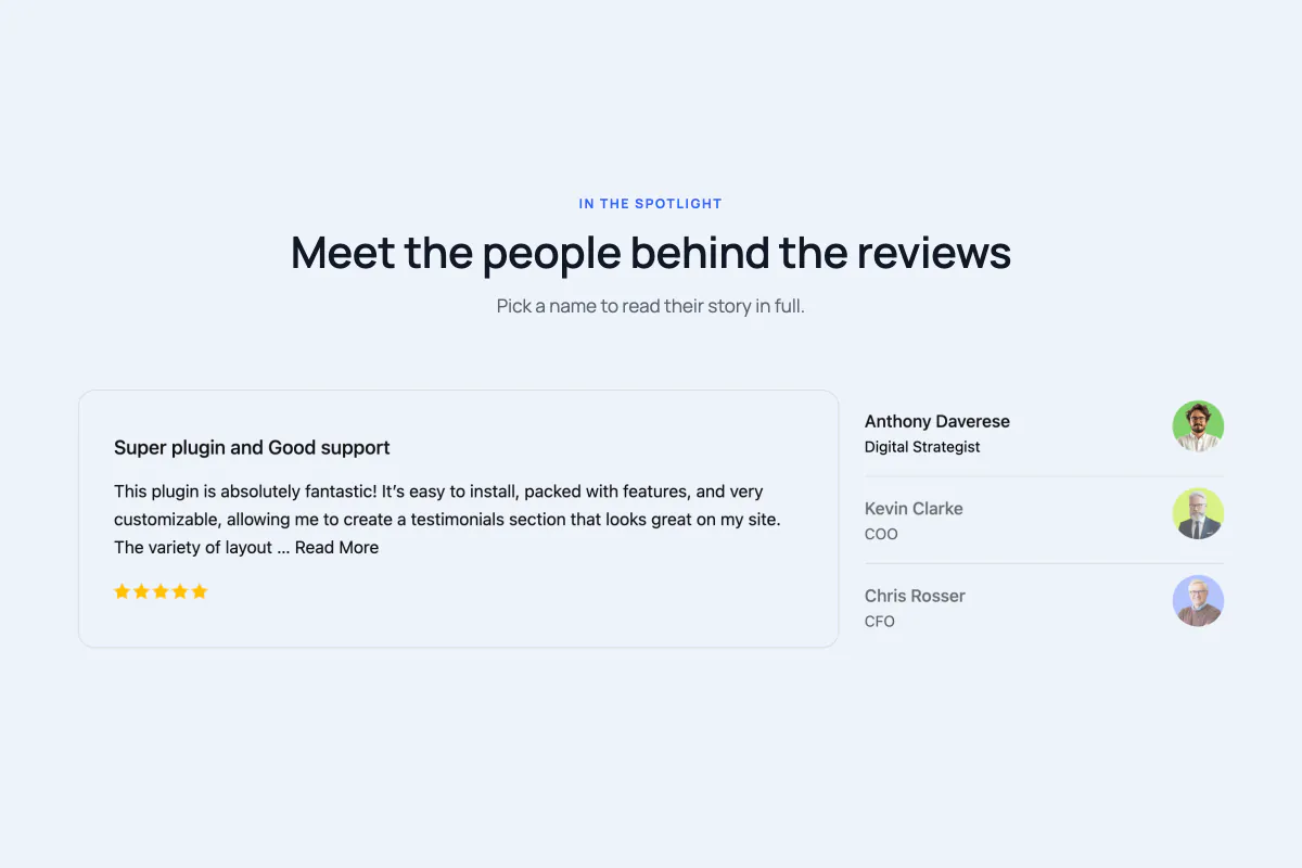
The Spotlight block (a ready-made content element you drop into the WordPress editor) works the opposite way round from a grid. Instead of showing every review at once and hoping visitors read one, it gives a single review the whole stage and turns the rest into a way to browse: a list of names down the side, a strip of photos that expands, or a wall of faces you click to open.
It's the right block when your testimonials are long and worth reading properly, and the wrong one when you just want a wall of short quotes.
When to use it
- Detailed, story-length testimonials that deserve to be read rather than skimmed.
- A page where the people matter: named customers, recognisable logos, real photos.
- A section that needs to feel interactive without a visitor having to scroll.
How to add it
- Click the + block inserter in the editor.
- Search for Spotlight (under the Real Testimonials category) and select it.
- A Select Layout box appears in the block's place. Pick Spotlight Minimal, Spotlight Carousel or Spotlight Grid. If you'd rather start from something finished, the same box has two buttons underneath: Start with Ready Patterns drops in a fully styled Spotlight from the pattern library, and Build with AI builds one from a plain-words description.
- Open Query Builder in the inspector (the settings sidebar on the right) to choose which testimonials appear.
You can switch layout at any time from the Layouts panel. Once the block is set up, you can also select it and click Refine with AI in its toolbar to describe a change, such as "open the review on hover and make the faces bigger". Build with AI explains how both AI buttons work, and the Carousel page covers the other editor shortcuts, such as Ready Patterns and Documentation at the top of the inspector.
The three layouts
Picking a layout changes the shape of the block and which panels you get, so it's worth understanding the three before you choose.
| Layout | What a visitor sees | How they move between reviews |
|---|---|---|
| Spotlight Minimal | A list of reviewers beside the open review, like tabs down one side. | Click a name in the list. There are no arrows or dots; the list itself is the control. |
| Spotlight Carousel | A horizontal strip where the open review widens out and the rest stay as narrow photos. | Arrows, dots or autoplay. Visitors can also click a photo to open it. |
| Spotlight Grid | A centred cluster of reviewer photos. The open review appears in a pop-up card above the face it belongs to. | Click a face to open its review, and click it again to close it. You can also make reviews open on hover or cycle on their own. |
Each layout also comes in a few orientations, which are variations on the same shape:
| Layout | Orientations |
|---|---|
| Spotlight Minimal | With Photo (name list with the photo trailing) · Name List (plain names) · List First (list on the left, photo leading, with a rating) |
| Spotlight Carousel | Leading (the open card leads the row) · Centered (the open card sits centred, waiting photos scaled back) |
| Spotlight Grid | Offset Rows (rows staggered) · Aligned Rows (rows lined up) |
There's no card design picker here
Every other display block asks you to pick one of six card designs. Spotlight doesn't. On all three layouts the open review is a flat list of parts, so there's only one card design and the block picks it for you. Use Card Content to decide which parts appear and in what order.
Finding your way around the inspector
The inspector is the settings sidebar on the right of the editor. Click the block once and you'll see the panels below. Panels marked (Carousel only) or (Minimal only) appear only on that layout.
| Panel | What it controls |
|---|---|
| Layouts | The layout and orientation, columns and gaps, and which child blocks to attach. |
| Query Builder | Which testimonials appear. |
| Sidebar (Minimal only) | The reviewer list: which side it sits on, how wide it is, and the line between rows. |
| Navigation Arrow (Carousel only) | The previous/next arrows. |
| Pagination Dots (Carousel only) | The dots under the strip. |
| Card Content | The parts of the open review. On the Grid, also what opens a review and how wide its card gets. |
| Testimonial Content | The title and the quote. |
| Star Rating | The rating icons. |
| Reviewer Image | The reviewer photo, and the play icon for video testimonials. |
| Reviewer Details | The name, job title, company and date. |
| Social Media | The reviewer's social icons. |
| Motion Effects | Entrance animation as the block scrolls into view. |
| Advanced Settings | Background, spacing, per-device visibility, custom CSS class and ID. |
Now let's go through the panels that are Spotlight's own.
Layouts
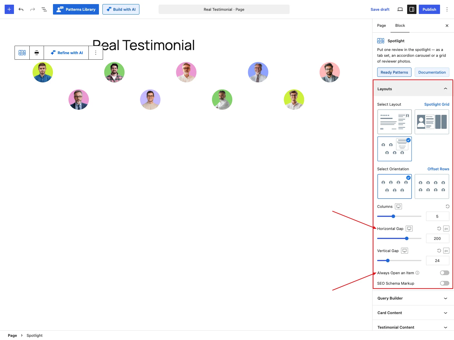
On Spotlight Minimal and Spotlight Grid this panel is a single list of controls. On Spotlight Carousel it has two tabs: Settings (below) and Carousel for autoplay and movement.
Settings tab
| Control | What it does |
|---|---|
| Select Layout | Spotlight Minimal, Spotlight Carousel or Spotlight Grid. |
| Select Orientation | The variations listed above (three on Minimal, two on the others). On Minimal, picking an orientation also moves the list for you: List First puts it on the left, the other two on the right. You can still change the side afterwards in the Sidebar panel. |
| Columns (not on Minimal) | How many reviewer photos sit across the row: up to 12 on the Grid, up to 6 on the Carousel. Picking a layout sets it for you: 5 / 3 / 2 (desktop / tablet / phone) on the Grid, 3 / 2 / 1 on the Carousel. |
| Horizontal Gap (Grid only) | The space between two faces, up to 300 px. Picking the Grid sets it to 200 / 120 / 60 px. If the block is too narrow to fit the photos at that spacing, the gap shrinks on its own so nothing spills out. |
| Gap Between Items (Carousel only) | Space between the photos, up to 100 px. Default 24 px (16 on tablets, 12 on phones). On the Centered orientation, this is exactly the space you see between the waiting photos. |
| Vertical Gap (Grid only) | Space between rows of photos, up to 100 px. Default 24 px. |
| Always Open an Item (Grid only) | Off by default: every face starts closed, nothing opens until a visitor asks, and they can close the open review again. On: the first review is already open when the page loads, and one review always stays open. |
| Navigation Arrow (Carousel only) | Previous/next arrows. On by default. |
| Pagination Dots (Carousel only) | Dots under the strip. On by default. |
| Review Summary (not on Grid) | Adds an aggregate Review Summary above the block. |
| Live Frontend Filter (not on Grid) | Adds filter controls so visitors refine reviews live. |
| Ajax Testimonial Search (not on Grid) | Adds a live search box. |
| SEO Schema Markup (not on Minimal) | Outputs review data search engines can read. Available when the SEO Schema module is on. |
Switching layout resets some settings
Every layout switch rewrites a handful of settings so the new shape looks right straight away:
- Columns and the gap between photos go to that layout's defaults (see the table above).
- Testimonial Content length goes to Full on Minimal, where the open review has room, and Limited on the Carousel and Grid.
- Card alignment goes to Center on the Grid (its pop-up card is a narrow column) and Left on the other two.
- Reviewer photo corners change to suit the layout: round on Minimal and the Grid, a rounded rectangle on the Carousel's tall photo cards.
- Reviewer photo size goes to a small 36 px with no margin when the photo sits in Minimal's name list (With Photo and List First), and back to 70 px with a 12 px gap below it everywhere else.
Switching to the Grid also turns off the Review Summary, Live Frontend Filter and Ajax Testimonial Search (there's no room for them), and raises your Display Limit to 9. So pick your layout first, then style it and set up child blocks.
There's no Ajax Pagination on any Spotlight layout. The whole point of the block is that every review is already reachable from the list, strip or grid.
The Grid's pop-up card floats over the content above it
The review card opens above the face you clicked, so on the top row it overlaps whatever sits above the block, such as a heading. The block doesn't hold empty space open for it. If the card covers something you care about, leave a little room above the block, for example with a Spacer block.
Carousel tab
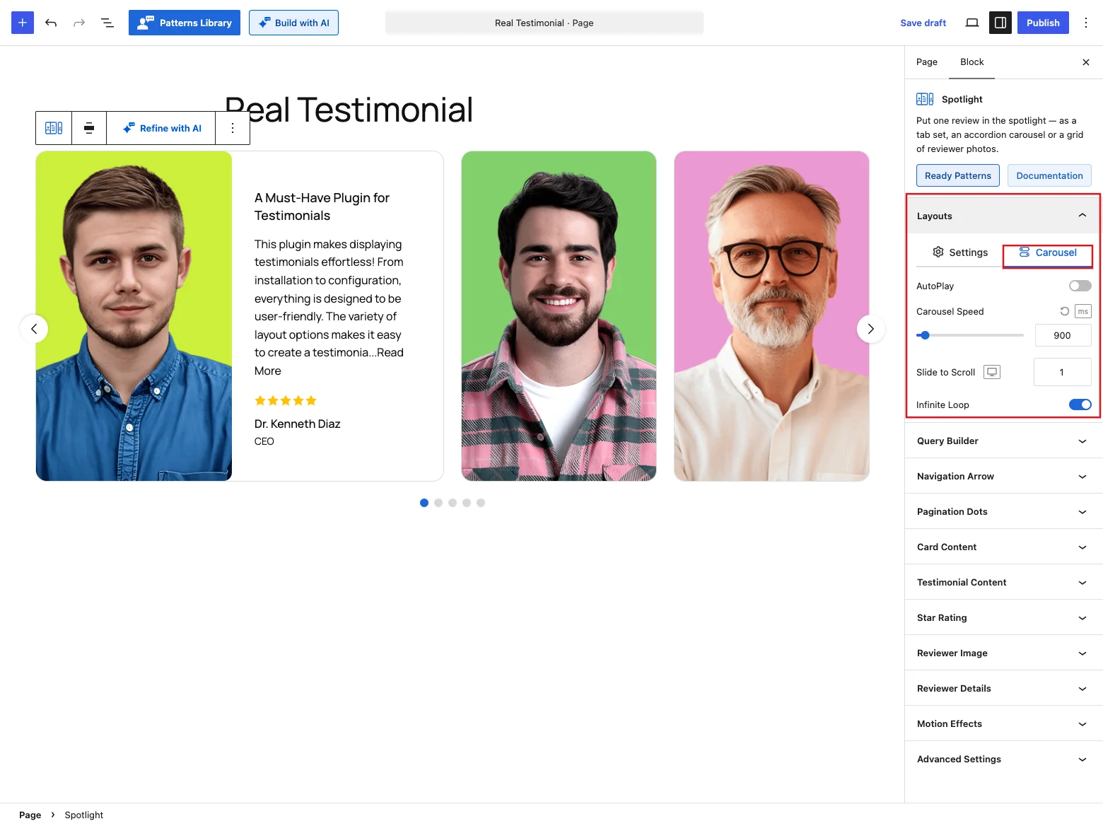
Spotlight Carousel only. This tab controls how the strip moves on its own and how far each step goes.
| Control | What it does |
|---|---|
| AutoPlay | Opens the next review on its own. Off by default. |
| Autoplay Delay (AutoPlay on) | How long each review stays open, 100–10,000 ms. Default 3000 ms. |
| Carousel Speed | How long the move from one review to the next takes, 100–10,000 ms. Default 900 ms. |
| Slide to Scroll | How many reviews one arrow click or autoplay step moves. Default 1. |
| Carousel Direction (AutoPlay on) | Left to Right (default) or Right to Left. Right to Left makes autoplay step backwards through your reviews; the strip itself isn't mirrored. |
| Pause on Hover (AutoPlay on) | Stops autoplay while the pointer is over the strip. On by default. |
| Infinite Loop | Carries on from the last review back to the first, moving forward rather than rewinding across the whole strip. On by default. Turn it off and the arrows grey out at the first and last review. |
The Carousel block's Adaptive Height, Tab and Key Navigation, MouseWheel Control and Free Scroll Mode settings aren't offered on the Spotlight Carousel. Each one would move the strip without opening a review.
The strip moves in the editor just as it will on your live page: the arrows, dots and autoplay all work on the canvas, so you can check the motion without previewing.
Query Builder
Use this panel to choose which reviews Spotlight works through: the latest ones, one or more groups, a hand-picked set, or only high star ratings. You set the display limit and the order here too, or shuffle them. Each option is covered in the Carousel reference.
The block starts with a Display Limit of 5 (9 once you switch to the Grid). Keep it sensible: every testimonial you pull becomes a name in the list or a face in the grid.
Sidebar
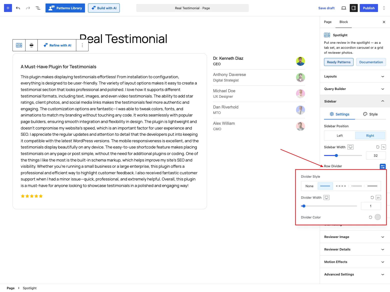
Spotlight Minimal only. This panel sets out the reviewer list beside the open review.
Settings tab
| Control | What it does |
|---|---|
| Sidebar Position | Left or Right. Default Right. Picking the List First orientation moves it to the left for you. |
| Sidebar Width | How much of the block the list takes, as a percentage or in pixels (up to 800 px). Default 32% on desktop, 38% on tablet and 100% on mobile. |
| Row Divider | A line between names in the list, on by default. Click it to open the Divider Style options: None, solid, dashed, dotted or double (solid by default), plus Divider Width (default 1 px) and Divider Color (default #E0E0E0). Pick None to remove the lines. |
| Vertical Gap | Space between names, up to 80 px. Default 0. |
Style tab
One control: Margin around the list. It moves the whole list as one block, so it doesn't add space between the names. That's what Vertical Gap is for.
What the list shows
The list is built from the same settings as the review, so there's no second set of name controls to keep in step:
- Which lines appear follows Card Content. Switch off the Reviewer Name or Designation part and that line leaves the list too. On List First, the rating row follows the Rating part.
- The photo shows on With Photo and List First. Size it with the Reviewer Image panel.
- The look of the names and job titles comes from the Reviewer Details panel: HTML tag, typography and colors.
- The company joins the job title, as in "Designer at Acme". That's why Reviewer Details only offers Show Name with Designation as the company display style on this layout.
A long list never makes the block taller than the review. It scrolls inside the height the open review sets. On screens narrower than 768 px, the list moves above the review, whichever side you picked for desktop.
Navigation Arrow
Spotlight Carousel only, when the toggle is on. Size, position and color the previous/next arrows here. The controls match the Carousel's, so the Carousel reference covers them.
The arrows step the open review, not the strip. Pressing next opens the following testimonial instead of scrolling the photos along. One review is always open: clicking the photo that's already open doesn't close it.
Pagination Dots
Spotlight Carousel only, when the toggle is on. Pick a dot style and set its size, spacing and colors. Details in the Carousel reference.
Clicking a dot opens its review, just like clicking a photo. If Slide to Scroll is more than 1, each dot stands for a group of that many reviews.
Card Content
This is where you design the open review. Switch its parts on or off and drag them into order (photo, title, text, rating, name and more), set the alignment and a hover effect, and style the background, border, shadow, corners and padding. Each control is explained in the Carousel reference.
On the Carousel and the Grid, the reviewer photo is part of the layout itself (the tall photo in the strip, or the face in the grid), so it always shows. The Reviewer Image part doesn't add a second copy of it inside the review.
On the Carousel, the card's background, border, corners and shadow wrap the photo and the review together, so an open card reads as one box. Padding still applies to the review only.
Grid controls
On the Grid, the Settings tab gets three extra controls. Show Testimonial sits at the top, and Max Width sits under the list of parts:
| Control | What it does |
|---|---|
| Show Testimonial | What opens a review: On Click (default), On Hover or AutoPlay. With On Hover, the review opens when the pointer rests on a face and closes shortly after the pointer leaves both the face and its card. AutoPlay opens one review after another on its own. |
| AutoPlay Delay (AutoPlay only) | How long each review stays open, 500–15,000 ms. Default 3000 ms. |
| Max Width | How wide the pop-up review card gets, up to 800 px. Default 384 px on desktop, 320 on tablet, 280 on mobile. |
Autoplay respects accessibility settings
If a visitor has asked their system to reduce motion, autoplay doesn't run for them. It also pauses when the browser tab is in the background, so people don't come back to a review three steps past the one they were reading.
Testimonial Content
Shape the title and the quote: heading tag, full or trimmed length with a Read More action (expand, popup or link), optional quote symbols, and typography and colors for both. Full details are in the Carousel reference.
If Read More opens a popup, the popup shows the reviewer's photo along with the full review, on every layout.
Star Rating
Style the rating on the open review. Choose from 16 icon styles (stars, hearts, thumbs and more) and set the size, spacing, and filled and empty colors. More in the Carousel reference.
Reviewer Image
This panel sets up the reviewer photo: resolution, aspect ratio and size, the fallback avatar for testimonials without a photo, retina loading, and click-to-play video testimonials. The shared controls are covered in the Carousel reference.
Each layout draws its photo differently, so the panel only shows the controls that photo can use:
| Layout | What the panel sizes | What's different |
|---|---|---|
| Minimal | The photo in the name list (With Photo, List First), or the photo inside the review (Name List). | Every control is here, including Margin on the Style tab. |
| Carousel | The tall photo in the strip. | It always fills its slot in the strip, so Aspect Ratio, Image Width and Image Height are hidden, and so is Margin. |
| Grid | Each face in the cluster. | Image Width (70 px by default) and Aspect Ratio (1:1) set the face size. There's no Margin; Horizontal Gap and Vertical Gap handle the spacing. |
On every layout, Image Resolution picks which size of the uploaded photo loads, and Load 2x in Retina Display serves a sharper copy to high-resolution screens. Photos are round on Minimal and the Grid and slightly rounded (12 px) on the Carousel. Switching layout sets this for you, and you can change it on the Style tab afterwards.
Show Video Testimonial puts a play icon on the photo for reviewers who have a video, on all three layouts. Clicking the icon plays the clip in a popup:
- On the Carousel, it plays the clip without opening that review or moving the strip.
- On the Grid, the icon sits over the face, and clicking it plays the clip without opening the review card.
- On Minimal, clicking the icon in the list plays the clip and also selects that reviewer.
Reviewer Details
Style the who-said-it line: the name's heading tag, a verified badge, how company info, location and date are shown, and the typography for each part. See the Carousel reference for each setting.
On Minimal, this panel also styles the names and job titles in the reviewer list. See What the list shows.
Social Media
This panel appears when the Social Profiles card part is on and the Reviewer Social Profiles module is enabled. It sizes and styles the reviewer's social icons, as described in the Carousel reference.
Motion Effects
Turn on the Motion Effects module and this panel lets the block animate as it scrolls into view, with an entrance animation (fade, slide, zoom, bounce) and an optional scrolling effect for each device. The options are listed in the Carousel reference.
Advanced Settings
Settings for the whole block live here: a background with padding and margin, per-device visibility, and custom CSS class and ID fields for your own styling. For the full breakdown, see the Carousel reference.
Tips
- Spotlight Minimal is the safest starting point. It reads well at every width and doesn't need arrows or dots.
- Clicking a photo on the Carousel opens that review; it doesn't scroll the strip. If visitors seem to expect scrolling, add the arrows back.
- On the Grid, keep Columns at 4–6. A dense wall of tiny faces is hard to aim at on a touchscreen.
- Want the Grid to look busy from the moment the page loads? Turn on Always Open an Item so the first review is already showing.
- Use On Hover sparingly. It feels quick on a desktop and does nothing useful on a phone, where there's no hover.
- Spotlight honours wide and full width alignment from the block toolbar. Use it, because the block needs horizontal room.